Pranksy
“Pale sage and brick red, with the display face outlined rather than filled, so the biggest thing on the page is a drawing of type instead of a slab of colour. Three faces do the whole job: a heavy condensed wordmark, a hand-drawn marker at marquee scale that never stops moving, and a small letterspaced sans for the labels. The homepage is three moves and a footer, which takes more confidence than another section would.”
Own this site? Claim it, correct it, or ask for it to come down. No account needed.
This website was built with
- Framework
- Next.js
- CDN
- Amazon CloudFront
- Analytics
- Google Tag Manager
Read from the response headers and the HTML this page served us on 2026-09-25, not from a database of guesses. Hover a name to see the exact string it came from. A stack can change the day after we look, and anything a site loads later we never saw.
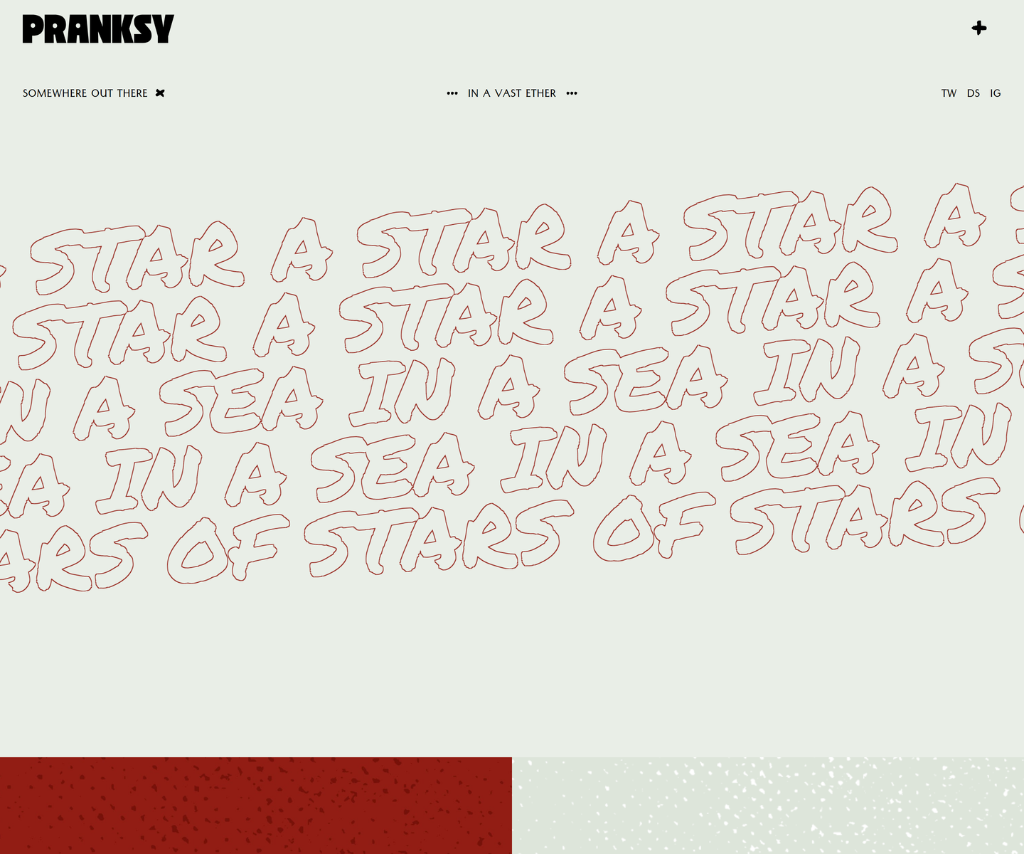
Design DNA
More of the design
Curated sections · the build, top to bottom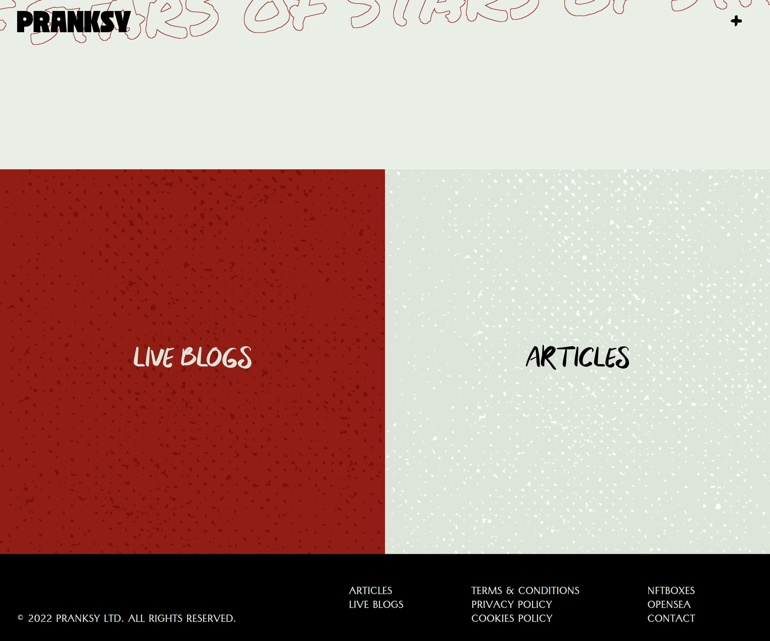
Tools on this screenshot
Eyedrop its colours, send the palette to the Workbench, measure spacing, overlay a grid, or recreate it with AI. These run on our render, so they read pixels.
For the whole system read from the site's own CSS — the tokens it declares, roles with the token each came from, the type scale, spacing, breakpoints and states, measured contrast, and eight take-away formats including a DESIGN.md and a shadcn install — decode Pranksy in full.
Sites like this ranked by shared facets and the dominant colour read off each render
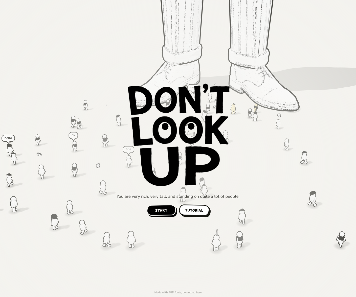
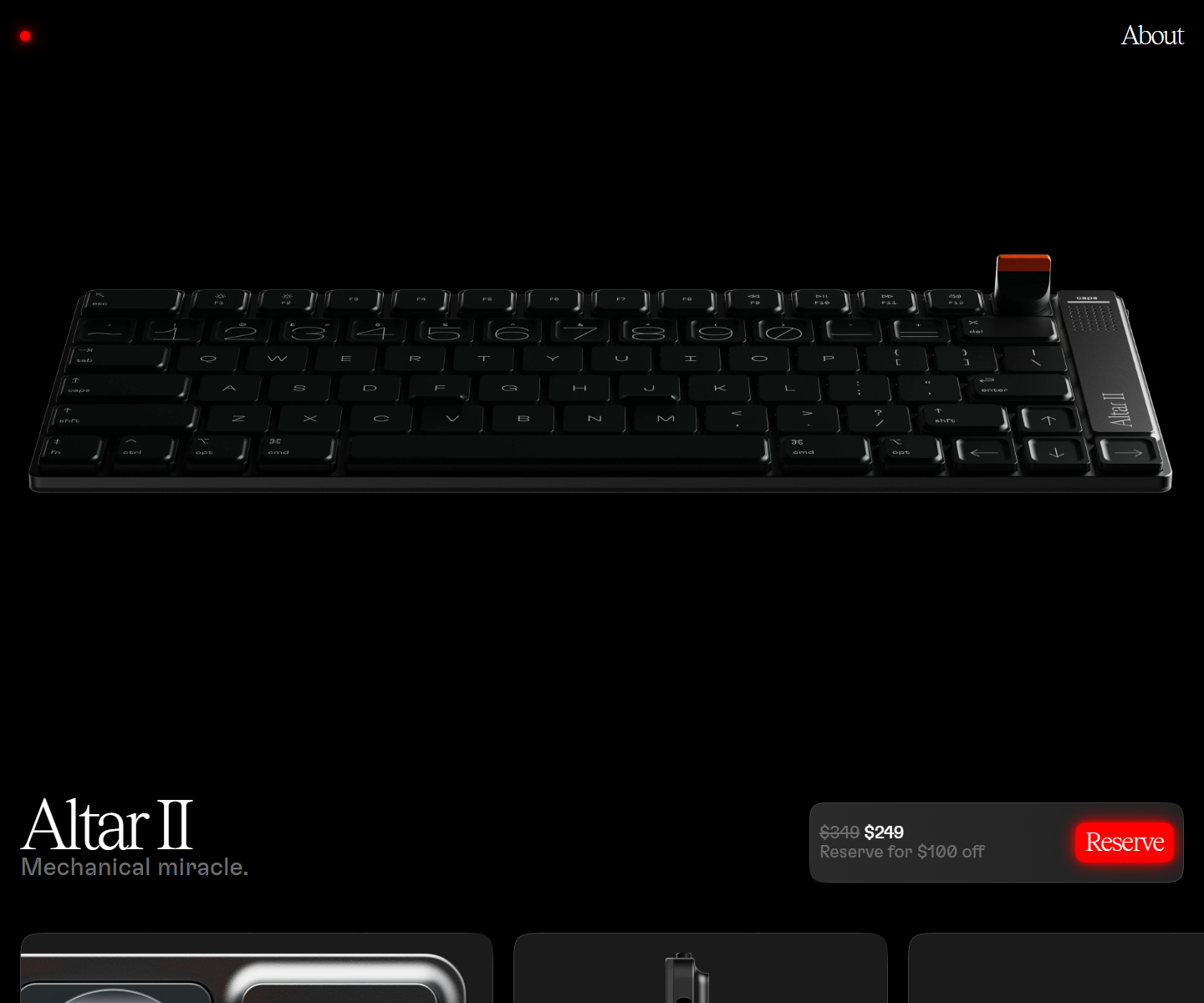
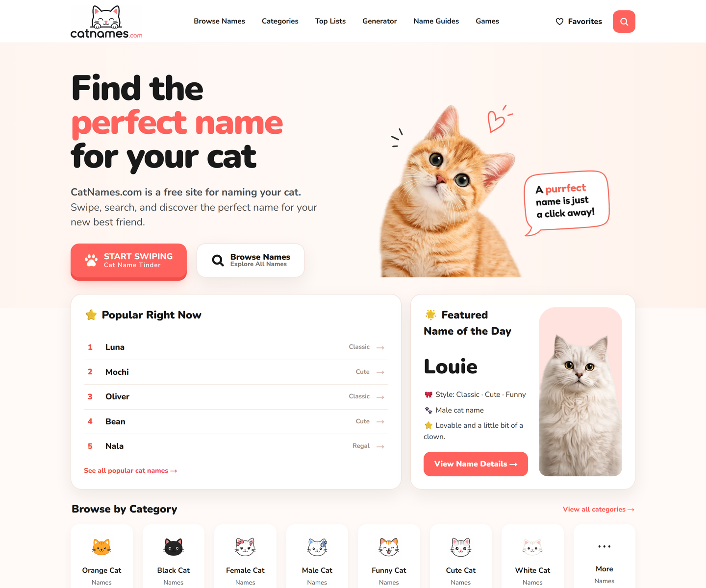
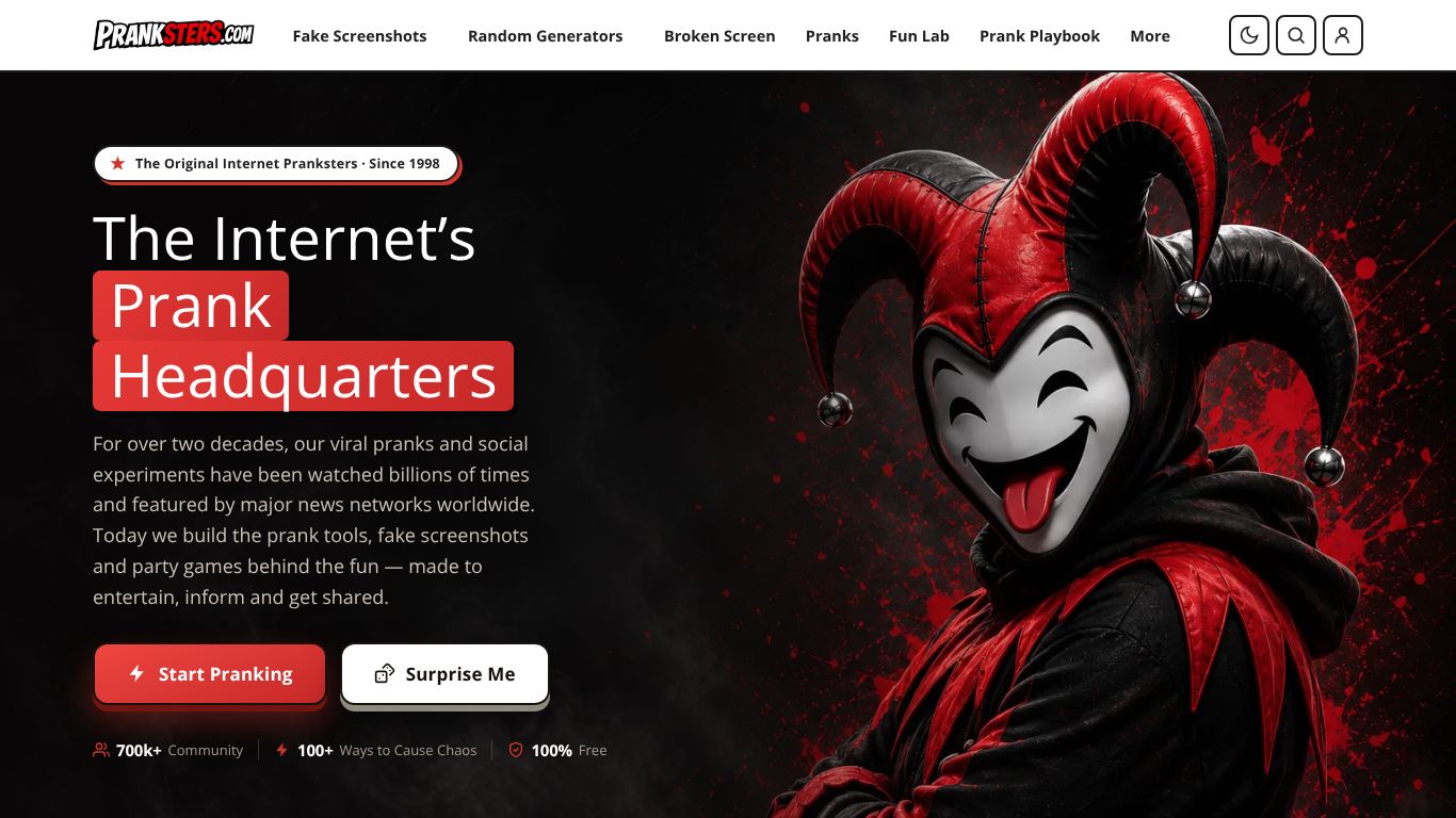
Our own render · scroll it, or use ← → for the next site