Style · collection
Type-Based web design
8 curated type-based sites, shown as our own renders. Click any one to decode it — pull the palette, measure the spacing, or install its shadcn theme.
What to look for. Typography is the interface. Font choice, weight pairing and line length are doing the job a photo would do elsewhere.
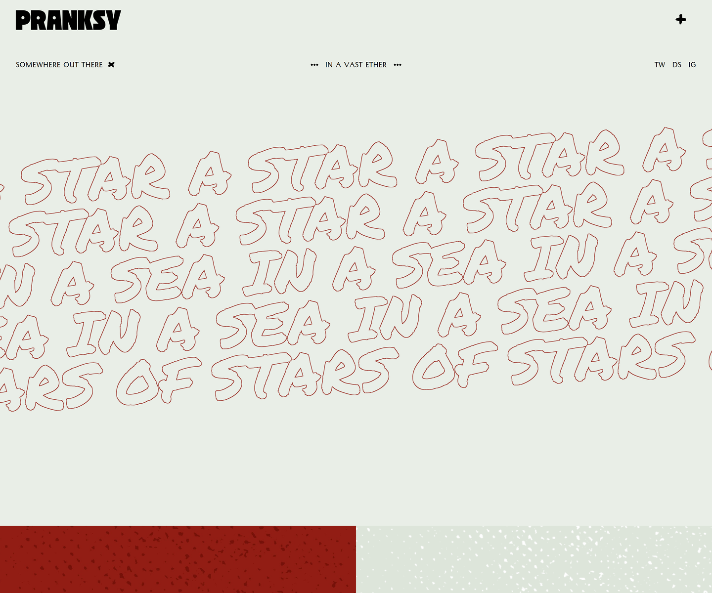 Pranksy pranksy.io Decode Pale sage and brick red, with the display face outlined rather than filled, so the biggest thing on the page is a drawing of type instead of a slab of colour. Three faces do the whole job: a heavy condensed wordmark, a hand-drawn marker at marquee scale that never stops moving, and a small letterspaced sans for the labels. The homepage is three moves and a footer, which takes more confidence than another section would.
 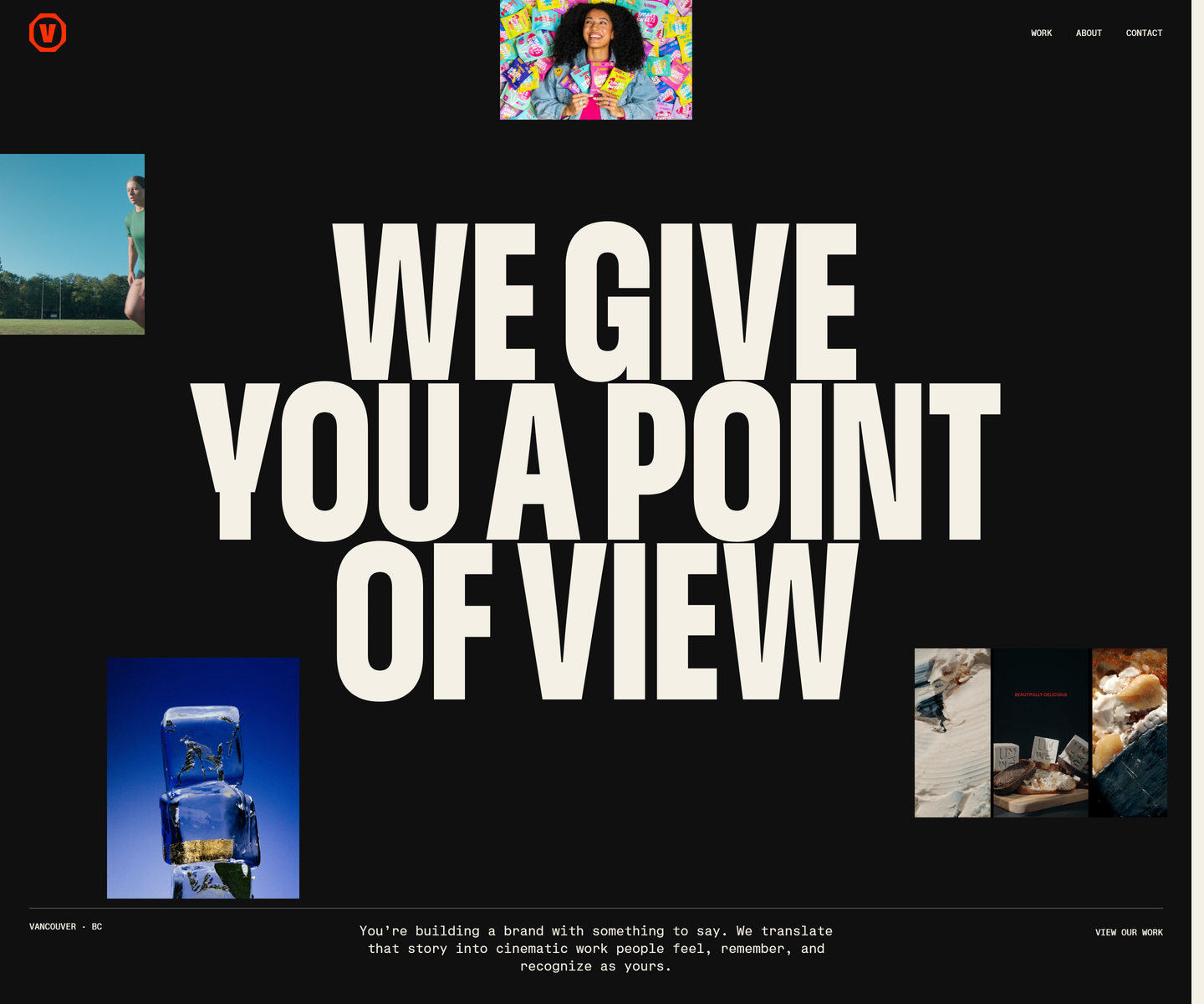 Velour Productions velourproductions.com Decode Cream condensed caps at fold-filling scale on near-black, with film stills tucked into the gaps between the letters rather than laid out beside them. A mono caption row runs underneath like a slate, and orange is held back entirely for the mark and the closing panel, where the studio name fills the screen.
 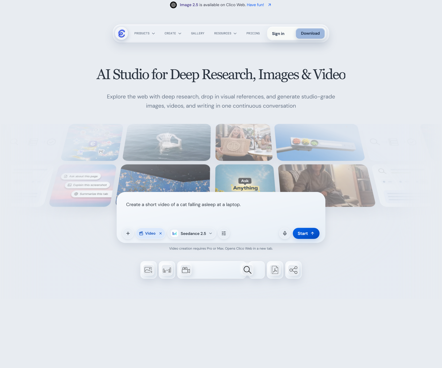 Clico tryclico.com Decode A serif headline over pale blue-grey, with the product shown as a scatter of its own floating windows instead of one screenshot. The second headline strikes through the word watermark, a rare case of type making the argument rather than describing it.
 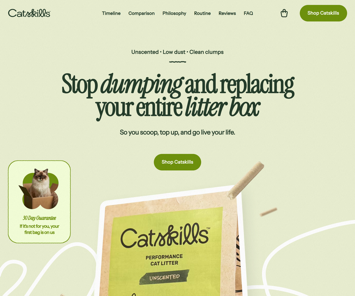 Catskills catskills-showcase.pages.dev Decode Two greens and nothing else: deep sage type on a pale olive ground, with Instrument Serif dropping into italic mid-headline to carry the emphasis a bold would usually take. Product photography sits in soft rounded frames, and a guarantee card leans over the hero at an angle, the only thing on the page allowed to be crooked.
 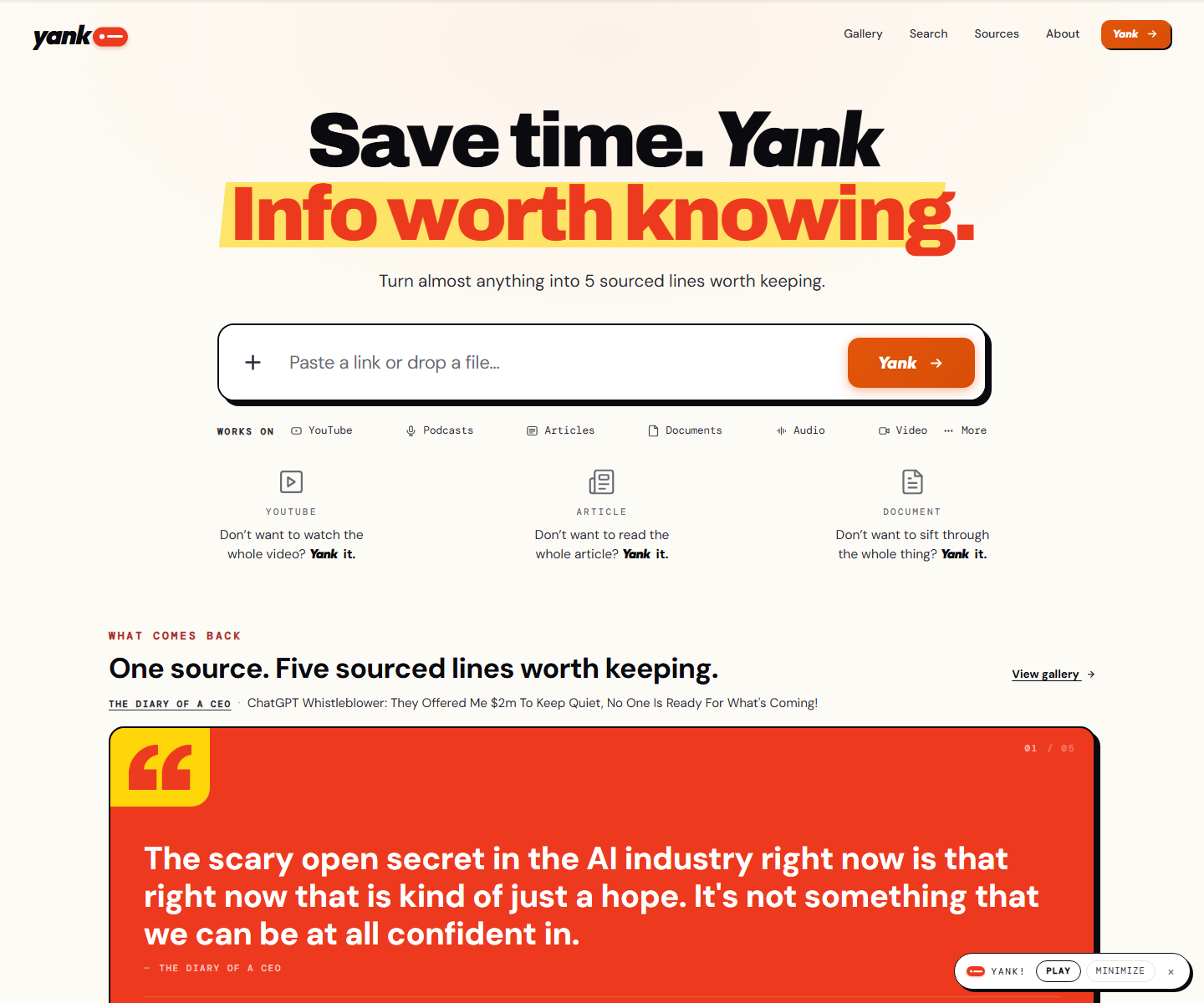 yank.info yank.info Decode Cream paper, an orange second line on a yellow highlighter swipe, and a hard black shadow under the paste box: a summarizer that looks like a marked-up page instead of a chat box. Right under the input the product runs itself on a pink panel, a TED talk with its distilled line in a red quote card and a numbered playlist of sources beside it.
 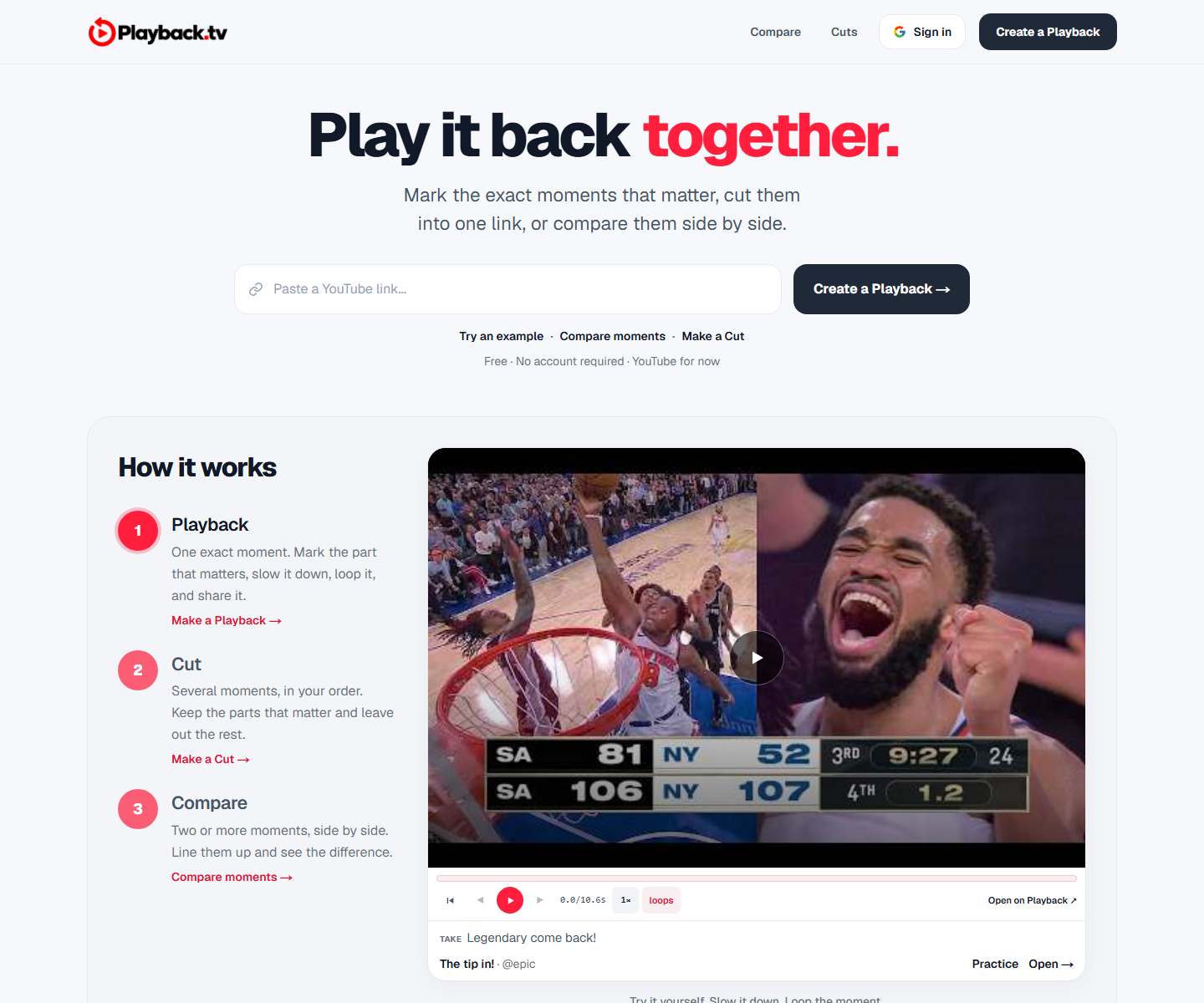 Playback playback.tv Decode A paste-a-link hero with the product demonstrating itself directly underneath: two clips side by side, scrubber and all. One red carries the second half of the headline and every action, everything else is black on white, and a handwriting face marks the human asides.
 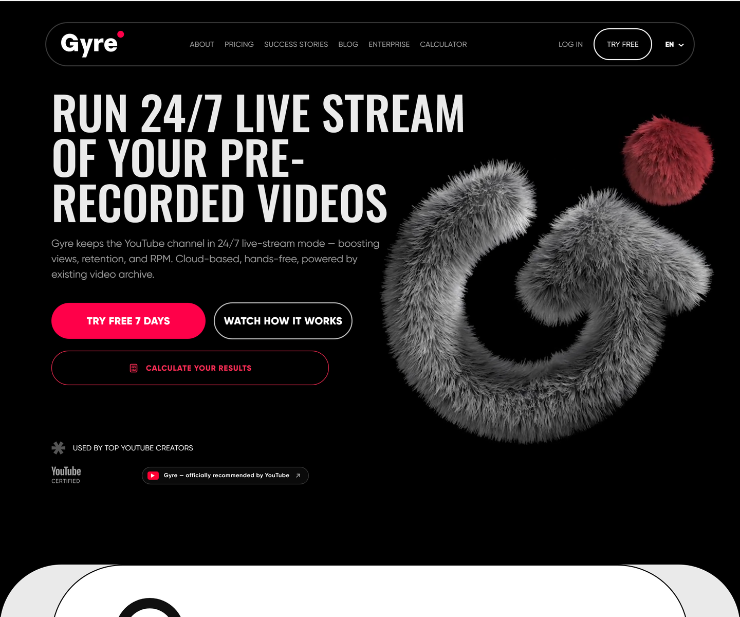 ★ Design of the Week Gyre gyre.pro Decode Condensed uppercase display type at poster scale on pure black, one hot pink accent carrying every action, and a fur-rendered 3D mark doing the job an illustration usually does. A streaming tool that looks like a record sleeve instead of a dashboard.
 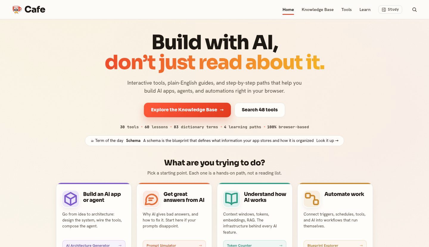 KB Cafe kbcafe.com Decode A warm editorial take on developer reference: paper-toned ground, a vermilion accent used only for wayfinding, and type doing the structural work across a large body of documentation.
 Also in these collections
Other axes these sites overlap with, ranked by how many they share.
Other style collections
Our own render · scroll it, or use ← → for the next site