Type · collection
Company websites
10 curated sites in Company, shown as our own renders. Click any one to decode it — pull the palette, measure the spacing, or install its shadcn theme.
What to look for. Company sites: the front door, built to explain and convince. The best ones keep a product-grade design system behind marketing-grade copy.
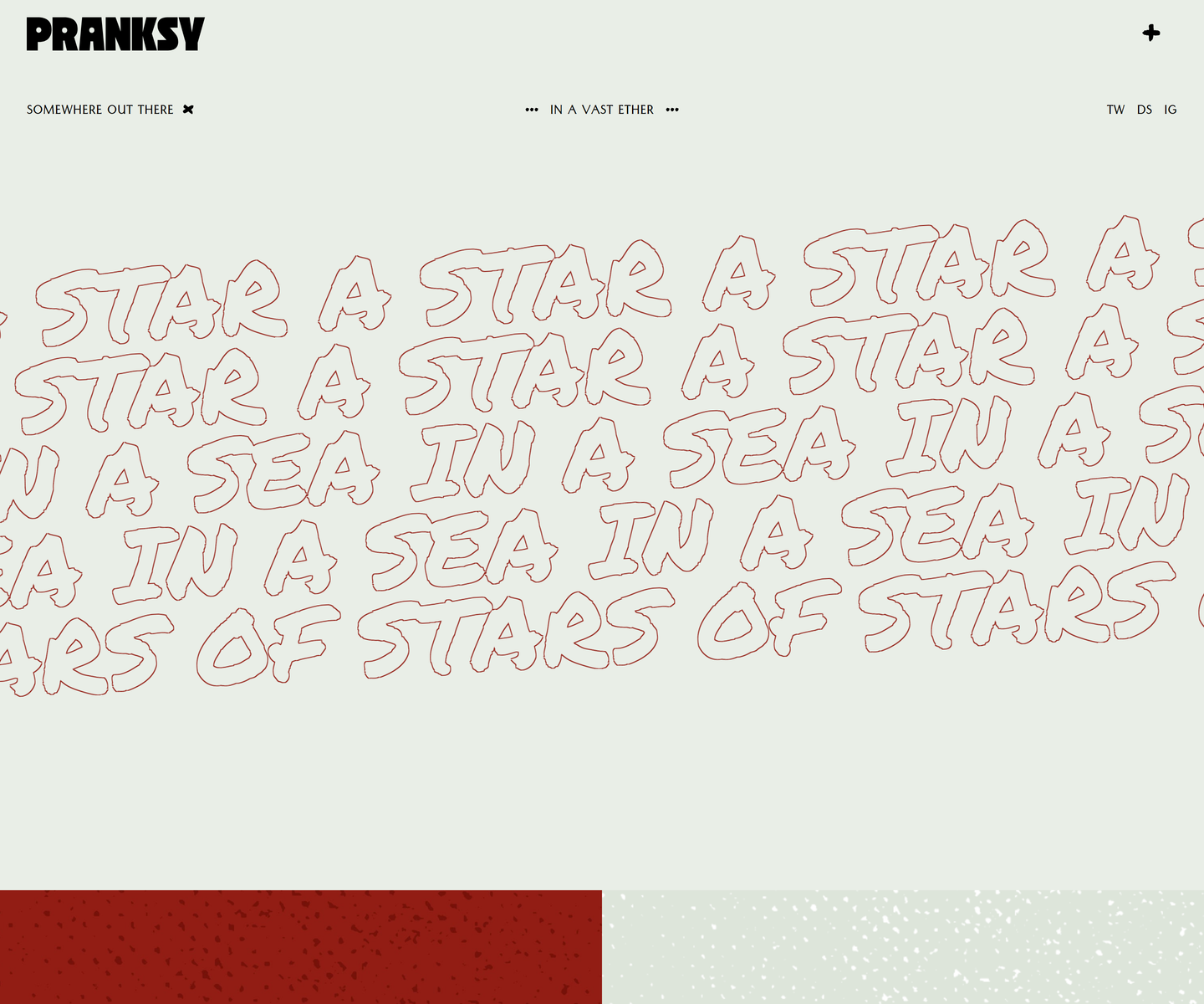 Pranksy pranksy.io Decode Pale sage and brick red, with the display face outlined rather than filled, so the biggest thing on the page is a drawing of type instead of a slab of colour. Three faces do the whole job: a heavy condensed wordmark, a hand-drawn marker at marquee scale that never stops moving, and a small letterspaced sans for the labels. The homepage is three moves and a footer, which takes more confidence than another section would.
 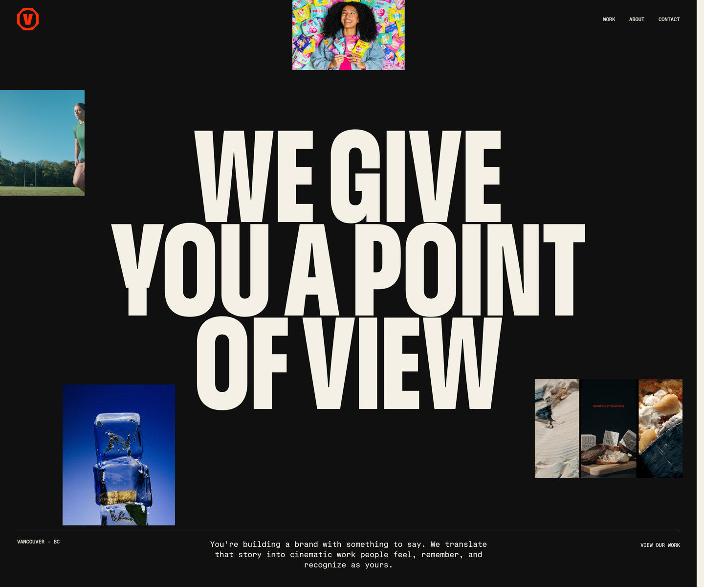 Velour Productions velourproductions.com Decode Cream condensed caps at fold-filling scale on near-black, with film stills tucked into the gaps between the letters rather than laid out beside them. A mono caption row runs underneath like a slate, and orange is held back entirely for the mark and the closing panel, where the studio name fills the screen.
 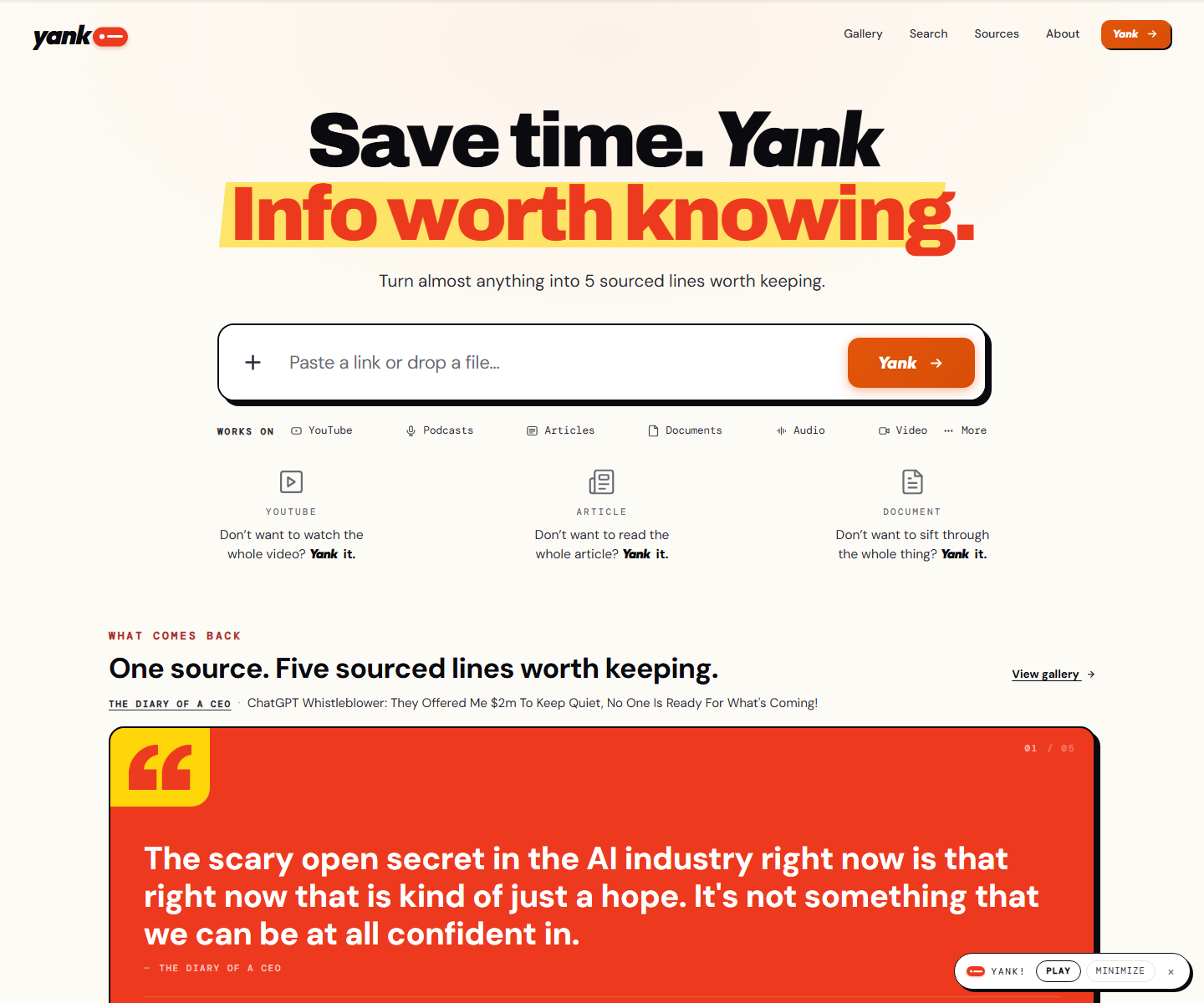 yank.info yank.info Decode Cream paper, an orange second line on a yellow highlighter swipe, and a hard black shadow under the paste box: a summarizer that looks like a marked-up page instead of a chat box. Right under the input the product runs itself on a pink panel, a TED talk with its distilled line in a red quote card and a numbered playlist of sources beside it.
 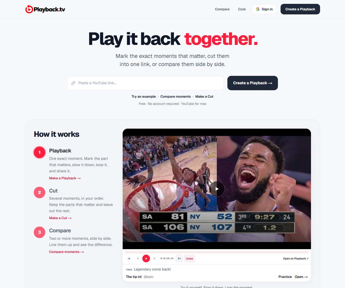 Playback playback.tv Decode A paste-a-link hero with the product demonstrating itself directly underneath: two clips side by side, scrubber and all. One red carries the second half of the headline and every action, everything else is black on white, and a handwriting face marks the human asides.
 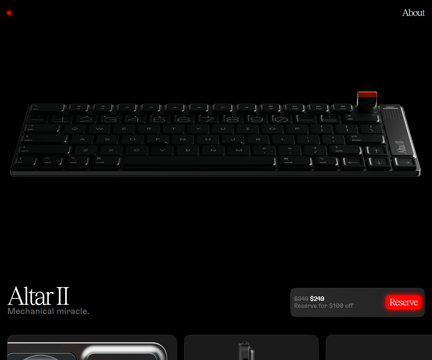 Electronic Materials Office electronicmaterialsoffice.com Decode Sells hardware by switching the lights off: a near-black page where photography of the product is the only illustration, a serif display line over a light grotesque, and the single saturated colour on screen saved for one glowing Reserve button. 26,000px of scroll and twelve inline videos, and not one stock graphic.
 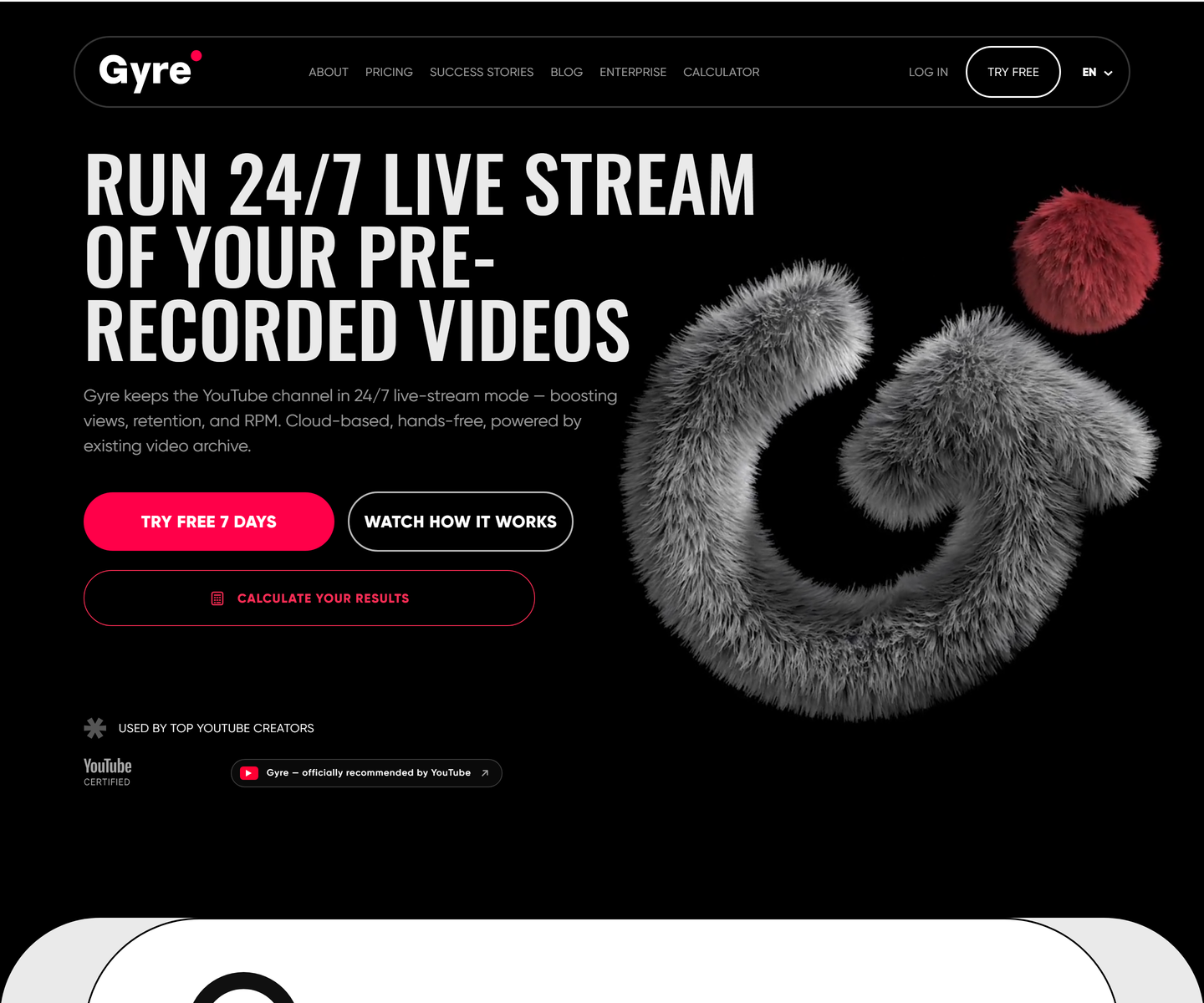 ★ Design of the Week Gyre gyre.pro Decode Condensed uppercase display type at poster scale on pure black, one hot pink accent carrying every action, and a fur-rendered 3D mark doing the job an illustration usually does. A streaming tool that looks like a record sleeve instead of a dashboard.
 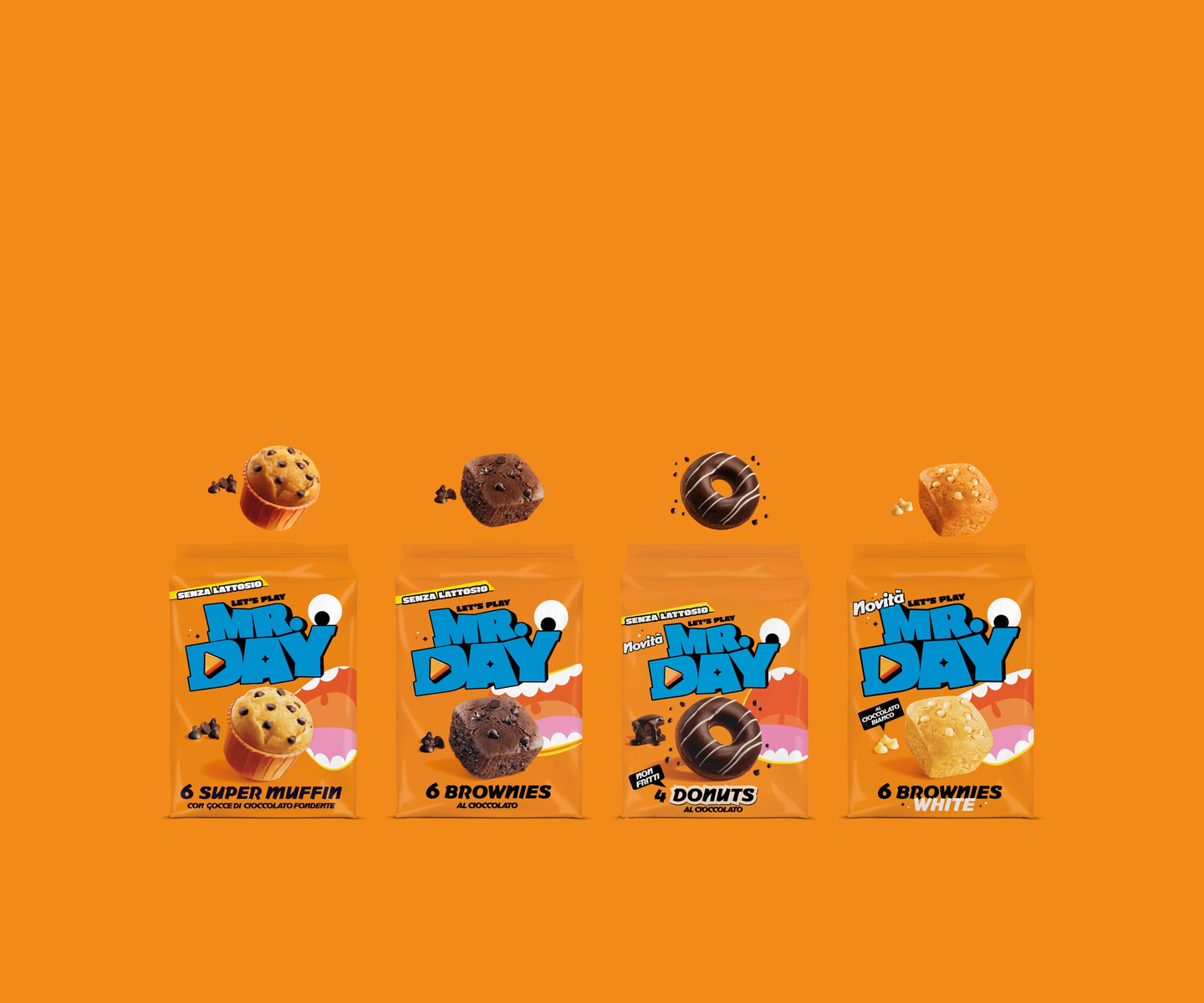 Mr.Day mrday.it Decode Marquee strips of heavy display type alternate with cut-out product shots, so the page scrolls like a moving poster — orange and cyan carry the brand while a “level up” gaming motif runs through the copy.
 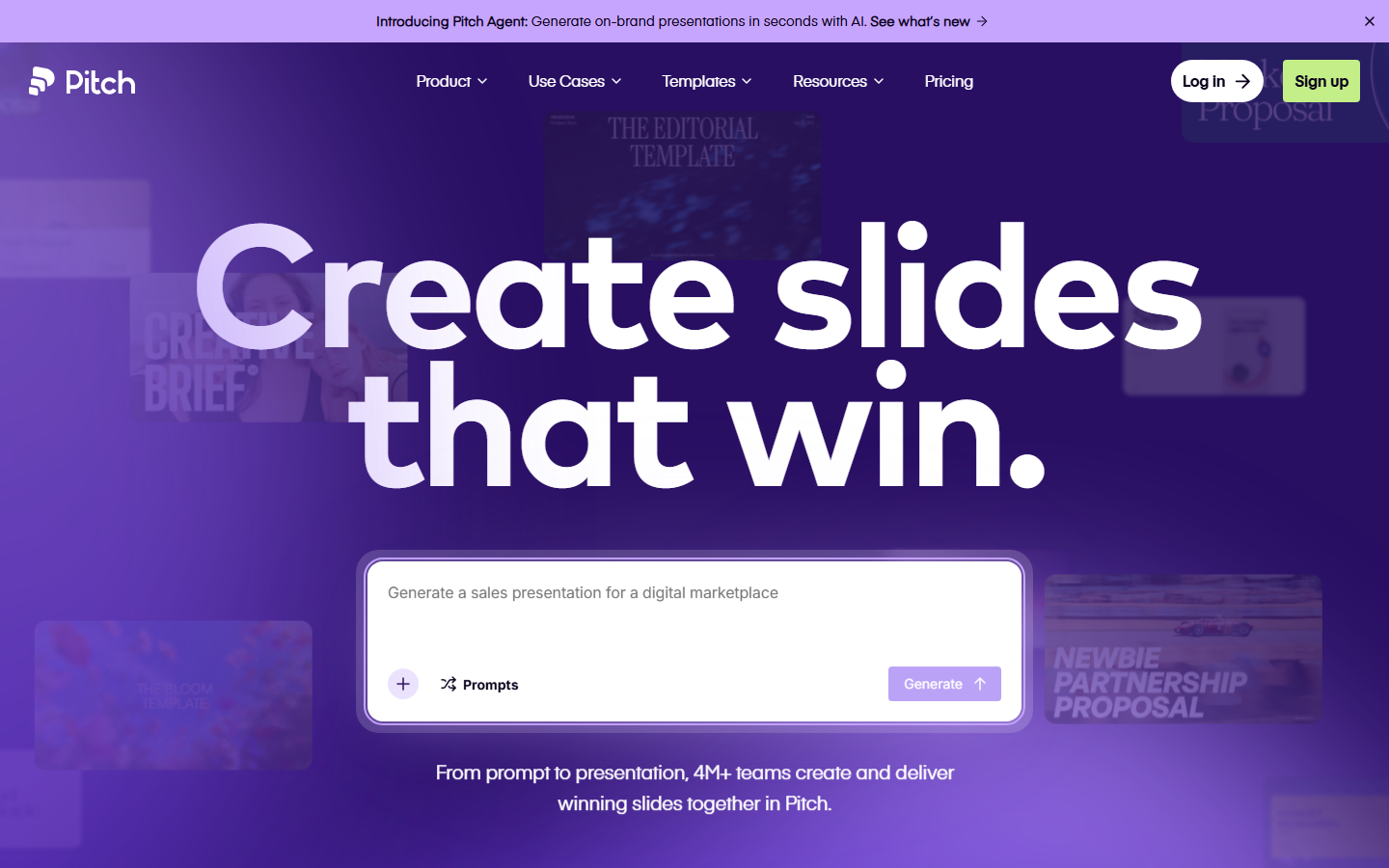 Pitch pitch.com Decode Presentation software that presents itself: bold type, vivid color blocks, and motion that mimics a live deck.
 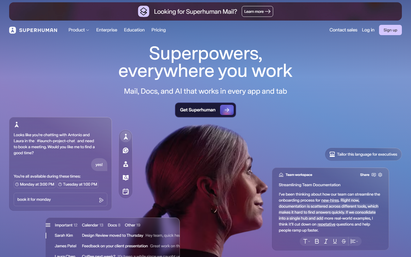 Superhuman superhuman.com Decode Speed sold through restraint: a confident type-led hero and snappy micro-interactions that reinforce the pitch.
 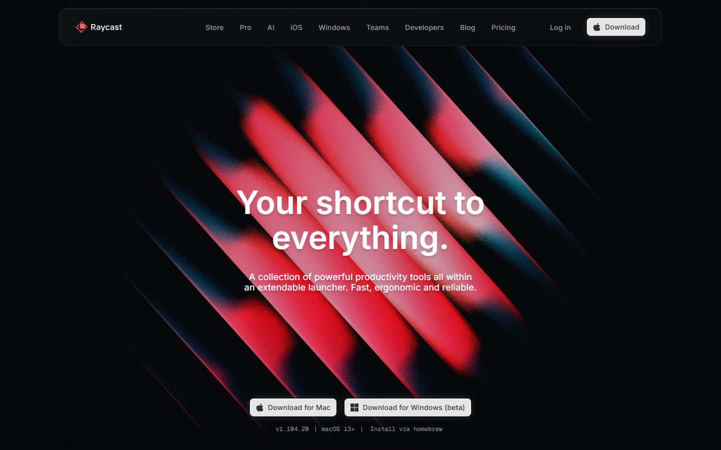 Raycast www.raycast.com Decode Keyboard-first personality carried into the page: clean dark sections, real UI clips, and one obvious download action.
 Also in these collections
Other axes these sites overlap with, ranked by how many they share.
Other type collections
Our own render · scroll it, or use ← → for the next site