The Showcase· 22 sites as of 24 Oct 2026
Sites worth taking apart.
A curated gallery of beautifully designed sites, shown as our own renders. Other directories just show you the work. Click any card here to decode it: pull the palette into the Workbench, measure the spacing, recreate it with AI, or X-ray the live build.
Two ways to go deeper: put any two of them side by side, or take a live page apart in the Decode workspace.
Filter these sites
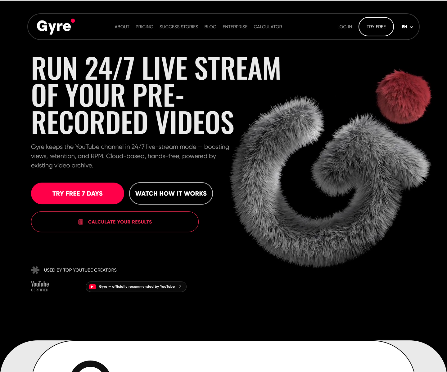 ★ Design of the Week Gyre gyre.pro Decode Condensed uppercase display type at poster scale on pure black, one hot pink accent carrying every action, and a fur-rendered 3D mark doing the job an illustration usually does. A streaming tool that looks like a record sleeve instead of a dashboard.
 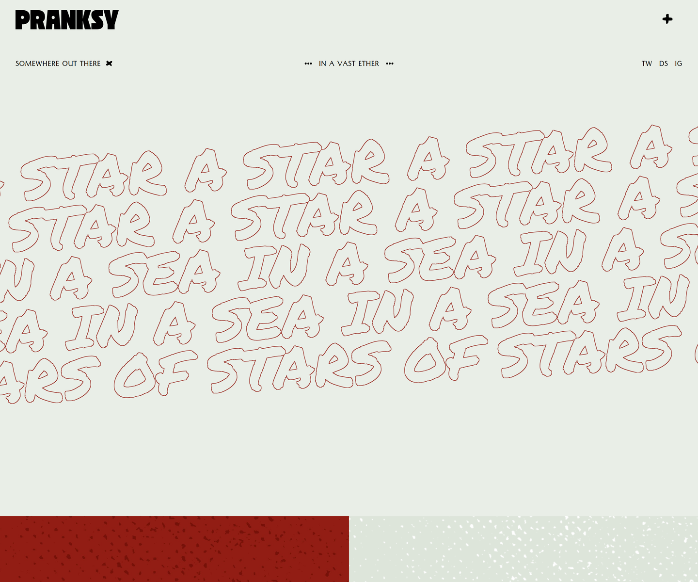 Pranksy pranksy.io Decode Pale sage and brick red, with the display face outlined rather than filled, so the biggest thing on the page is a drawing of type instead of a slab of colour. Three faces do the whole job: a heavy condensed wordmark, a hand-drawn marker at marquee scale that never stops moving, and a small letterspaced sans for the labels. The homepage is three moves and a footer, which takes more confidence than another section would.
 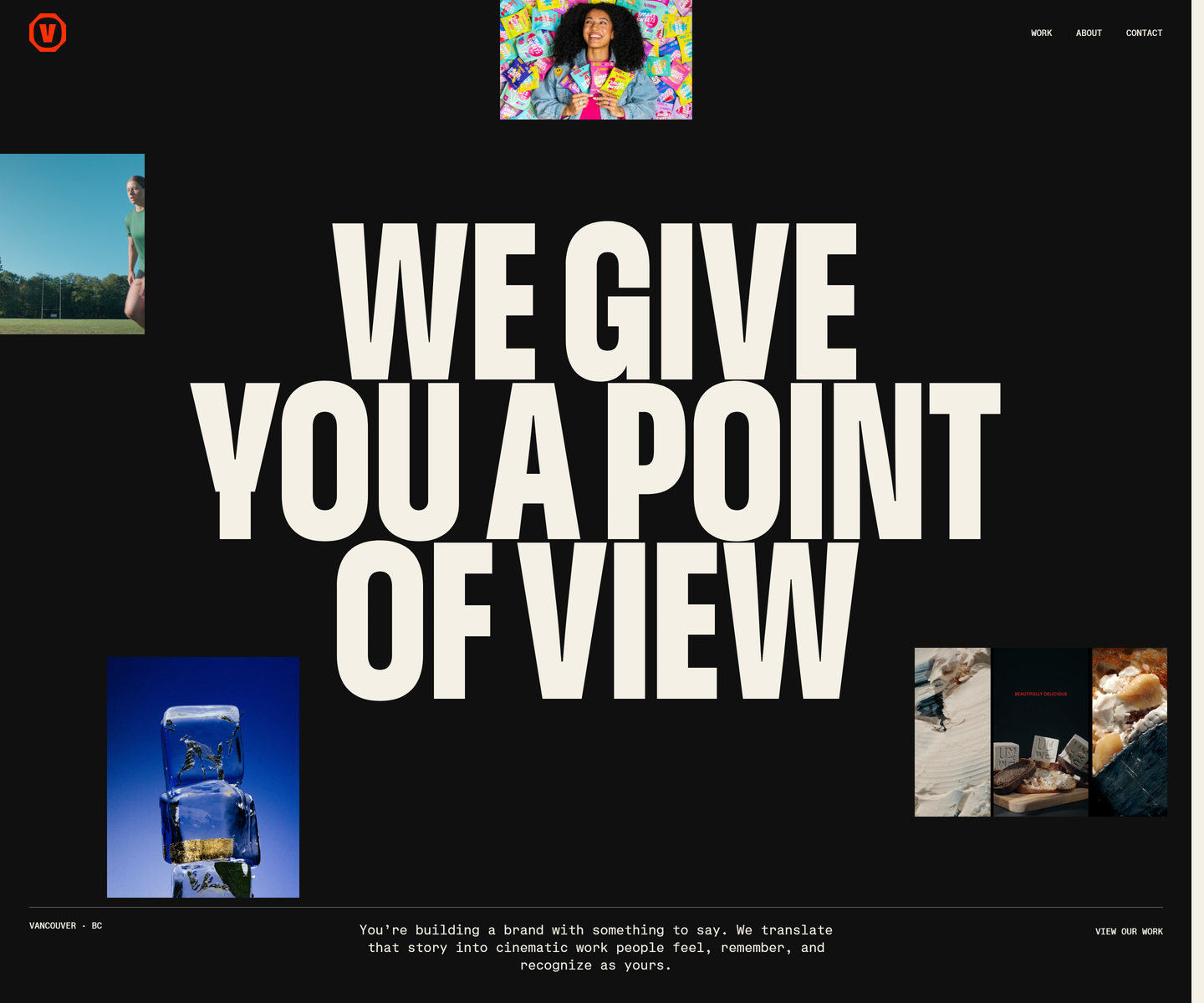 Velour Productions velourproductions.com Decode Cream condensed caps at fold-filling scale on near-black, with film stills tucked into the gaps between the letters rather than laid out beside them. A mono caption row runs underneath like a slate, and orange is held back entirely for the mark and the closing panel, where the studio name fills the screen.
 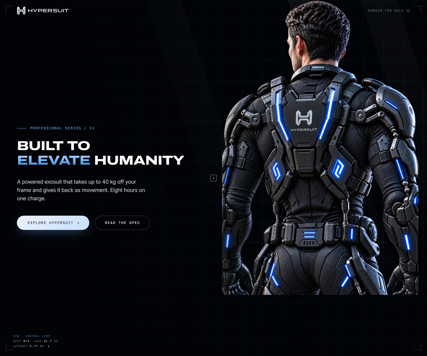 HyperSuit hypersuit.com Decode Near-black with one electric blue, photography bled to the edge, and mono telemetry ticking along the bottom of the fold like a readout. The feature row underneath is line icons and two lines each, which is what lets the hero stay as loud as it is.
 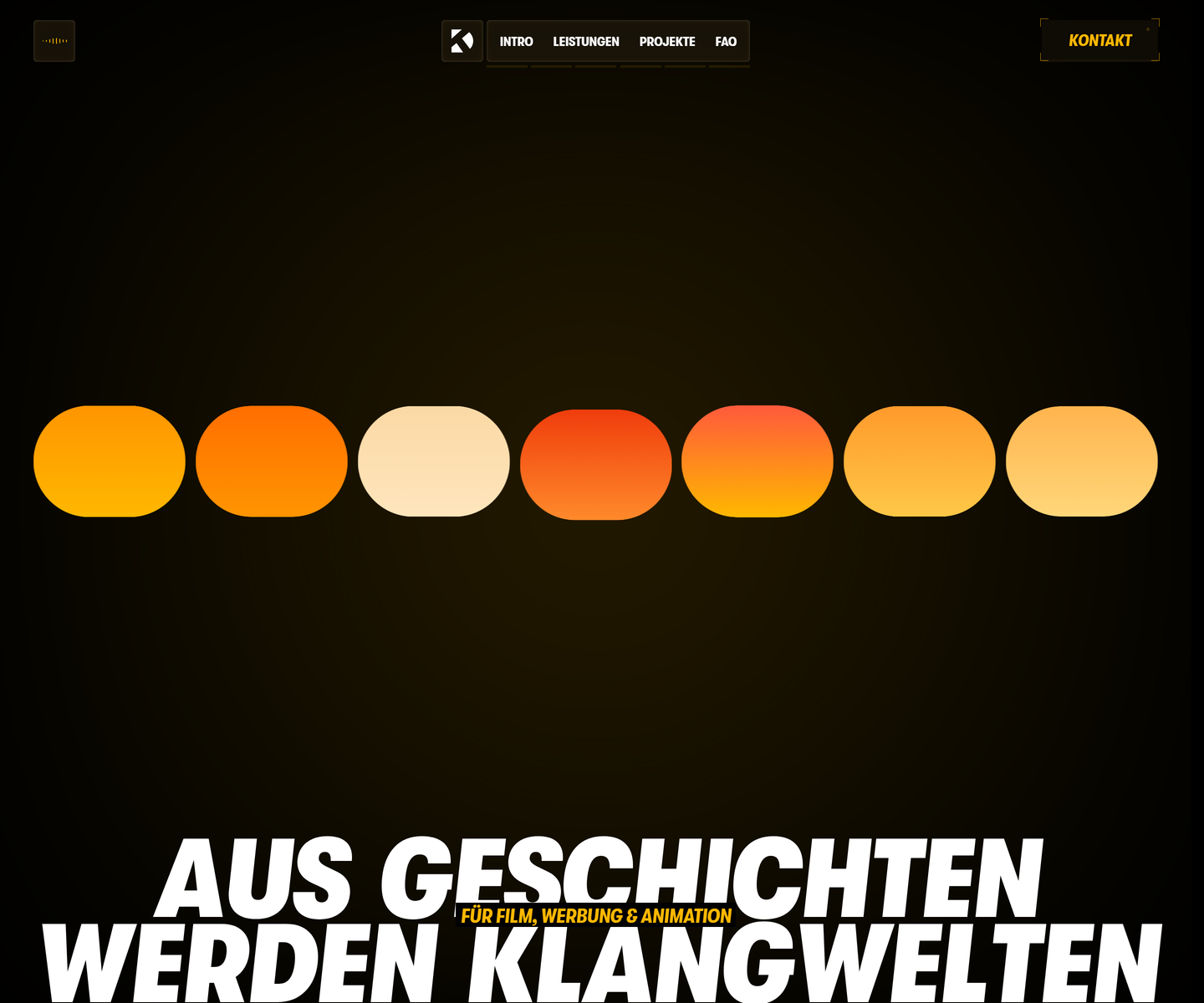 Dominik Kostolnik dkton.at Decode Condensed caps at full-bleed scale in amber on black, with an equaliser of rounded bars standing in for the work itself. Video stills are sliced into vertical strips like a waveform, and the section titles block in magenta and yellow behind the type. It opens on a gate you have to push through, which is the rare case where the splash screen is the point.
 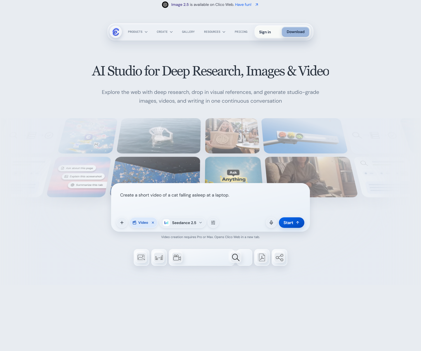 Clico tryclico.com Decode A serif headline over pale blue-grey, with the product shown as a scatter of its own floating windows instead of one screenshot. The second headline strikes through the word watermark, a rare case of type making the argument rather than describing it.
 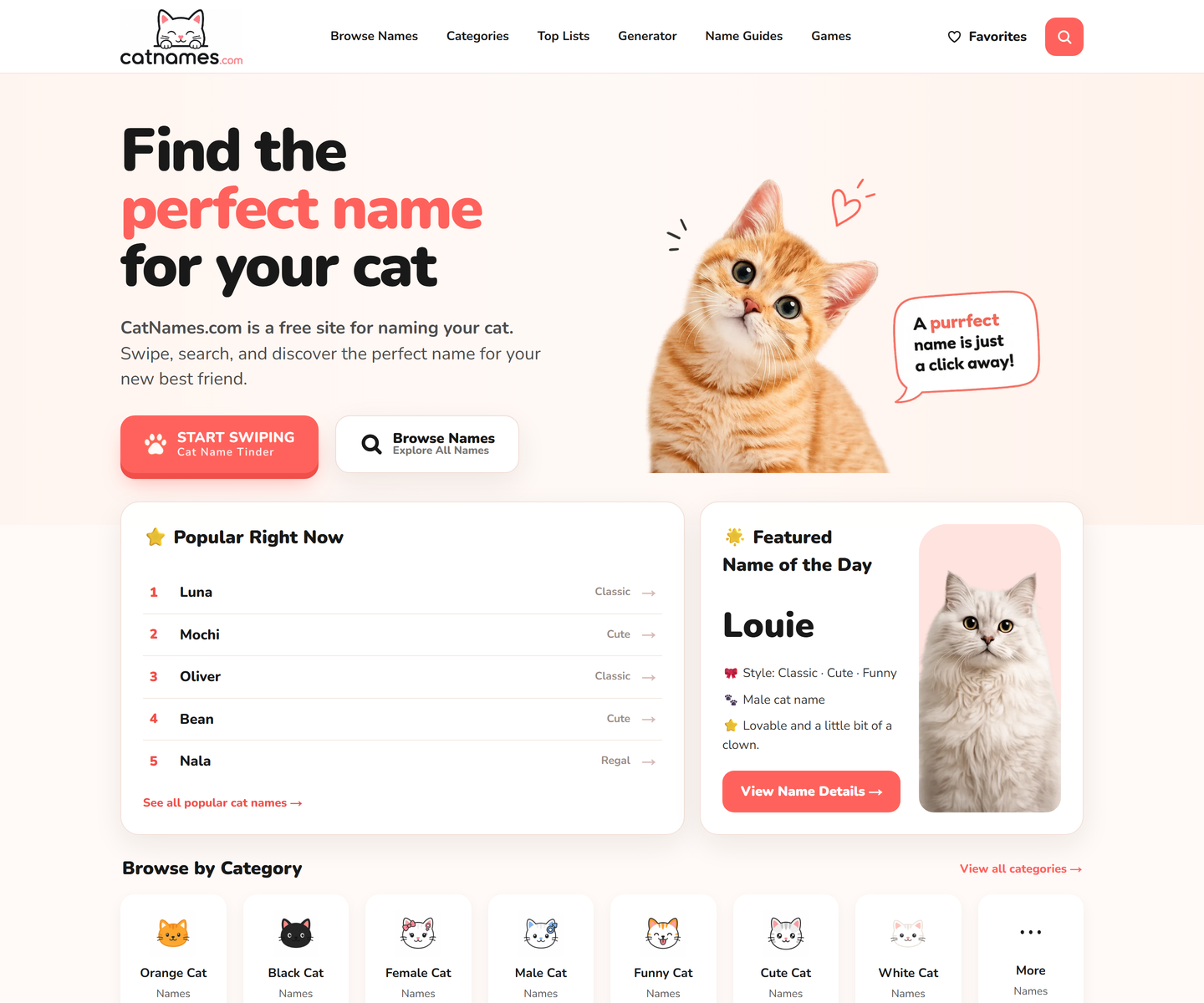 CatNames.com catnames.com Decode Coral on white, a rounded display face, and cut-out cats that break their own frames. Every block is a card, the hero cat gets a speech bubble, and the primary action is a swipe rather than a search, which states the whole product in one button.
 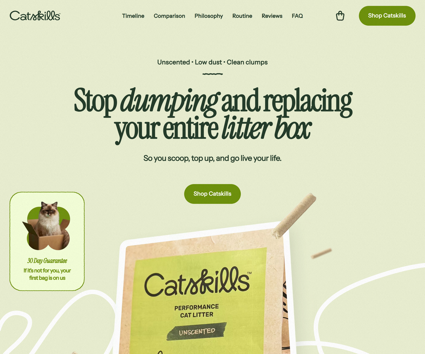 Catskills catskills-showcase.pages.dev Decode Two greens and nothing else: deep sage type on a pale olive ground, with Instrument Serif dropping into italic mid-headline to carry the emphasis a bold would usually take. Product photography sits in soft rounded frames, and a guarantee card leans over the hero at an angle, the only thing on the page allowed to be crooked.
 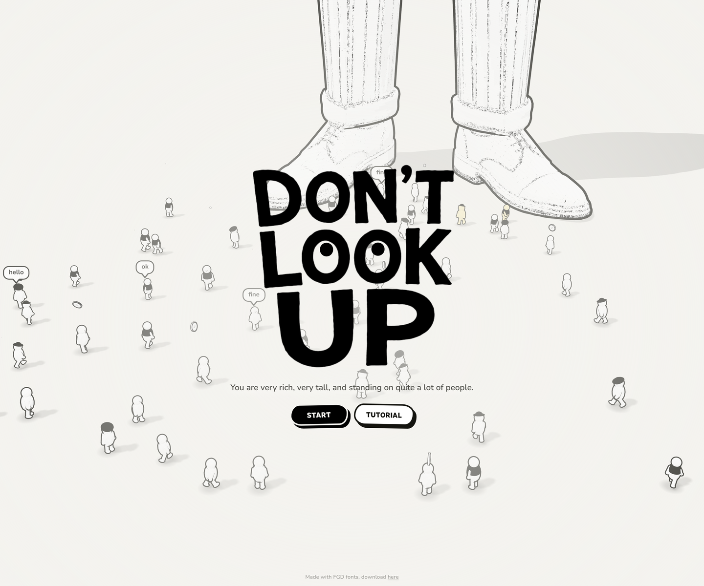 Don't Look Up www.dontlookup.app Decode Pencil-line figures at ant scale under two enormous shoes, the whole thing black on bone white with one red line marking what the crowd will carry. A fat comic display face shouts the title while the crowd mutters in speech bubbles, and the only other colour that ever arrives is the yellow of someone who has just noticed your fee.
 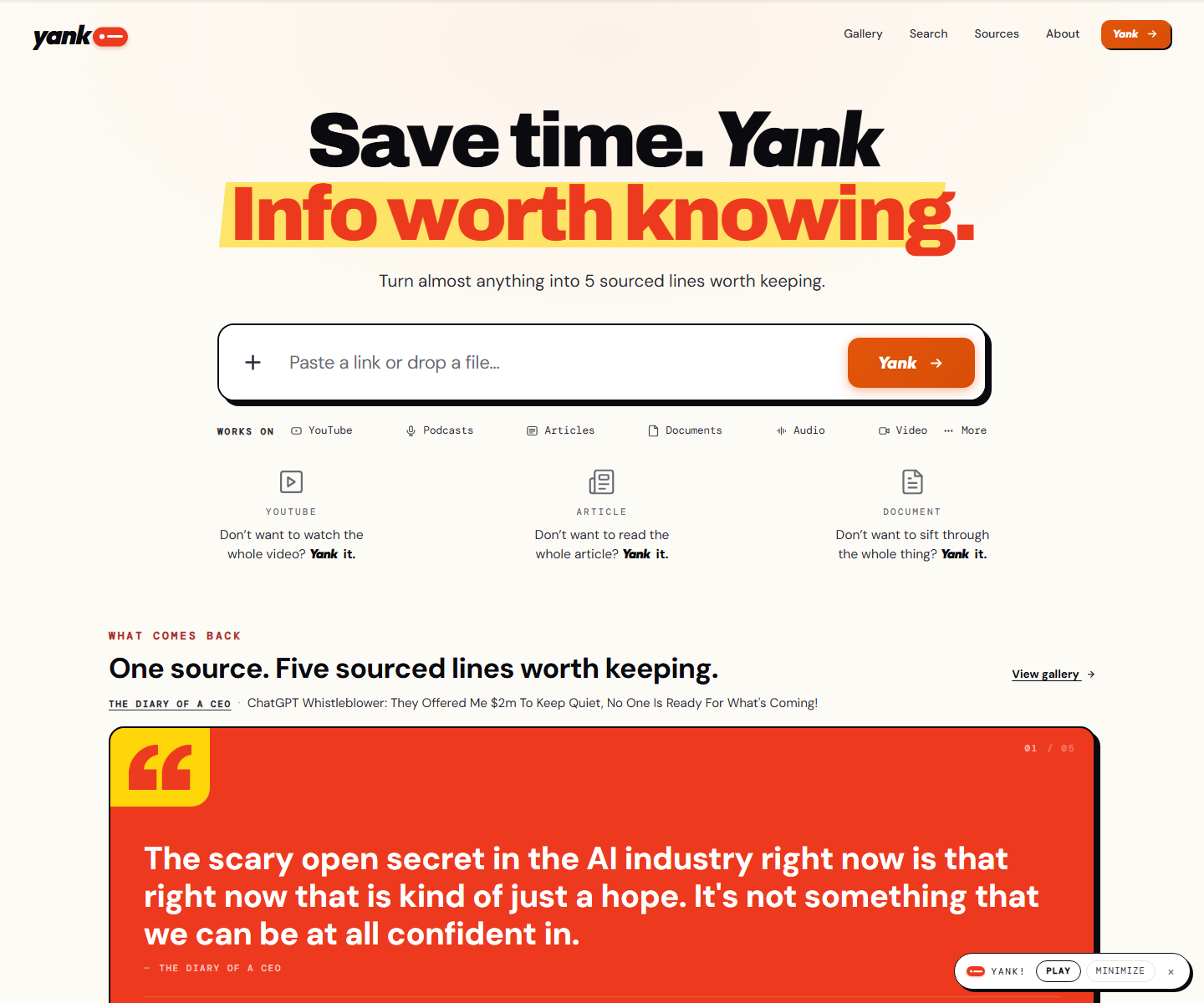 yank.info yank.info Decode Cream paper, an orange second line on a yellow highlighter swipe, and a hard black shadow under the paste box: a summarizer that looks like a marked-up page instead of a chat box. Right under the input the product runs itself on a pink panel, a TED talk with its distilled line in a red quote card and a numbered playlist of sources beside it.
 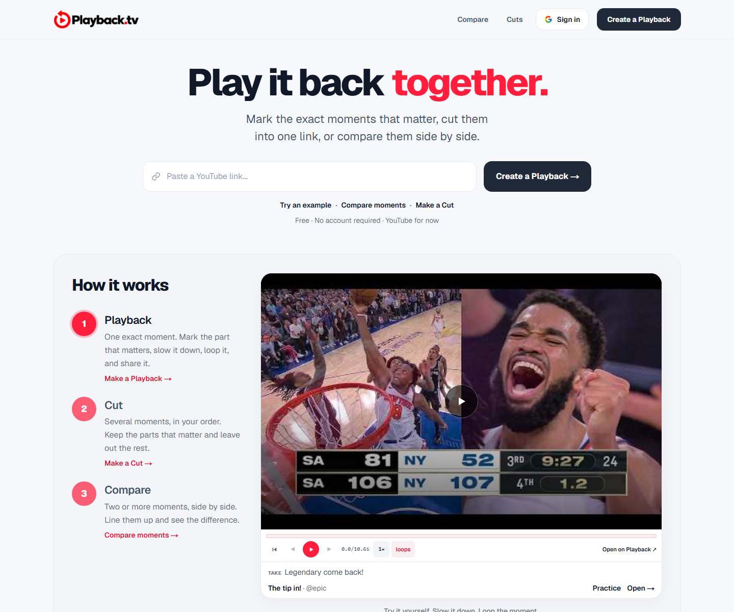 Playback playback.tv Decode A paste-a-link hero with the product demonstrating itself directly underneath: two clips side by side, scrubber and all. One red carries the second half of the headline and every action, everything else is black on white, and a handwriting face marks the human asides.
 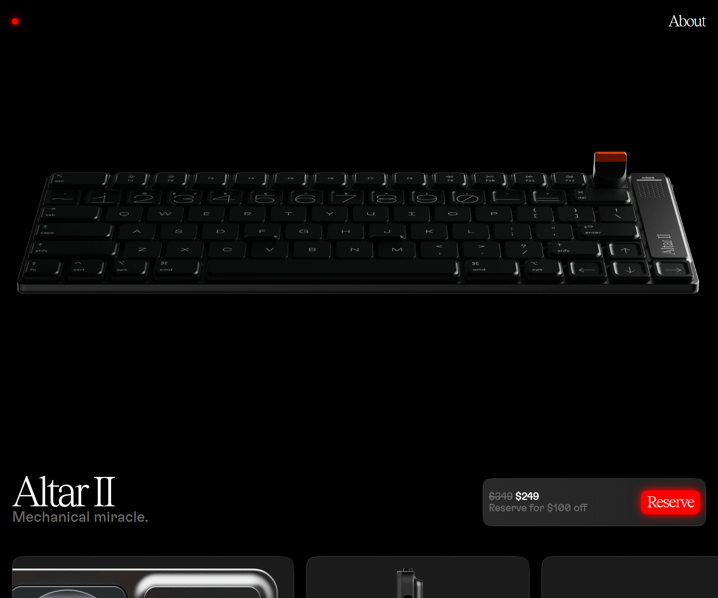 Electronic Materials Office electronicmaterialsoffice.com Decode Sells hardware by switching the lights off: a near-black page where photography of the product is the only illustration, a serif display line over a light grotesque, and the single saturated colour on screen saved for one glowing Reserve button. 26,000px of scroll and twelve inline videos, and not one stock graphic.
 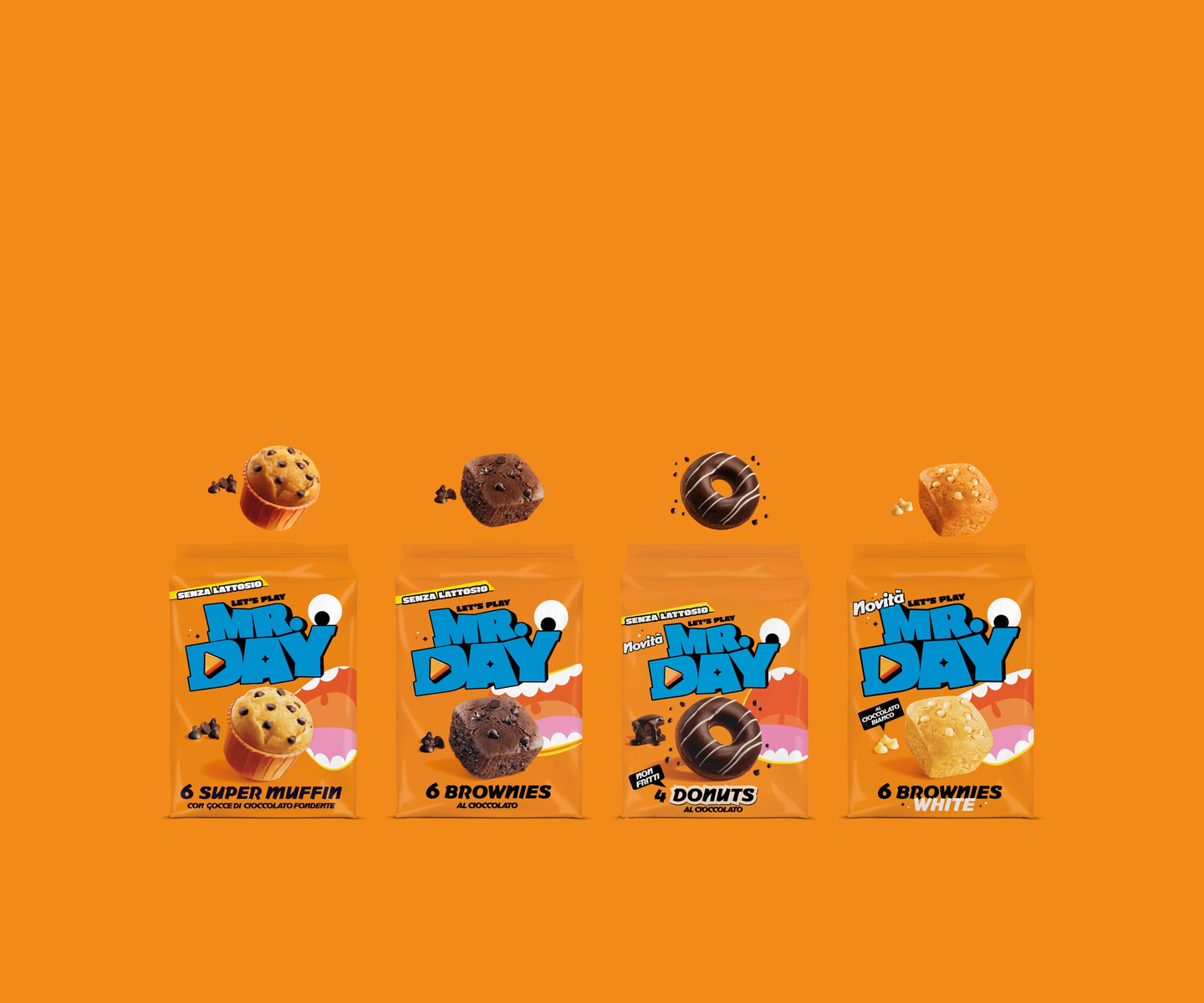 Mr.Day mrday.it Decode Marquee strips of heavy display type alternate with cut-out product shots, so the page scrolls like a moving poster — orange and cyan carry the brand while a “level up” gaming motif runs through the copy.
 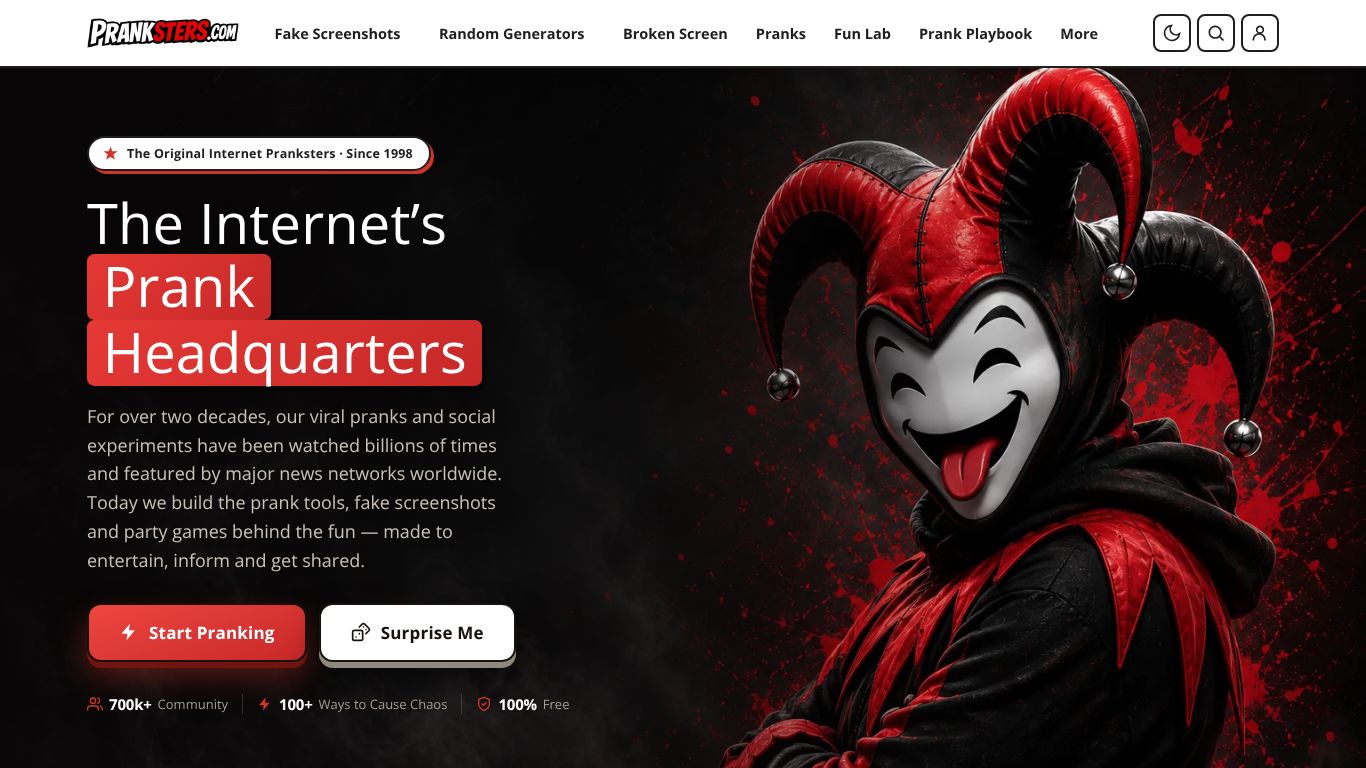 Pranksters.com pranksters.com Decode A near-black stage lit by a single red: highlight blocks set behind the headline, one red primary button, and character art holding the entire right half of the fold.
 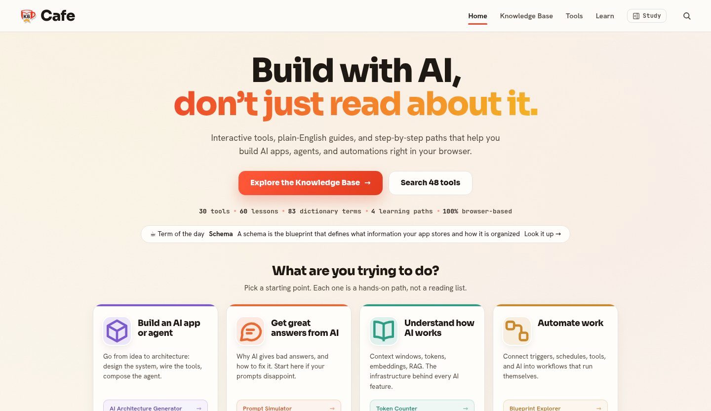 KB Cafe kbcafe.com Decode A warm editorial take on developer reference: paper-toned ground, a vermilion accent used only for wayfinding, and type doing the structural work across a large body of documentation.
  SEOAIO seoaio.ai Decode A restrained, near-white SaaS layout with a soft violet primary and a teal counterpoint, built so dense visibility metrics read as calm reporting rather than a dashboard shouting.
 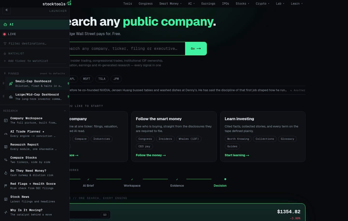 StockTools.ai stocktools.ai Decode A terminal aesthetic done properly: a near-black canvas, one signal-green accent reserved for live data, and a strict grid that keeps dense tables scannable without decoration.
 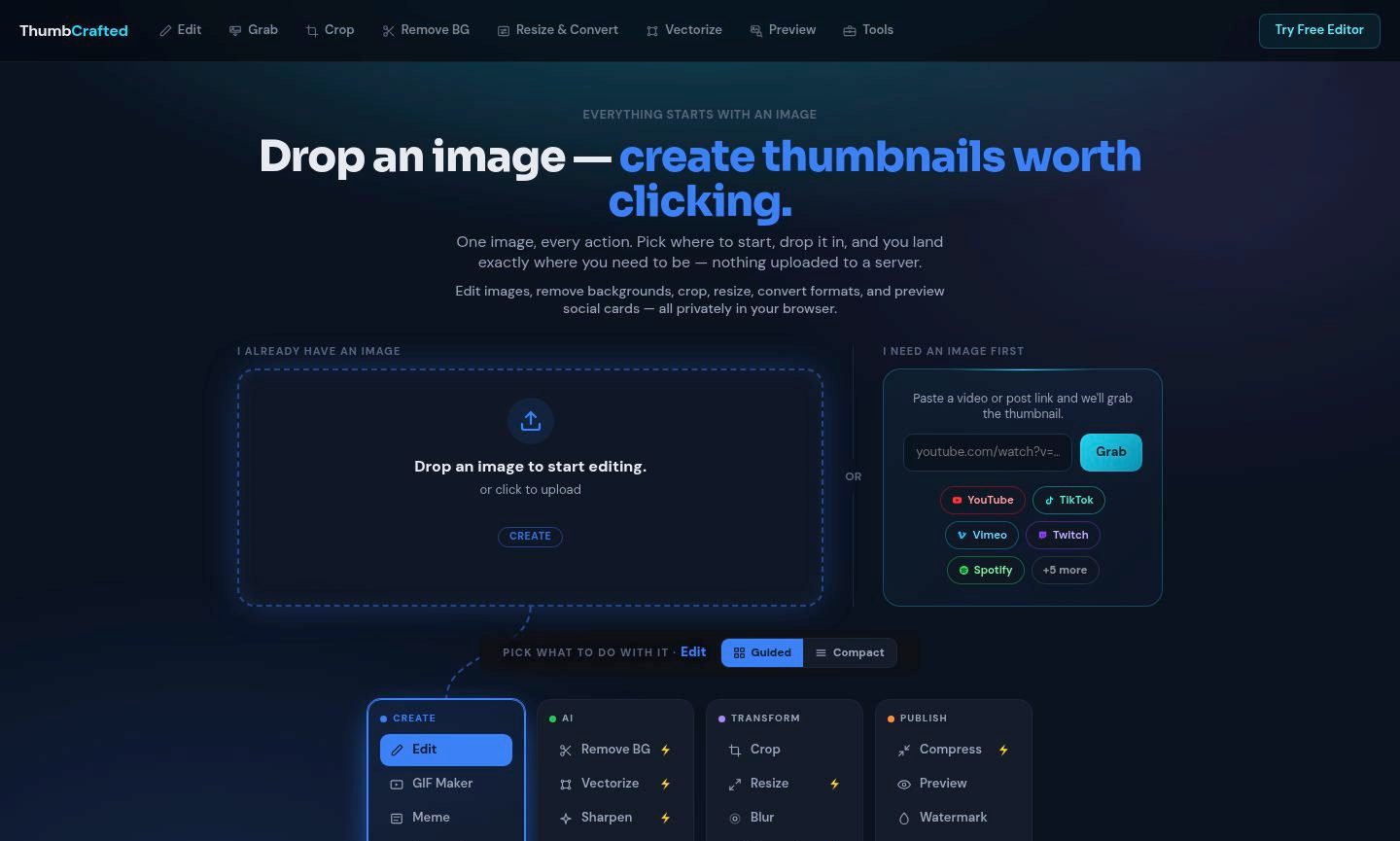 ThumbCrafted thumbcrafted.com Decode An image-first tool suite that lets the work carry the page: near-black chrome recedes so the uploaded image and its result stay the brightest things on screen.
 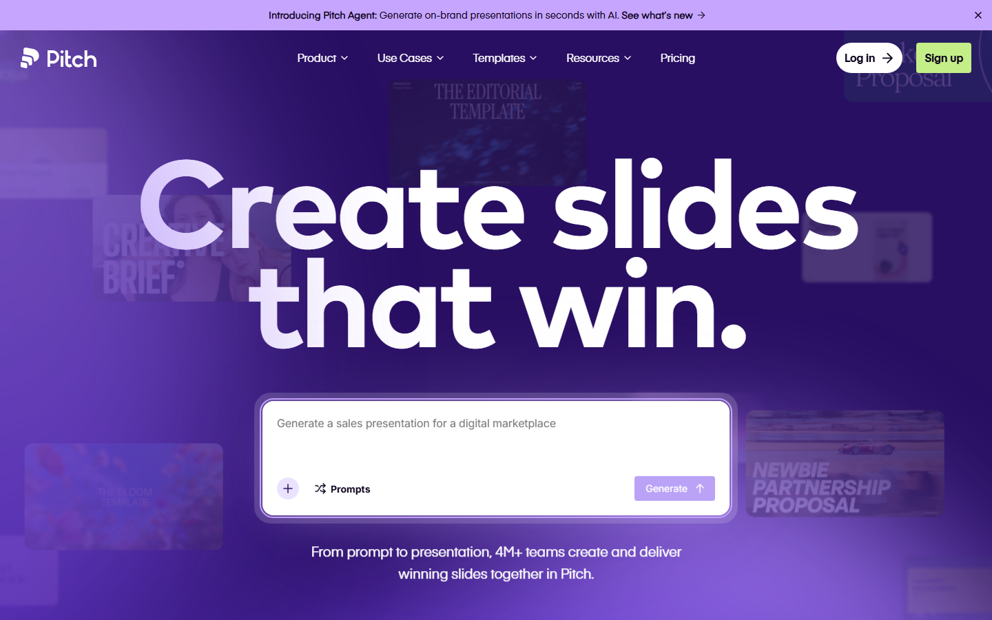 Pitch pitch.com Decode Presentation software that presents itself: bold type, vivid color blocks, and motion that mimics a live deck.
 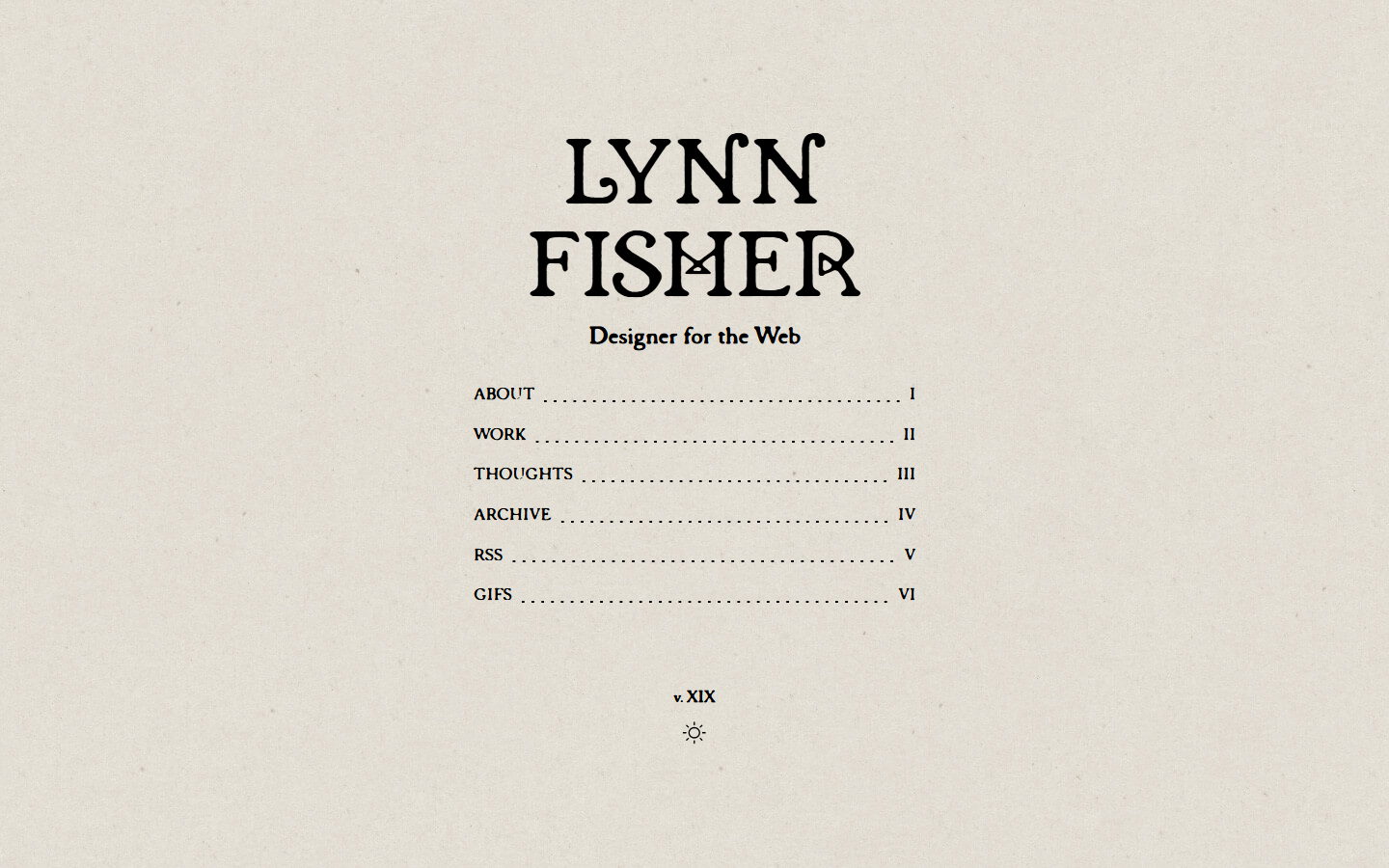 Lynn Fisher lynnandtonic.com Decode A site that reinvents its own layout at each breakpoint; the responsive behaviour itself is the artwork.
 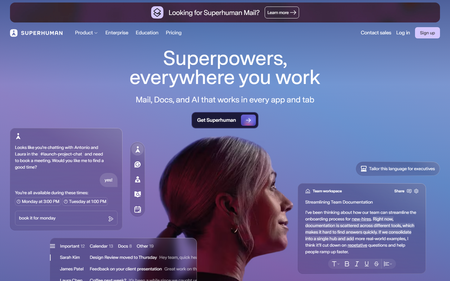 Superhuman superhuman.com Decode Speed sold through restraint: a confident type-led hero and snappy micro-interactions that reinforce the pitch.
 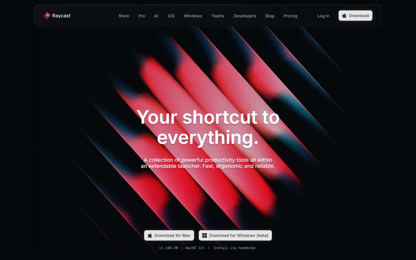 Raycast www.raycast.com Decode Keyboard-first personality carried into the page: clean dark sections, real UI clips, and one obvious download action.
 No sites match that combination yet.
Reading a whole page type instead?
A showcase entry decodes one site. A breakdown takes an archetype apart: what a SaaS pricing page, a dashboard shell or a landing hero is made of, and which parts are load-bearing.
Browse the collection
Every style, industry and platform we've decoded — each its own page, with a line on what to look for. See every collection with its notes →
B&W, Creative coding, Experimental, Gradient 1 each
Ecommerce, Fintech, Food & Beverage, Marketing, Portfolio 1 each
Platform Custom Code 20 · WordPress 1 · Astro 1
Our own render · scroll it, or use ← → for the next site