Style · collection
Minimal web design
9 curated minimal sites, shown as our own renders. Click any one to decode it — pull the palette, measure the spacing, or install its shadcn theme.
What to look for. Minimal is a spacing decision before it is a colour one. These sites earn the quiet with a strict type scale and a radius they never break.
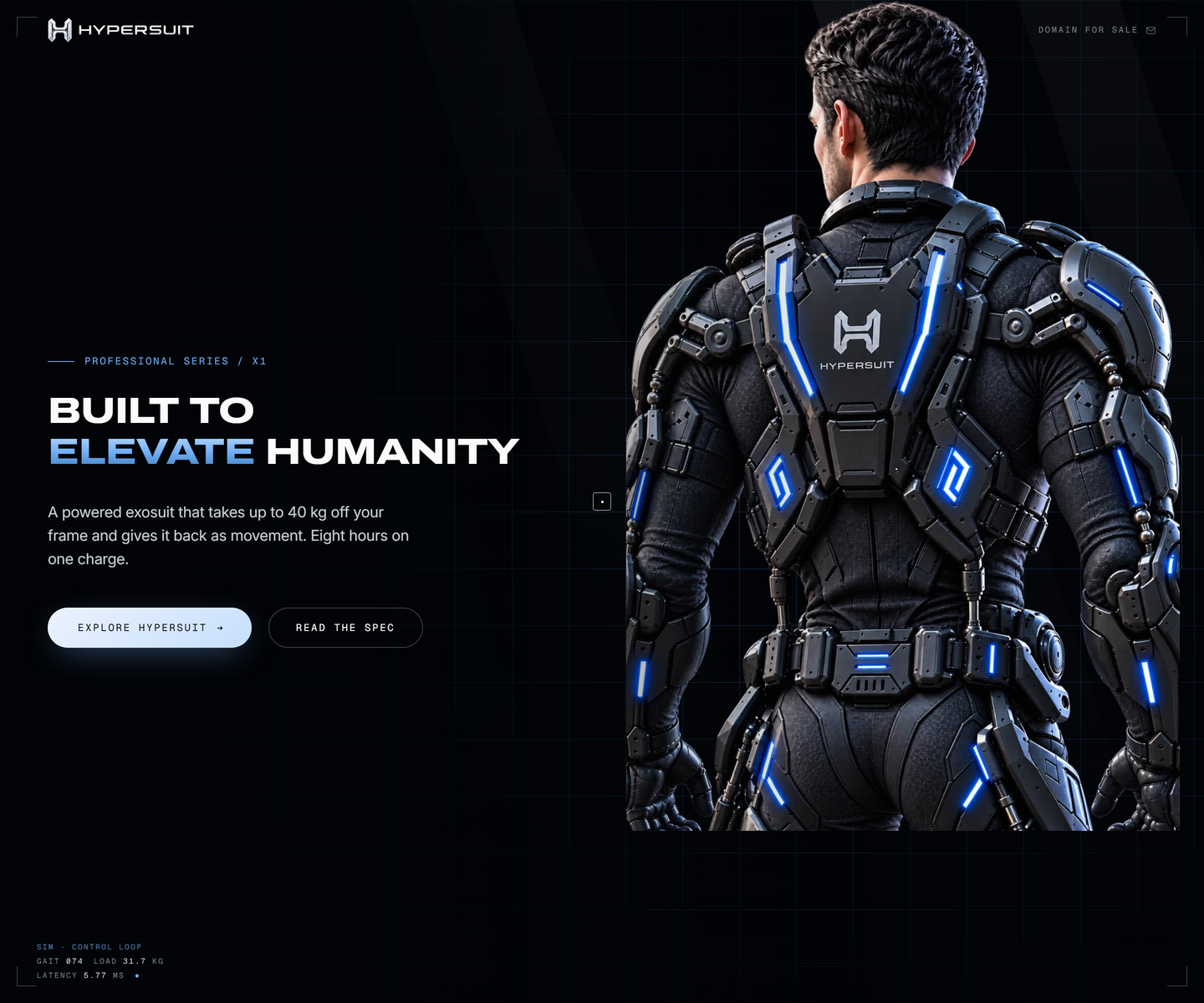 HyperSuit hypersuit.com Decode Near-black with one electric blue, photography bled to the edge, and mono telemetry ticking along the bottom of the fold like a readout. The feature row underneath is line icons and two lines each, which is what lets the hero stay as loud as it is.
 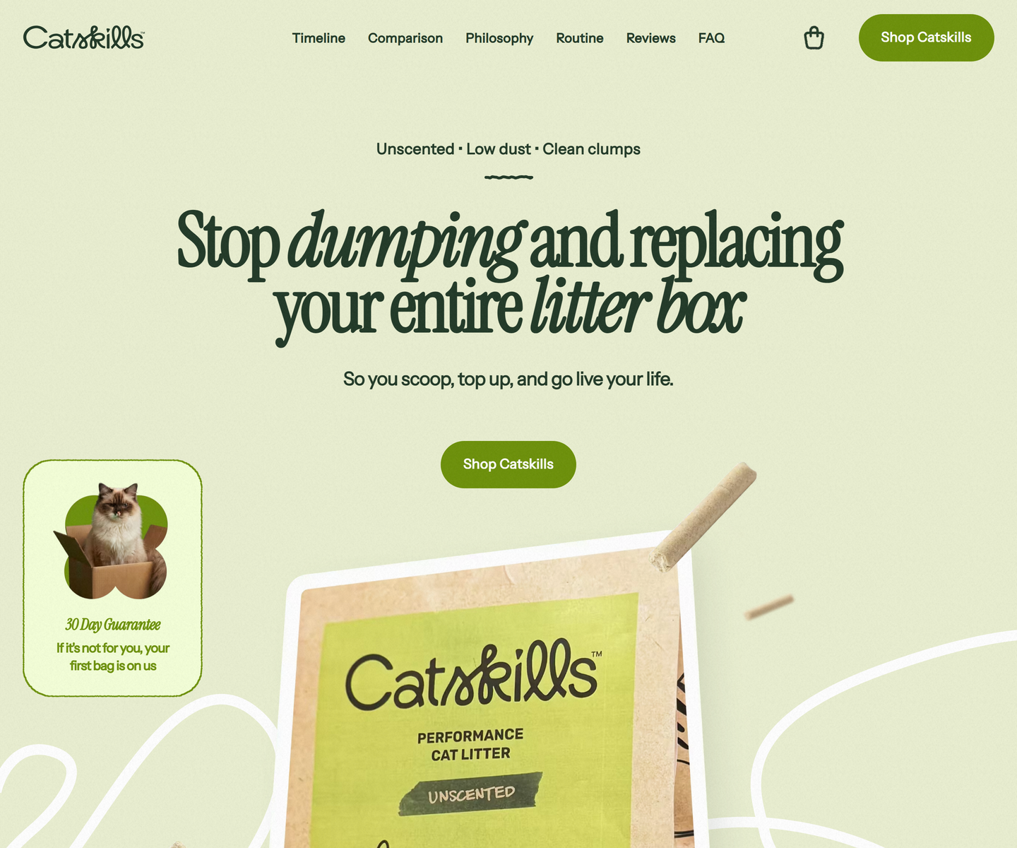 Catskills catskills-showcase.pages.dev Decode Two greens and nothing else: deep sage type on a pale olive ground, with Instrument Serif dropping into italic mid-headline to carry the emphasis a bold would usually take. Product photography sits in soft rounded frames, and a guarantee card leans over the hero at an angle, the only thing on the page allowed to be crooked.
 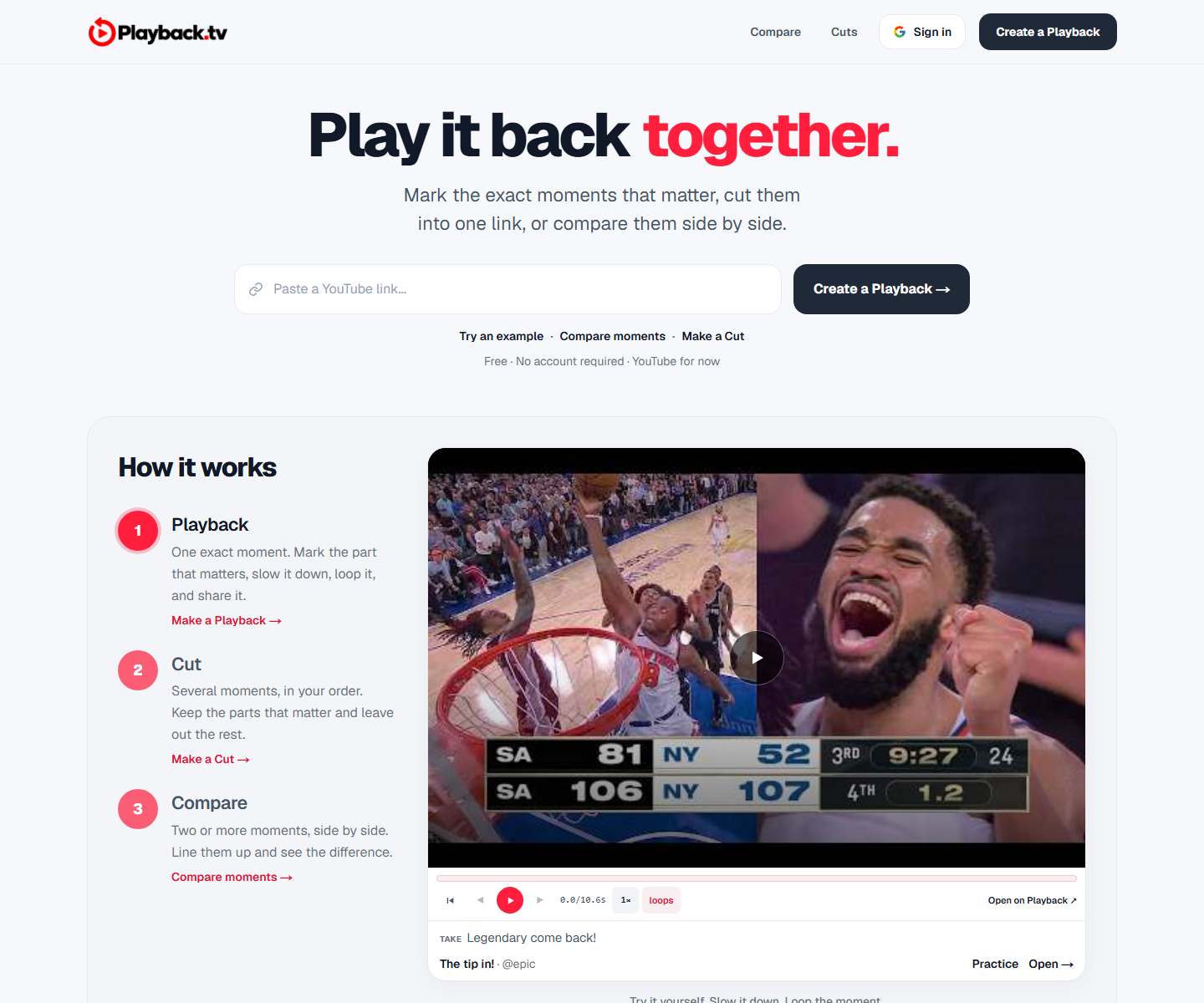 Playback playback.tv Decode A paste-a-link hero with the product demonstrating itself directly underneath: two clips side by side, scrubber and all. One red carries the second half of the headline and every action, everything else is black on white, and a handwriting face marks the human asides.
 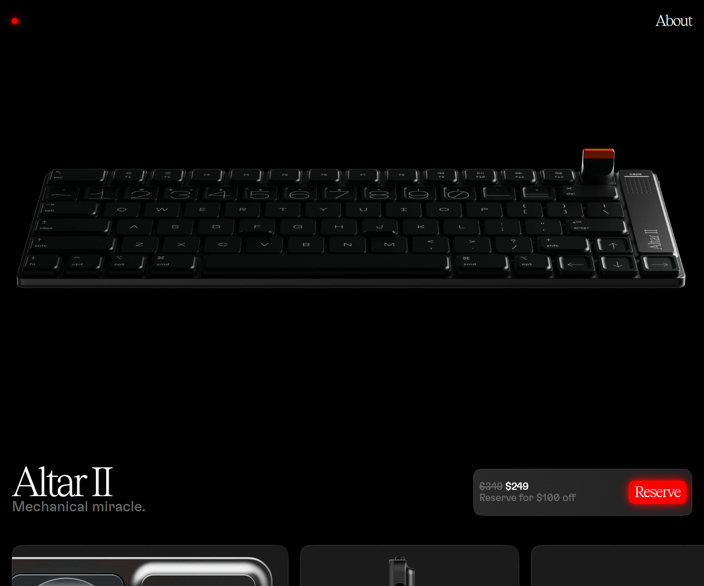 Electronic Materials Office electronicmaterialsoffice.com Decode Sells hardware by switching the lights off: a near-black page where photography of the product is the only illustration, a serif display line over a light grotesque, and the single saturated colour on screen saved for one glowing Reserve button. 26,000px of scroll and twelve inline videos, and not one stock graphic.
 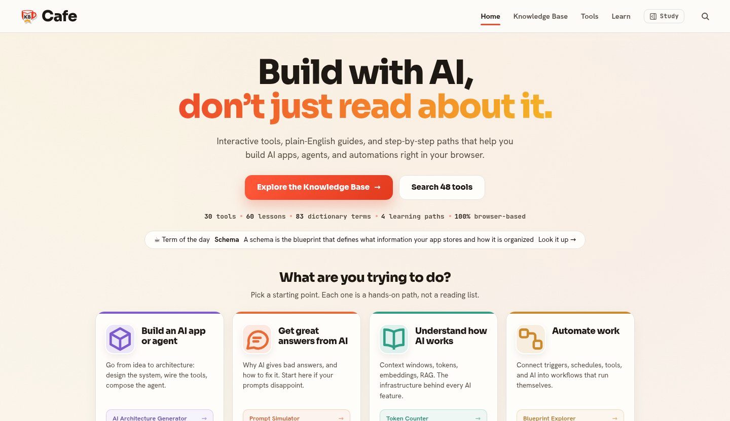 KB Cafe kbcafe.com Decode A warm editorial take on developer reference: paper-toned ground, a vermilion accent used only for wayfinding, and type doing the structural work across a large body of documentation.
  SEOAIO seoaio.ai Decode A restrained, near-white SaaS layout with a soft violet primary and a teal counterpoint, built so dense visibility metrics read as calm reporting rather than a dashboard shouting.
 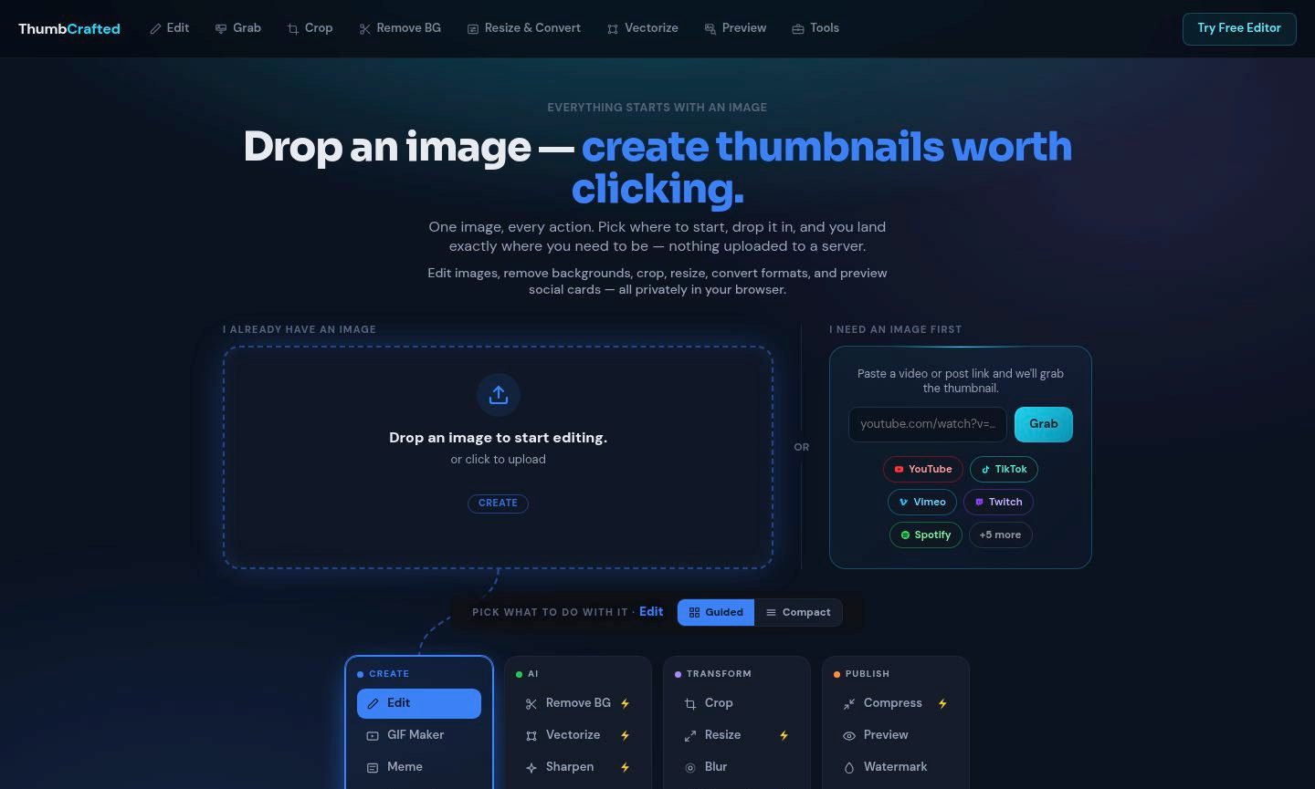 ThumbCrafted thumbcrafted.com Decode An image-first tool suite that lets the work carry the page: near-black chrome recedes so the uploaded image and its result stay the brightest things on screen.
 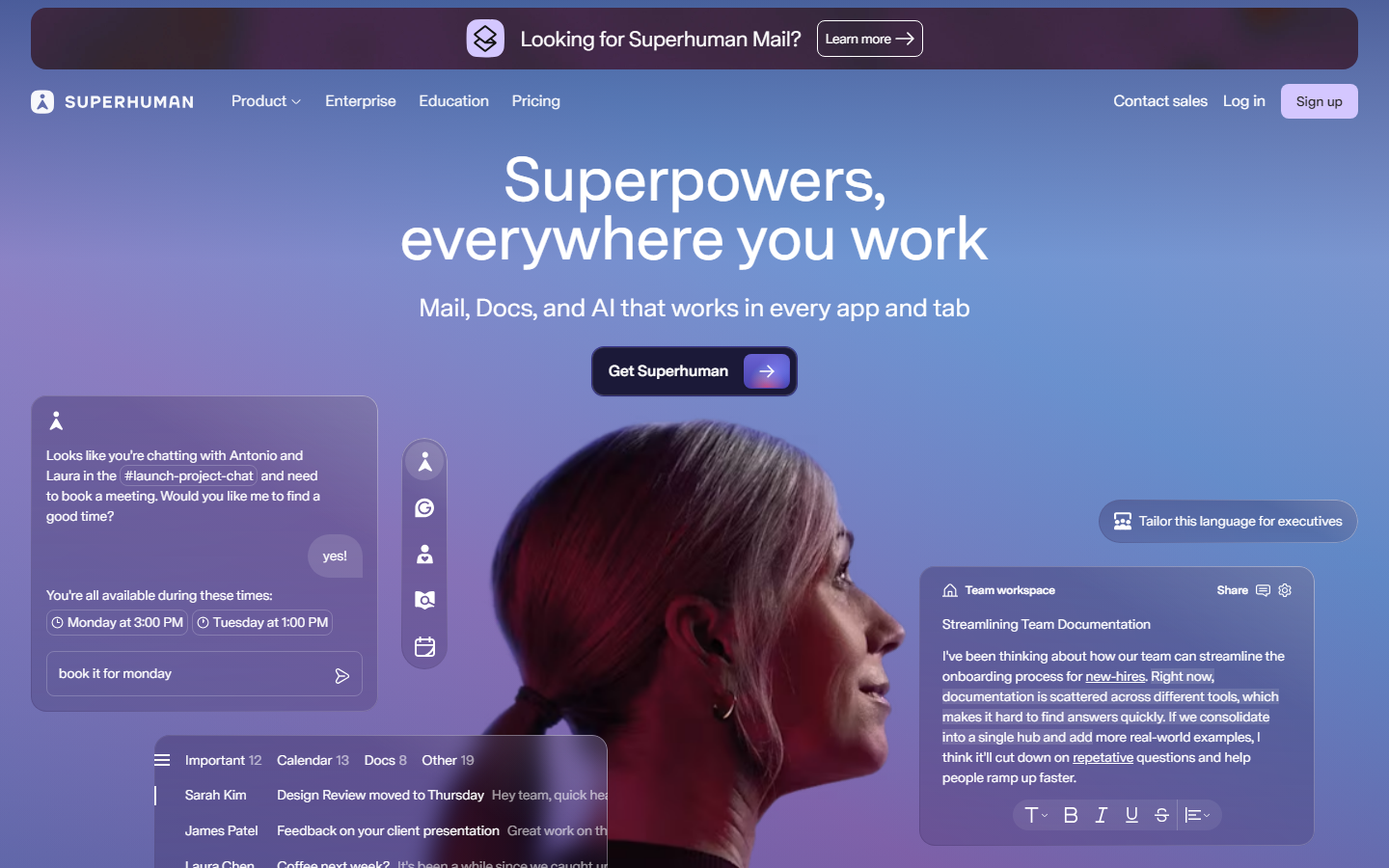 Superhuman superhuman.com Decode Speed sold through restraint: a confident type-led hero and snappy micro-interactions that reinforce the pitch.
 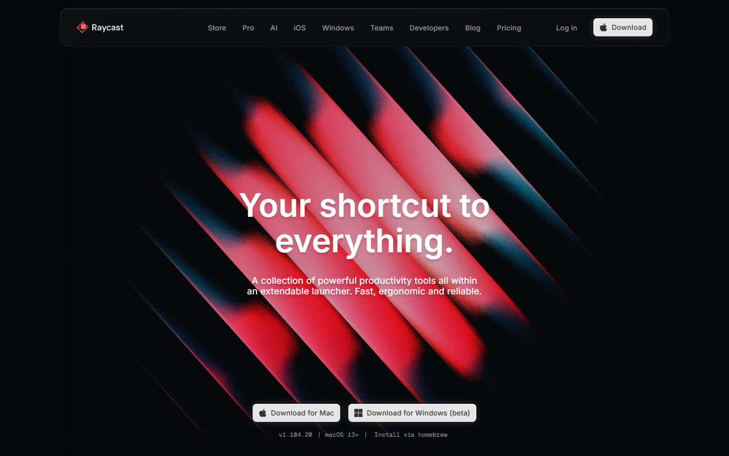 Raycast www.raycast.com Decode Keyboard-first personality carried into the page: clean dark sections, real UI clips, and one obvious download action.
 Also in these collections
Other axes these sites overlap with, ranked by how many they share.
Other style collections
Our own render · scroll it, or use ← → for the next site