Style · collection
Dark web design
8 curated dark sites, shown as our own renders. Click any one to decode it — pull the palette, measure the spacing, or install its shadcn theme.
What to look for. Dark interfaces live or die on their neutrals: the good ones keep a hue in the greys so the page reads as one material rather than black with things on it.
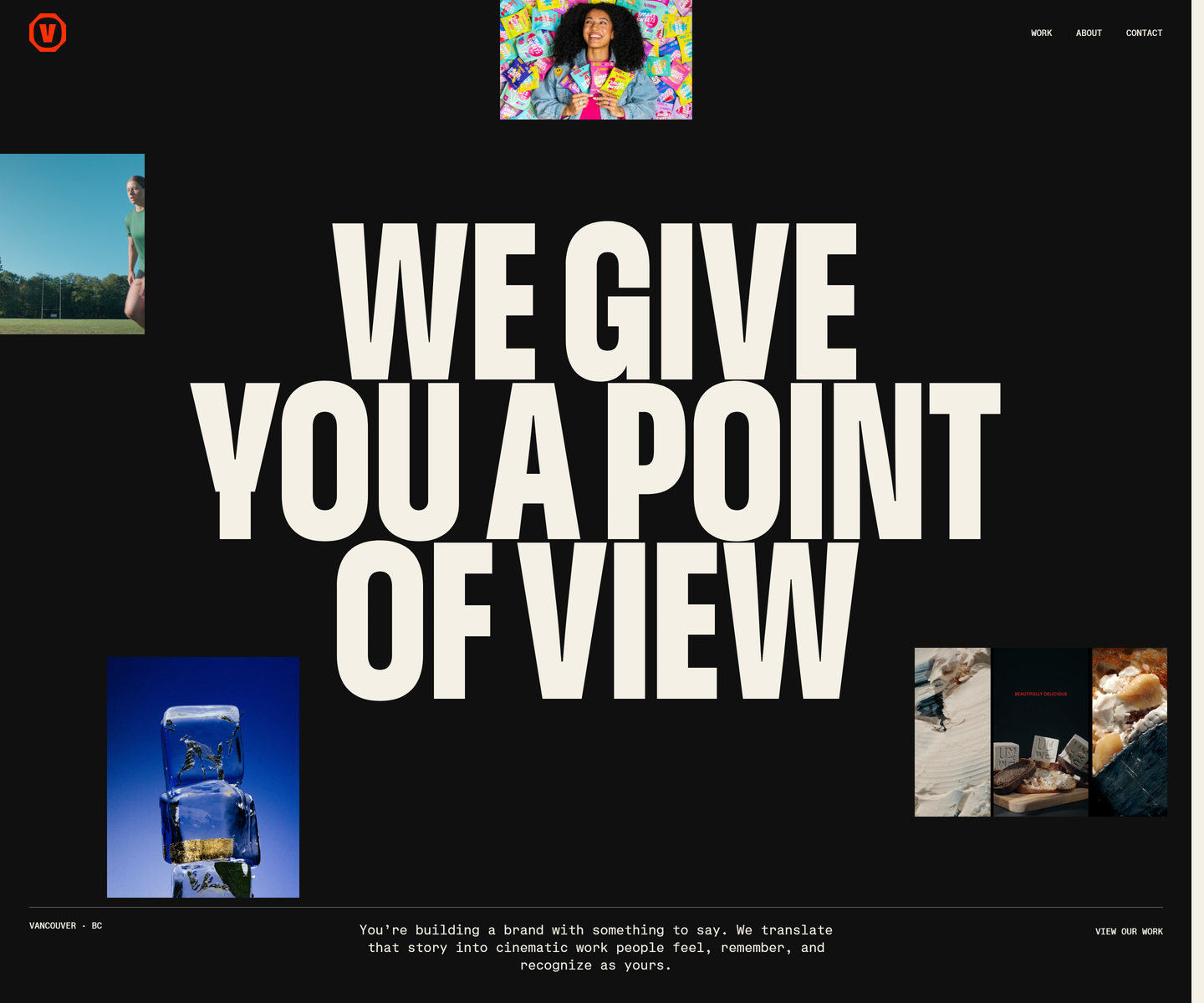 Velour Productions velourproductions.com Decode Cream condensed caps at fold-filling scale on near-black, with film stills tucked into the gaps between the letters rather than laid out beside them. A mono caption row runs underneath like a slate, and orange is held back entirely for the mark and the closing panel, where the studio name fills the screen.
 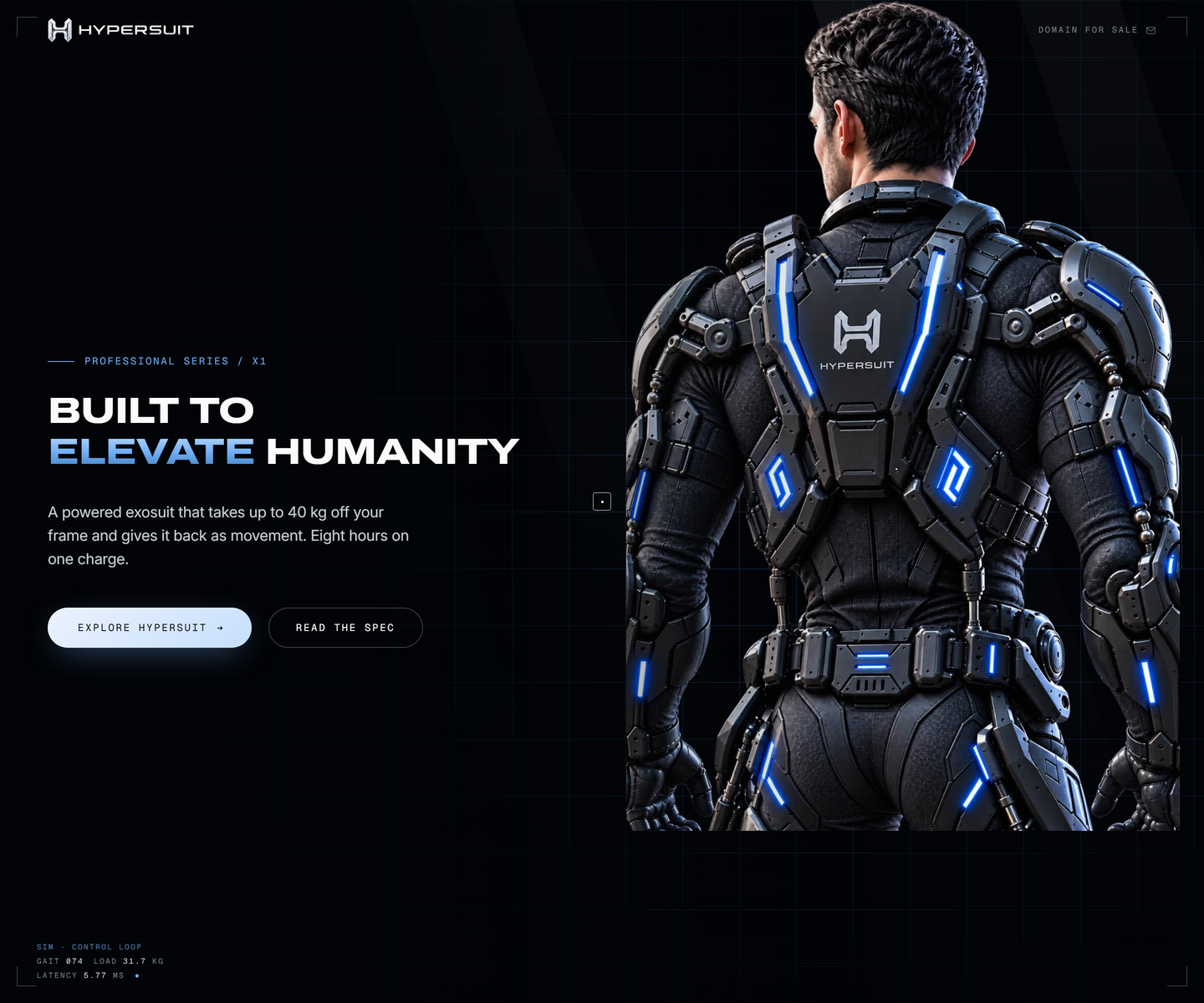 HyperSuit hypersuit.com Decode Near-black with one electric blue, photography bled to the edge, and mono telemetry ticking along the bottom of the fold like a readout. The feature row underneath is line icons and two lines each, which is what lets the hero stay as loud as it is.
 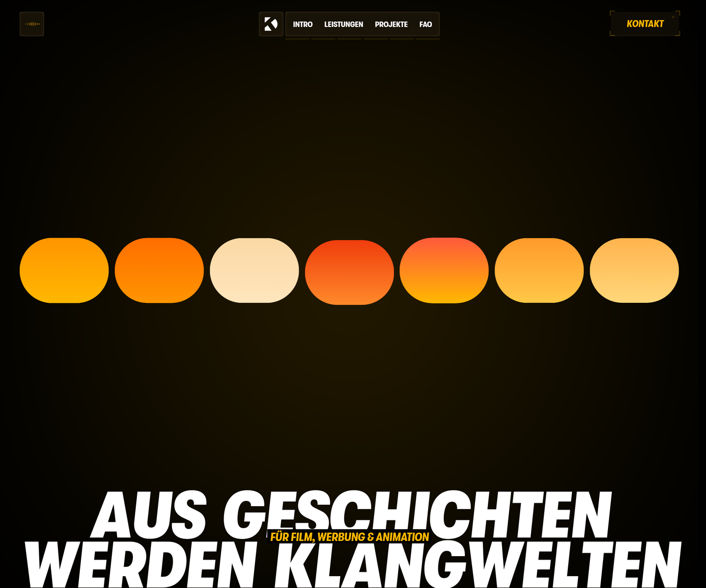 Dominik Kostolnik dkton.at Decode Condensed caps at full-bleed scale in amber on black, with an equaliser of rounded bars standing in for the work itself. Video stills are sliced into vertical strips like a waveform, and the section titles block in magenta and yellow behind the type. It opens on a gate you have to push through, which is the rare case where the splash screen is the point.
 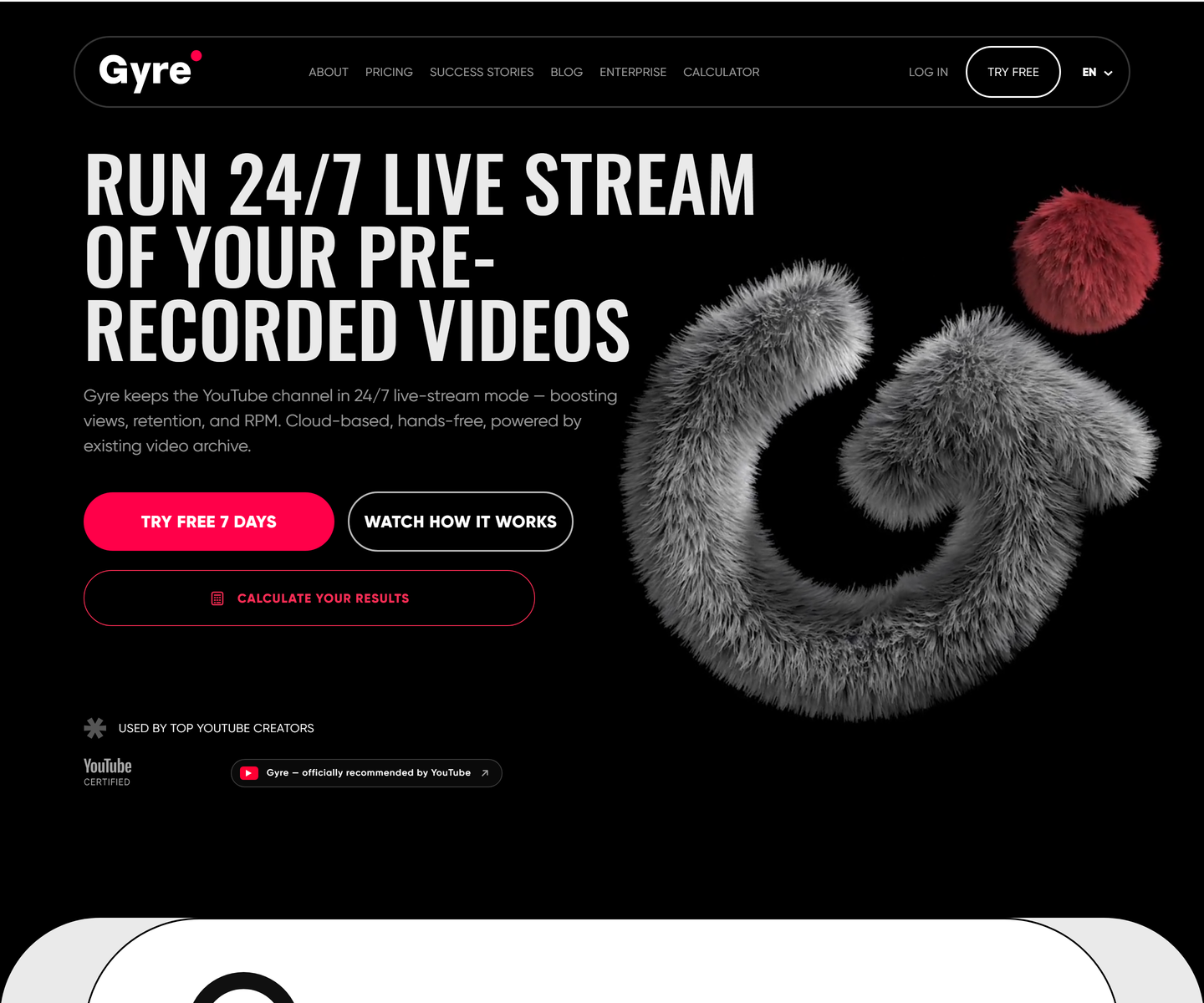 ★ Design of the Week Gyre gyre.pro Decode Condensed uppercase display type at poster scale on pure black, one hot pink accent carrying every action, and a fur-rendered 3D mark doing the job an illustration usually does. A streaming tool that looks like a record sleeve instead of a dashboard.
 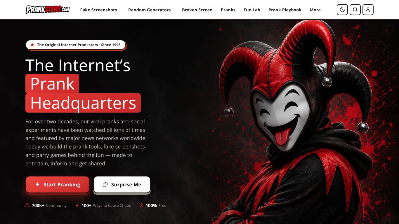 Pranksters.com pranksters.com Decode A near-black stage lit by a single red: highlight blocks set behind the headline, one red primary button, and character art holding the entire right half of the fold.
 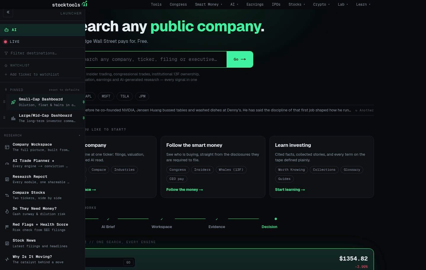 StockTools.ai stocktools.ai Decode A terminal aesthetic done properly: a near-black canvas, one signal-green accent reserved for live data, and a strict grid that keeps dense tables scannable without decoration.
 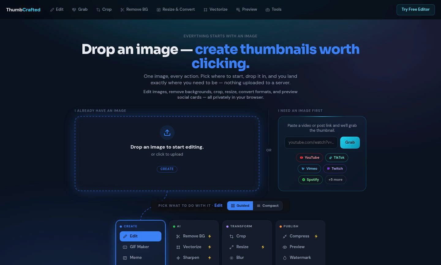 ThumbCrafted thumbcrafted.com Decode An image-first tool suite that lets the work carry the page: near-black chrome recedes so the uploaded image and its result stay the brightest things on screen.
 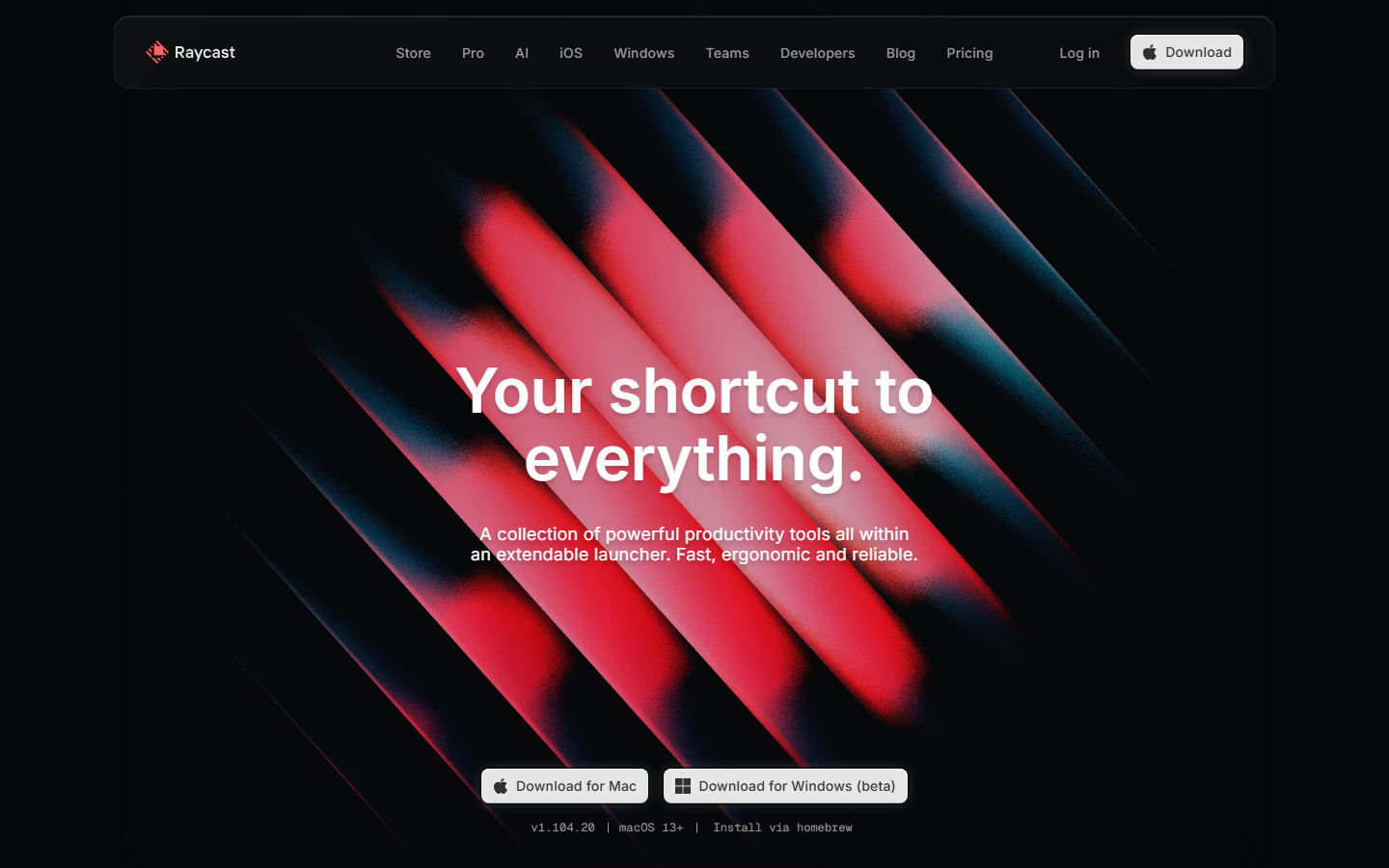 Raycast www.raycast.com Decode Keyboard-first personality carried into the page: clean dark sections, real UI clips, and one obvious download action.
 Also in these collections
Other axes these sites overlap with, ranked by how many they share.
Other style collections
Our own render · scroll it, or use ← → for the next site