Added · archive
June 2026
4 sites joined the showcase this month. Sliced by date rather than popularity: we do not rank what we have not measured.
September 2026July 2026June 2026
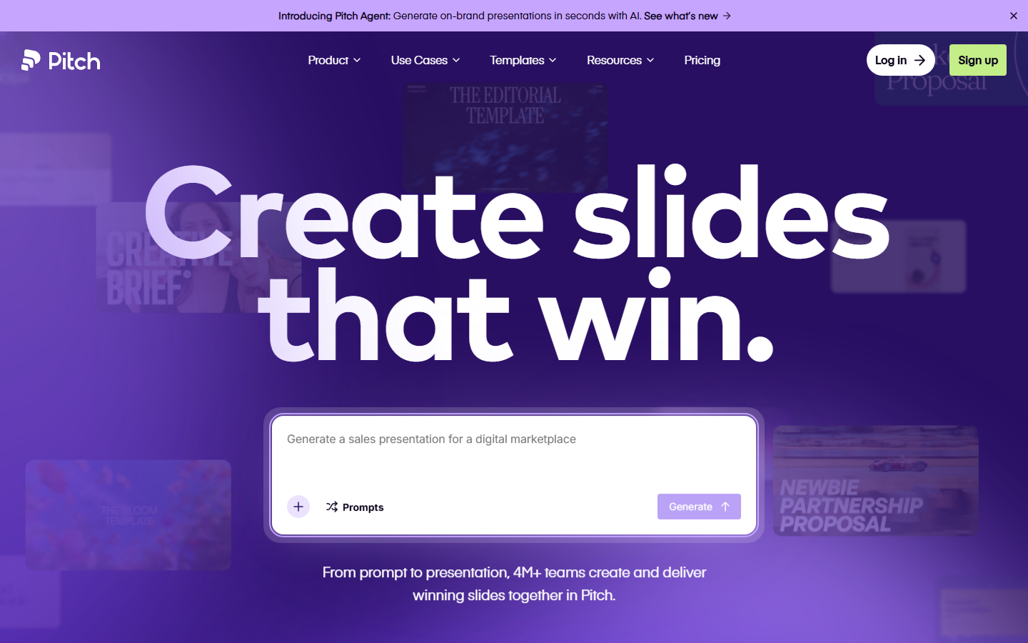 Pitch pitch.com Decode Presentation software that presents itself: bold type, vivid color blocks, and motion that mimics a live deck.
 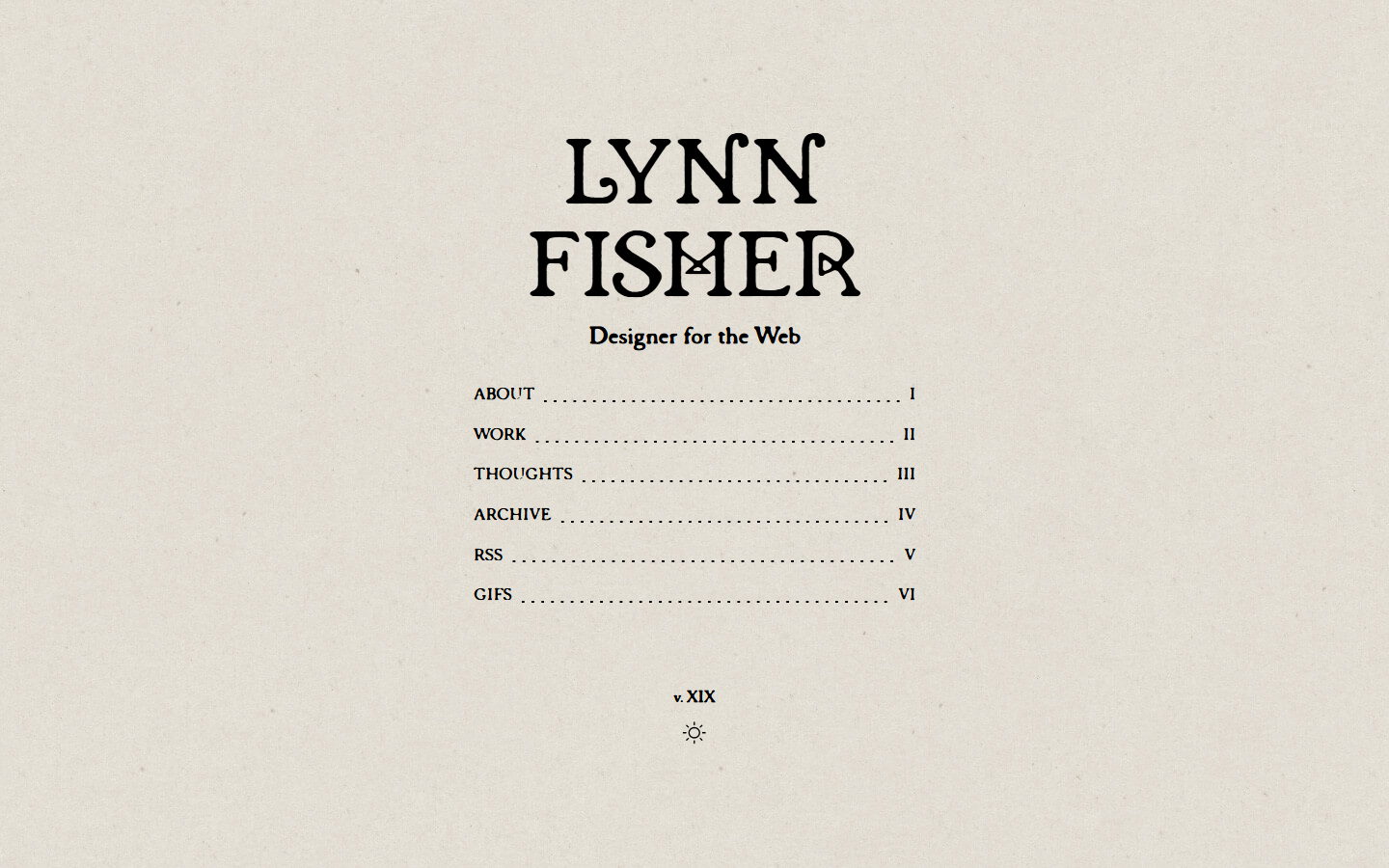 Lynn Fisher lynnandtonic.com Decode A site that reinvents its own layout at each breakpoint; the responsive behaviour itself is the artwork.
 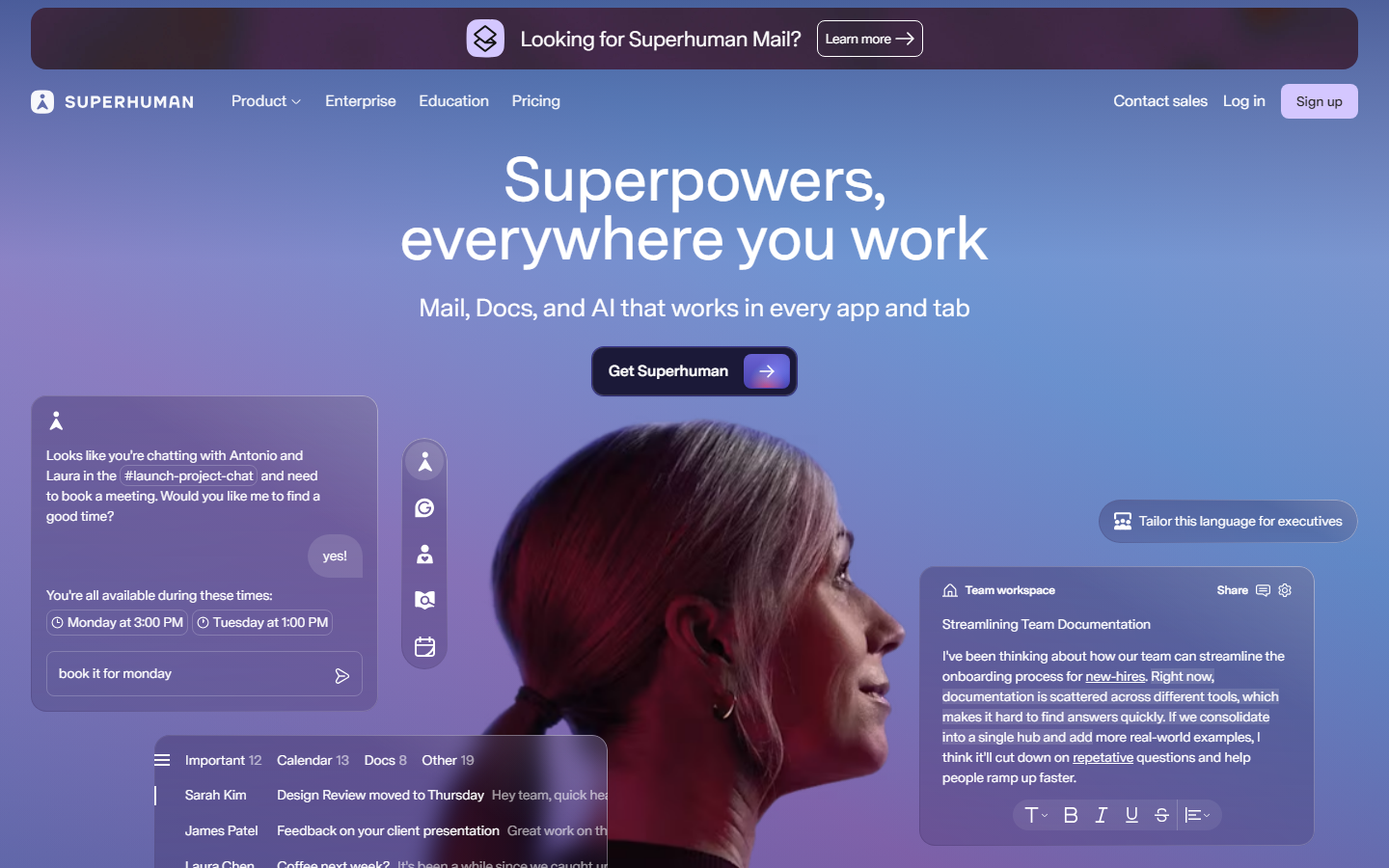 Superhuman superhuman.com Decode Speed sold through restraint: a confident type-led hero and snappy micro-interactions that reinforce the pitch.
 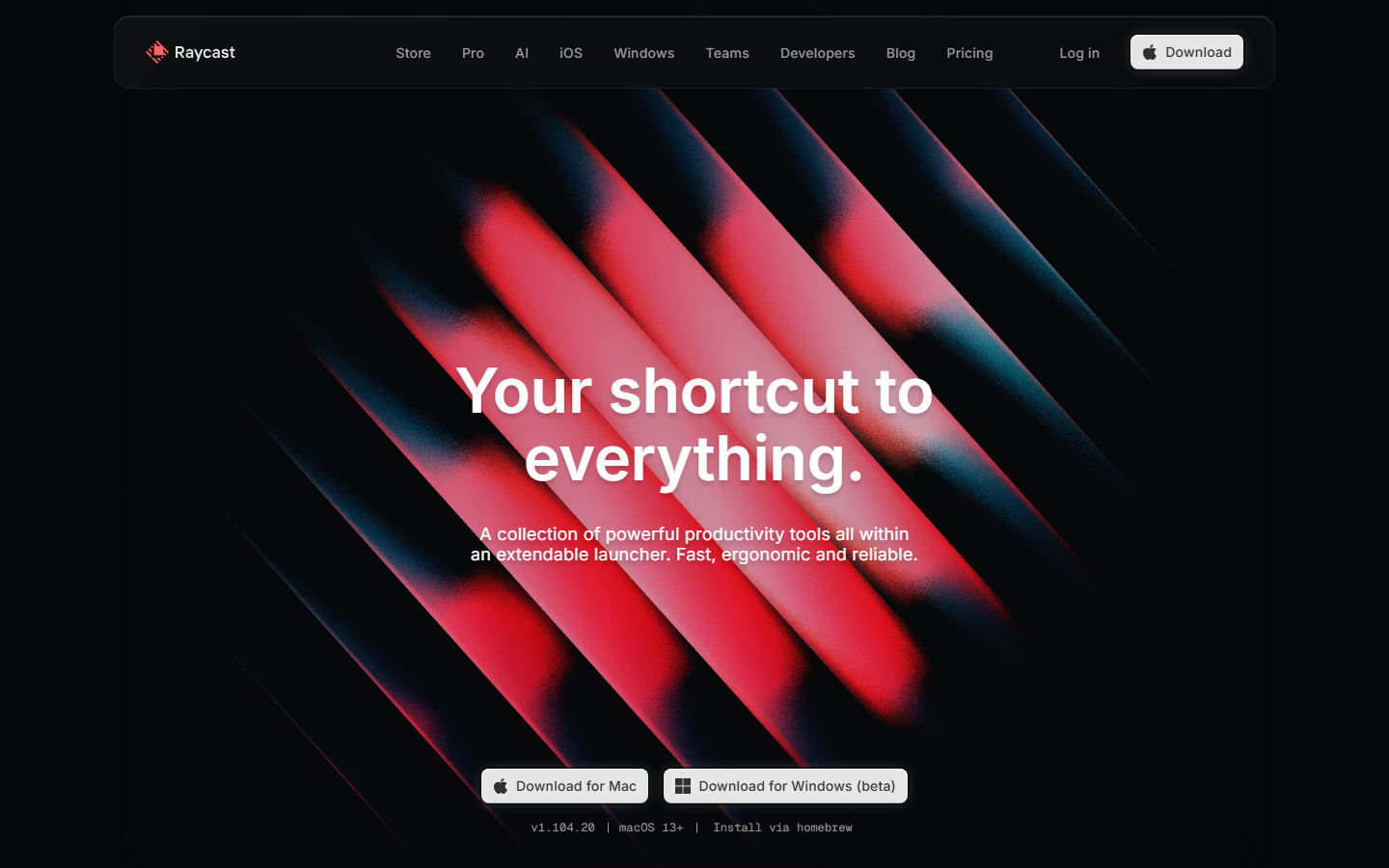 Raycast www.raycast.com Decode Keyboard-first personality carried into the page: clean dark sections, real UI clips, and one obvious download action.
 Our own render · scroll it, or use ← → for the next site