style × type · collection
Light × Product
3 sites that are both. Each axis has its own page too: Light and Product.
Light. Light sites have nowhere to hide. With no dark ground to lift a card off, spacing and type weight do all the work, and you can see exactly how much.
Product. Product sites, where the marketing surface and the app share a system. Decode one and you can usually see both.
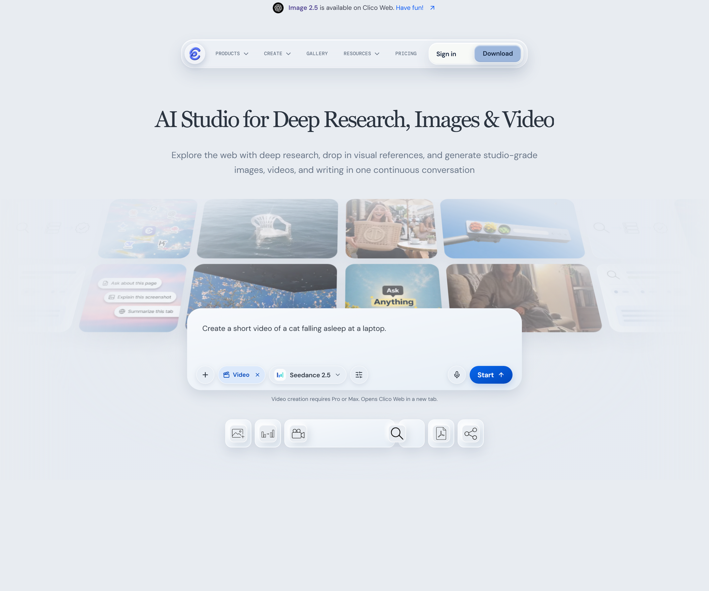 Clico tryclico.com Decode A serif headline over pale blue-grey, with the product shown as a scatter of its own floating windows instead of one screenshot. The second headline strikes through the word watermark, a rare case of type making the argument rather than describing it.
 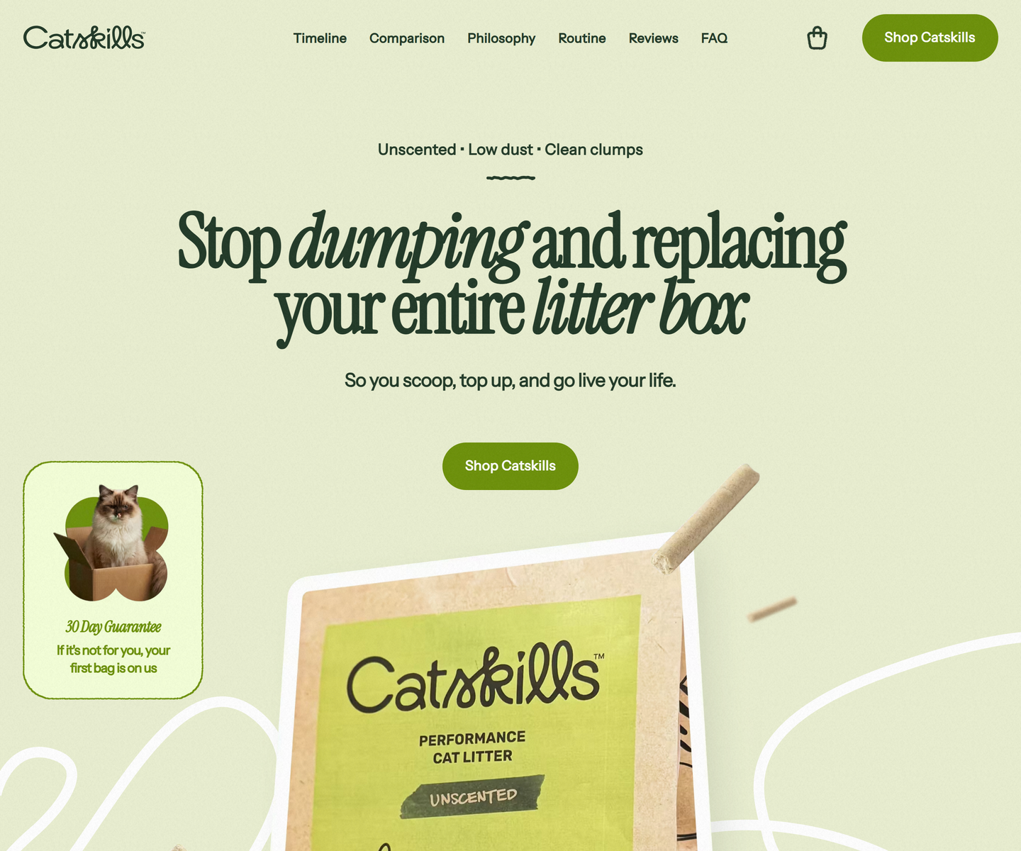 Catskills catskills-showcase.pages.dev Decode Two greens and nothing else: deep sage type on a pale olive ground, with Instrument Serif dropping into italic mid-headline to carry the emphasis a bold would usually take. Product photography sits in soft rounded frames, and a guarantee card leans over the hero at an angle, the only thing on the page allowed to be crooked.
 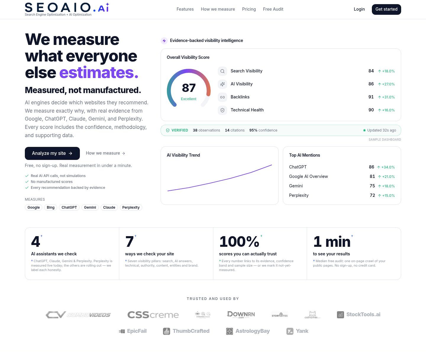 SEOAIO seoaio.ai Decode A restrained, near-white SaaS layout with a soft violet primary and a teal counterpoint, built so dense visibility metrics read as calm reporting rather than a dashboard shouting.
 Other pairs
Our own render · scroll it, or use ← → for the next site