style × type · collection
Dark × Product
4 sites that are both. Each axis has its own page too: Dark and Product.
Dark. Dark interfaces live or die on their neutrals: the good ones keep a hue in the greys so the page reads as one material rather than black with things on it.
Product. Product sites, where the marketing surface and the app share a system. Decode one and you can usually see both.
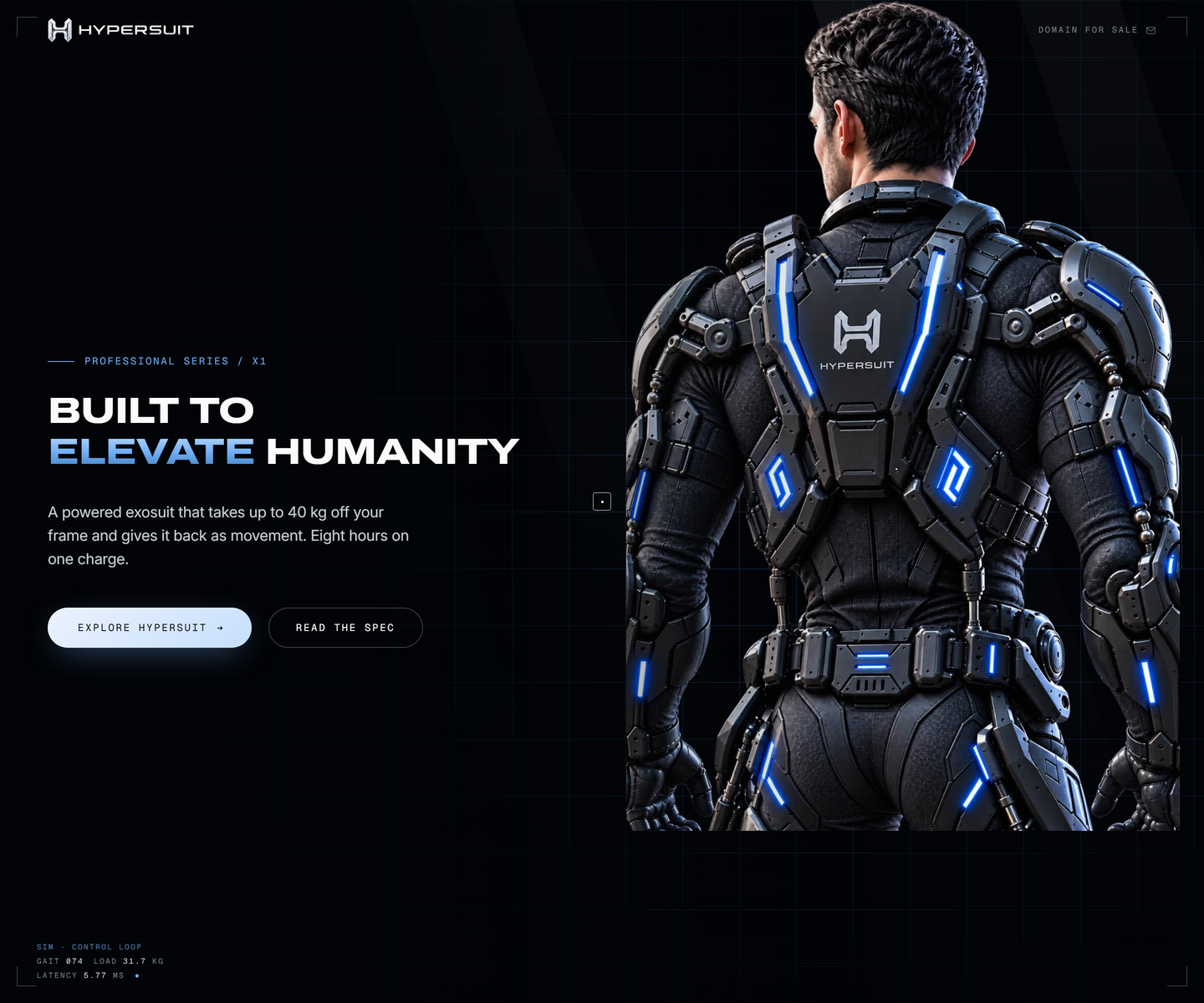 HyperSuit hypersuit.com Decode Near-black with one electric blue, photography bled to the edge, and mono telemetry ticking along the bottom of the fold like a readout. The feature row underneath is line icons and two lines each, which is what lets the hero stay as loud as it is.
 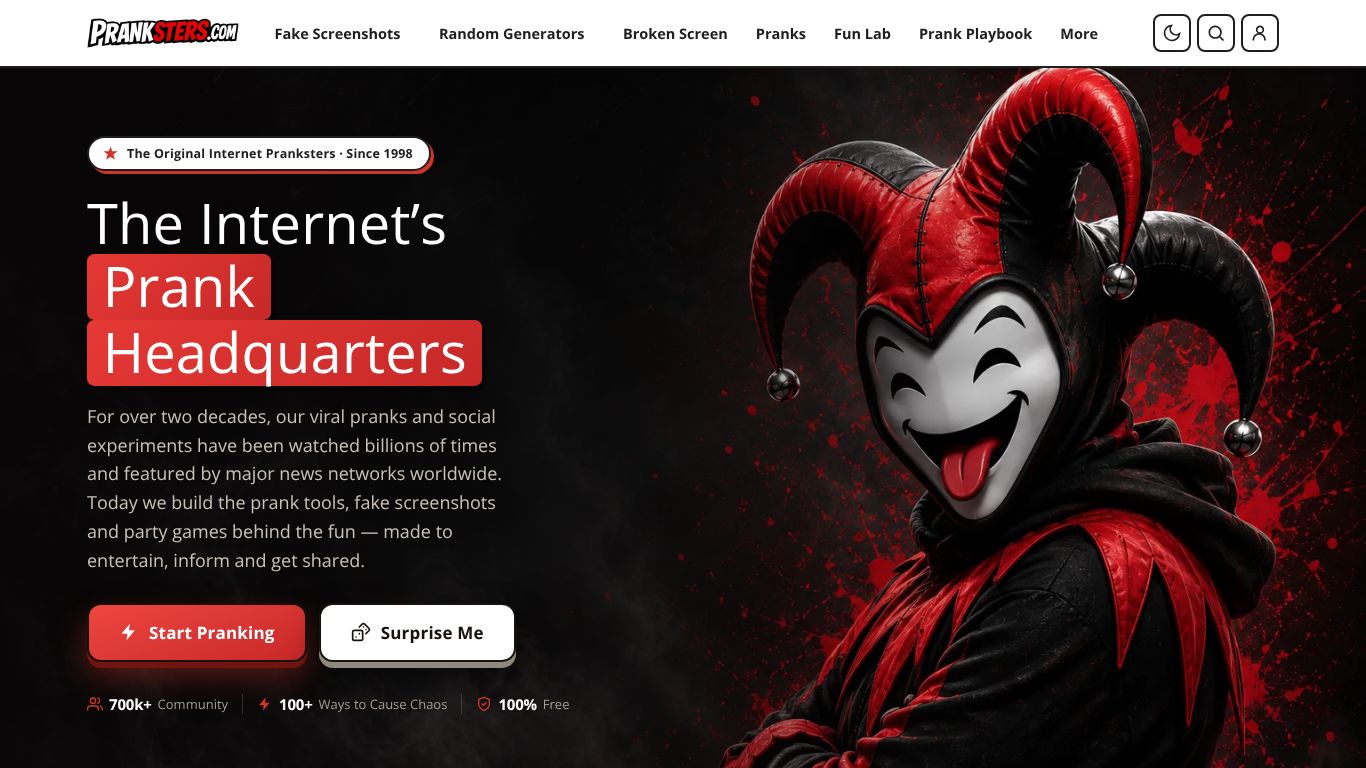 Pranksters.com pranksters.com Decode A near-black stage lit by a single red: highlight blocks set behind the headline, one red primary button, and character art holding the entire right half of the fold.
 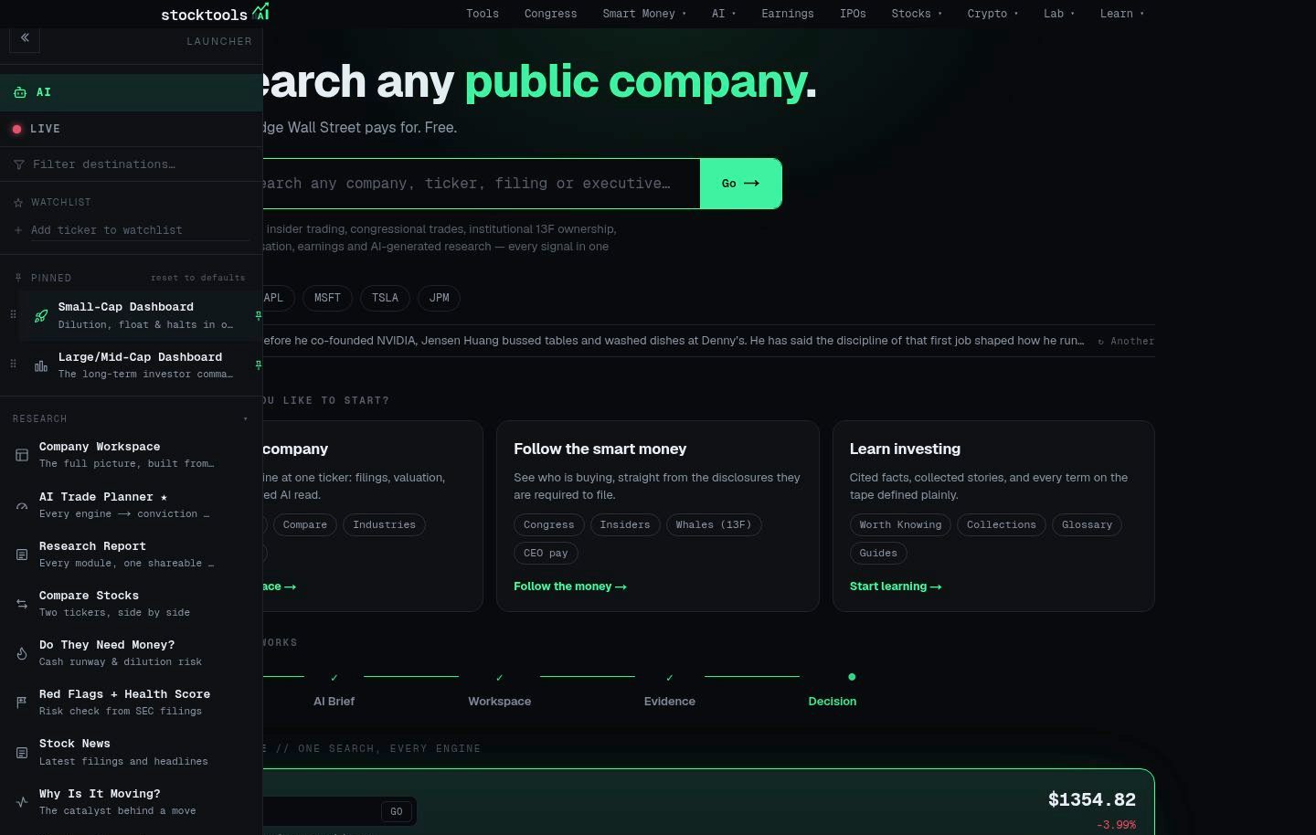 StockTools.ai stocktools.ai Decode A terminal aesthetic done properly: a near-black canvas, one signal-green accent reserved for live data, and a strict grid that keeps dense tables scannable without decoration.
 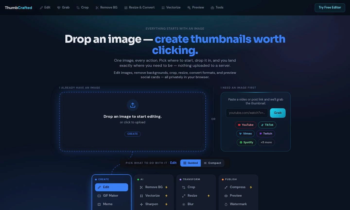 ThumbCrafted thumbcrafted.com Decode An image-first tool suite that lets the work carry the page: near-black chrome recedes so the uploaded image and its result stay the brightest things on screen.
 Other pairs
Our own render · scroll it, or use ← → for the next site