style × type · collection
Minimal × Company
4 sites that are both. Each axis has its own page too: Minimal and Company.
Minimal. Minimal is a spacing decision before it is a colour one. These sites earn the quiet with a strict type scale and a radius they never break.
Company. Company sites: the front door, built to explain and convince. The best ones keep a product-grade design system behind marketing-grade copy.
 Playback playback.tv Decode A paste-a-link hero with the product demonstrating itself directly underneath: two clips side by side, scrubber and all. One red carries the second half of the headline and every action, everything else is black on white, and a handwriting face marks the human asides.
 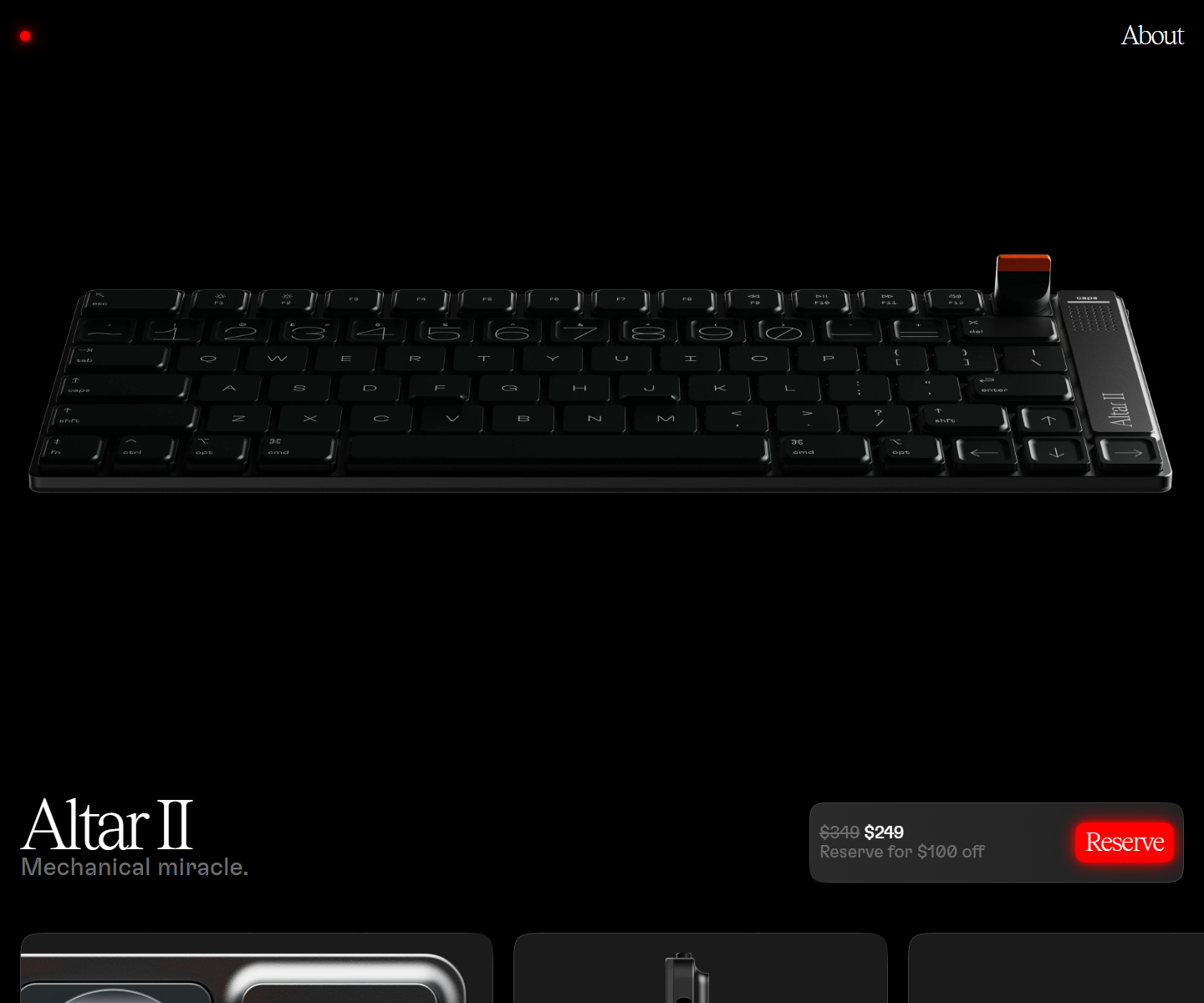 Electronic Materials Office electronicmaterialsoffice.com Decode Sells hardware by switching the lights off: a near-black page where photography of the product is the only illustration, a serif display line over a light grotesque, and the single saturated colour on screen saved for one glowing Reserve button. 26,000px of scroll and twelve inline videos, and not one stock graphic.
  Superhuman superhuman.com Decode Speed sold through restraint: a confident type-led hero and snappy micro-interactions that reinforce the pitch.
 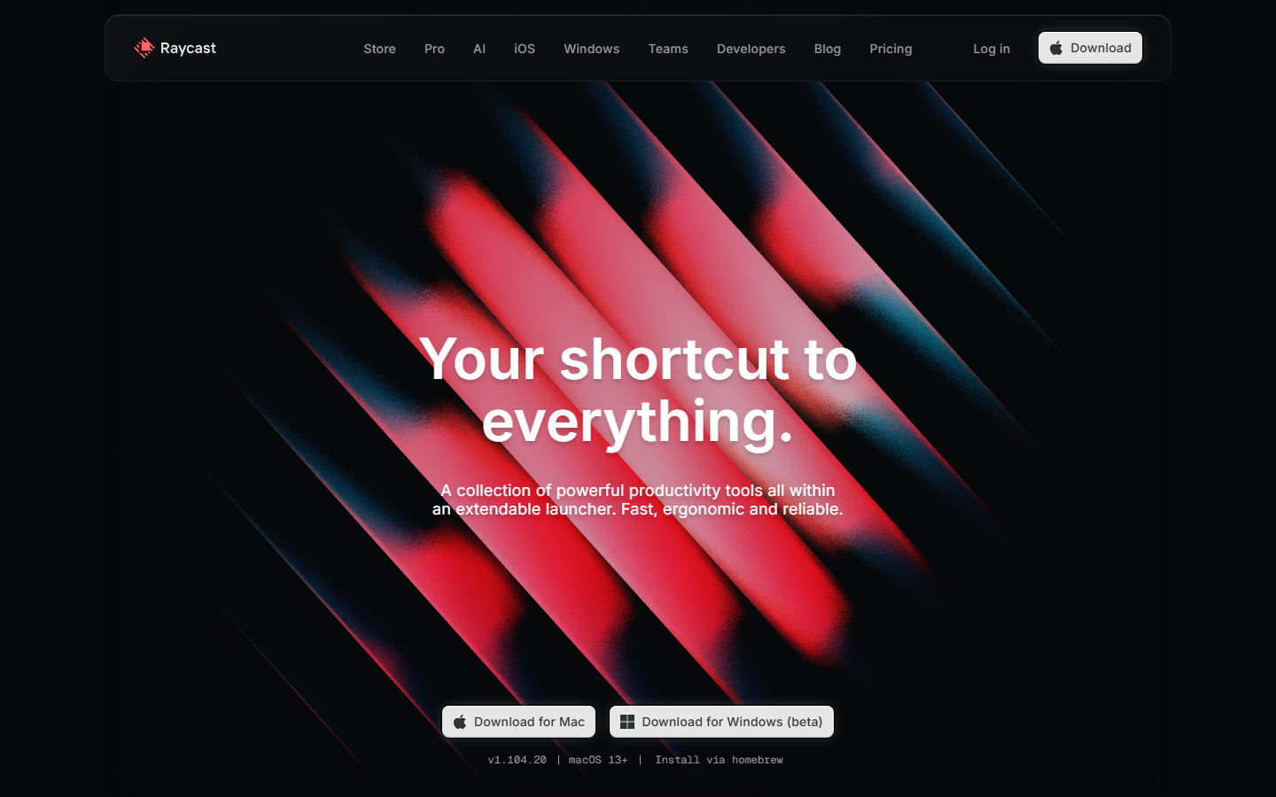 Raycast www.raycast.com Decode Keyboard-first personality carried into the page: clean dark sections, real UI clips, and one obvious download action.
 Other pairs
Our own render · scroll it, or use ← → for the next site