style × type · collection
Dark × Company
3 sites that are both. Each axis has its own page too: Dark and Company.
Dark. Dark interfaces live or die on their neutrals: the good ones keep a hue in the greys so the page reads as one material rather than black with things on it.
Company. Company sites: the front door, built to explain and convince. The best ones keep a product-grade design system behind marketing-grade copy.
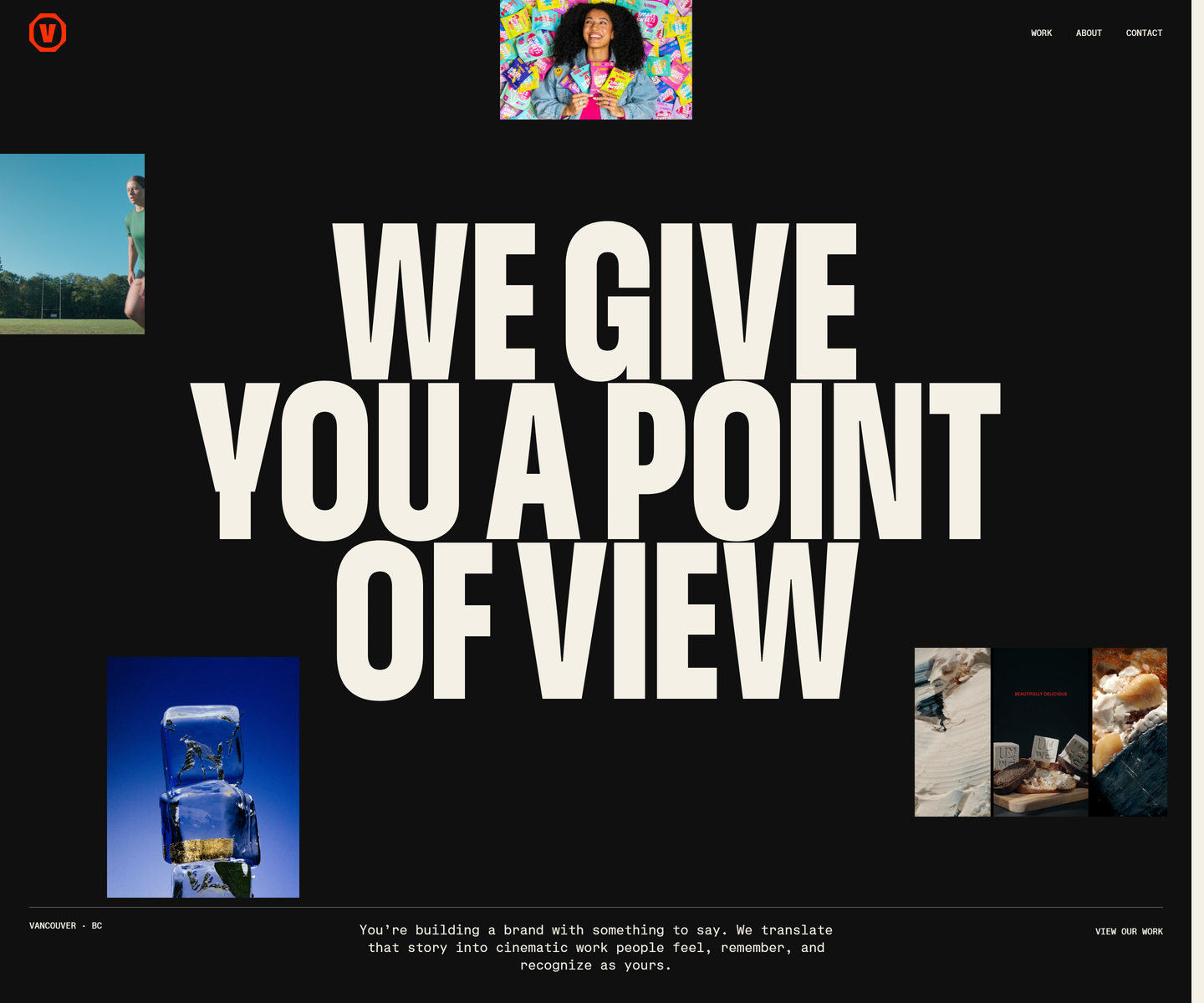 Velour Productions velourproductions.com Decode Cream condensed caps at fold-filling scale on near-black, with film stills tucked into the gaps between the letters rather than laid out beside them. A mono caption row runs underneath like a slate, and orange is held back entirely for the mark and the closing panel, where the studio name fills the screen.
 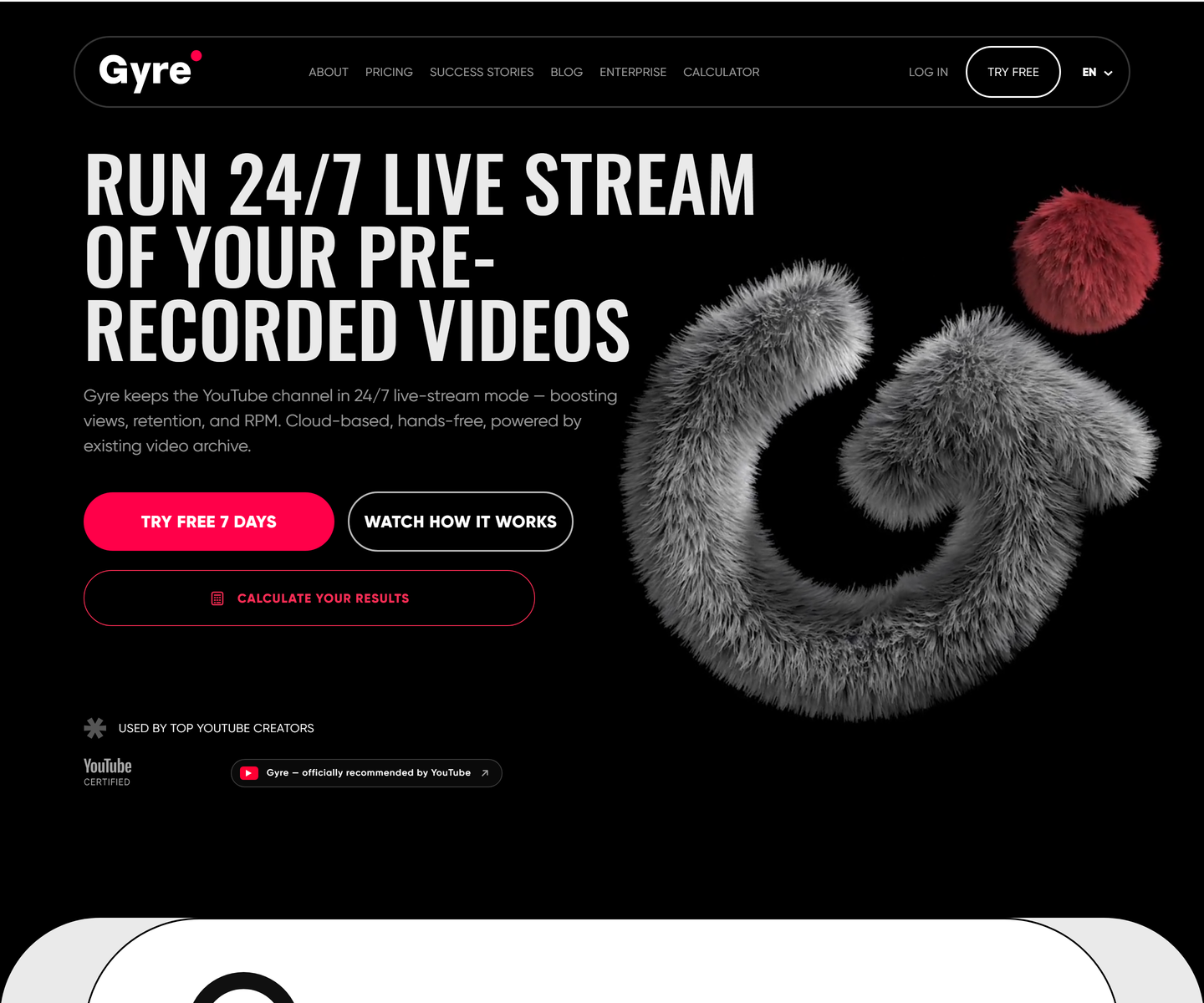 ★ Design of the Week Gyre gyre.pro Decode Condensed uppercase display type at poster scale on pure black, one hot pink accent carrying every action, and a fur-rendered 3D mark doing the job an illustration usually does. A streaming tool that looks like a record sleeve instead of a dashboard.
 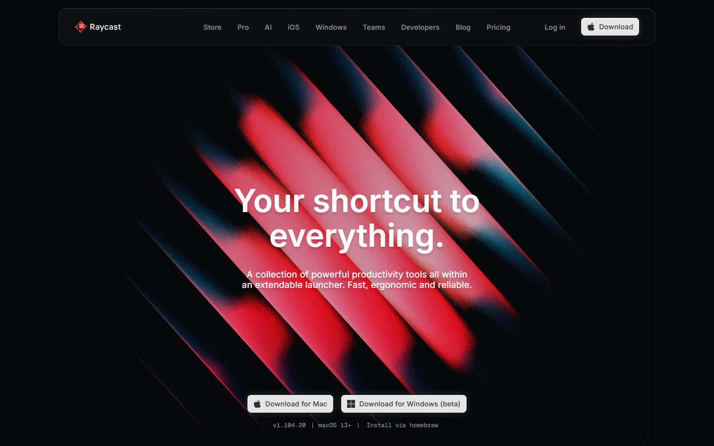 Raycast www.raycast.com Decode Keyboard-first personality carried into the page: clean dark sections, real UI clips, and one obvious download action.
 Other pairs
Our own render · scroll it, or use ← → for the next site