style × type · collection
Motion × Company
3 sites that are both. Each axis has its own page too: Motion and Company.
Motion. Sites where movement carries meaning: scroll-driven reveals, transitions that explain state. The X-ray reads the durations and easings off the DOM.
Company. Company sites: the front door, built to explain and convince. The best ones keep a product-grade design system behind marketing-grade copy.
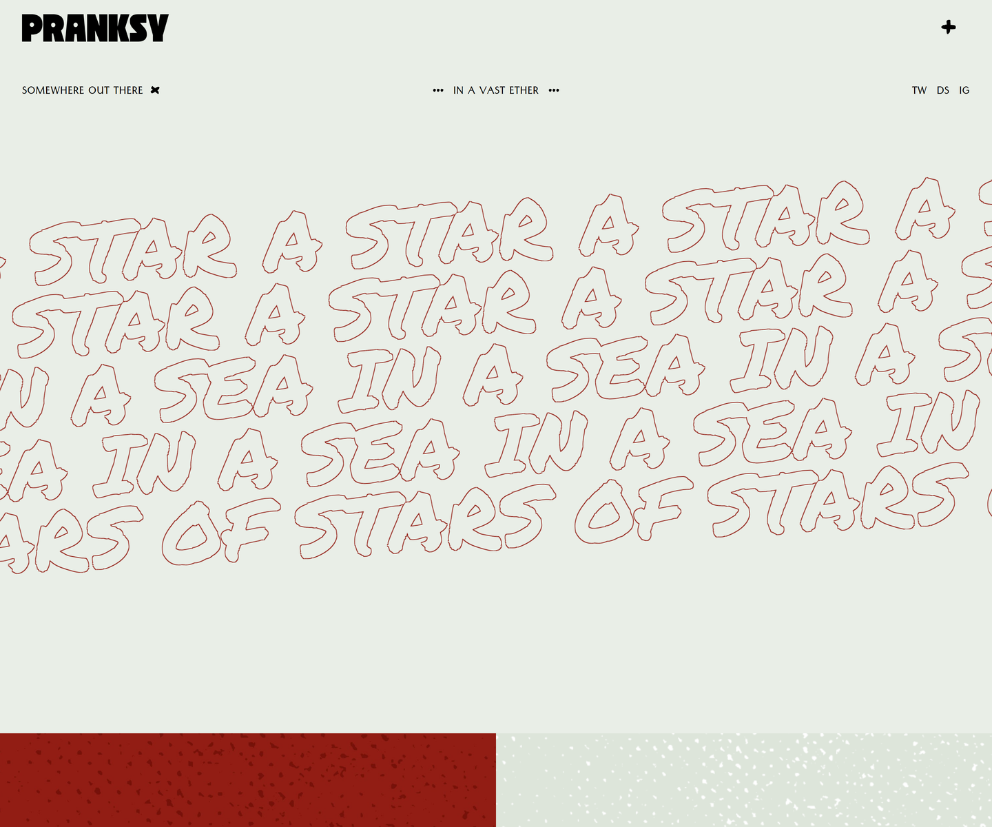 Pranksy pranksy.io Decode Pale sage and brick red, with the display face outlined rather than filled, so the biggest thing on the page is a drawing of type instead of a slab of colour. Three faces do the whole job: a heavy condensed wordmark, a hand-drawn marker at marquee scale that never stops moving, and a small letterspaced sans for the labels. The homepage is three moves and a footer, which takes more confidence than another section would.
 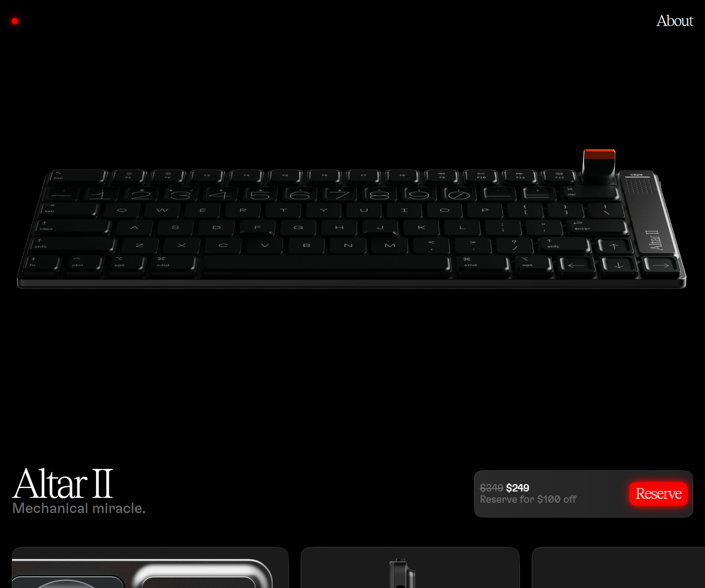 Electronic Materials Office electronicmaterialsoffice.com Decode Sells hardware by switching the lights off: a near-black page where photography of the product is the only illustration, a serif display line over a light grotesque, and the single saturated colour on screen saved for one glowing Reserve button. 26,000px of scroll and twelve inline videos, and not one stock graphic.
  Pitch pitch.com Decode Presentation software that presents itself: bold type, vivid color blocks, and motion that mimics a live deck.
 Other pairs
Our own render · scroll it, or use ← → for the next site