style × type · collection
Big Type × Company
9 sites that are both. Each axis has its own page too: Big Type and Company.
Big Type. Display sizes past 80px, often as the only image on the page. The tell of a confident scale is that the small text still holds up next to it.
Company. Company sites: the front door, built to explain and convince. The best ones keep a product-grade design system behind marketing-grade copy.
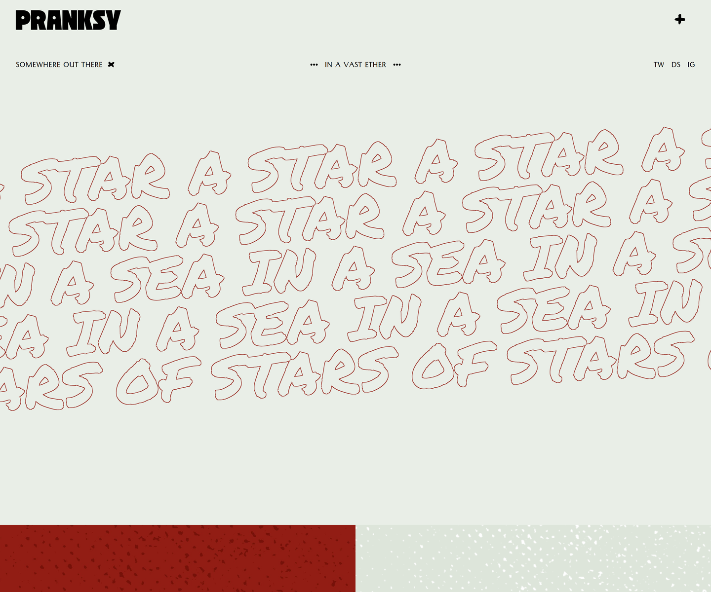 Pranksy pranksy.io Decode Pale sage and brick red, with the display face outlined rather than filled, so the biggest thing on the page is a drawing of type instead of a slab of colour. Three faces do the whole job: a heavy condensed wordmark, a hand-drawn marker at marquee scale that never stops moving, and a small letterspaced sans for the labels. The homepage is three moves and a footer, which takes more confidence than another section would.
 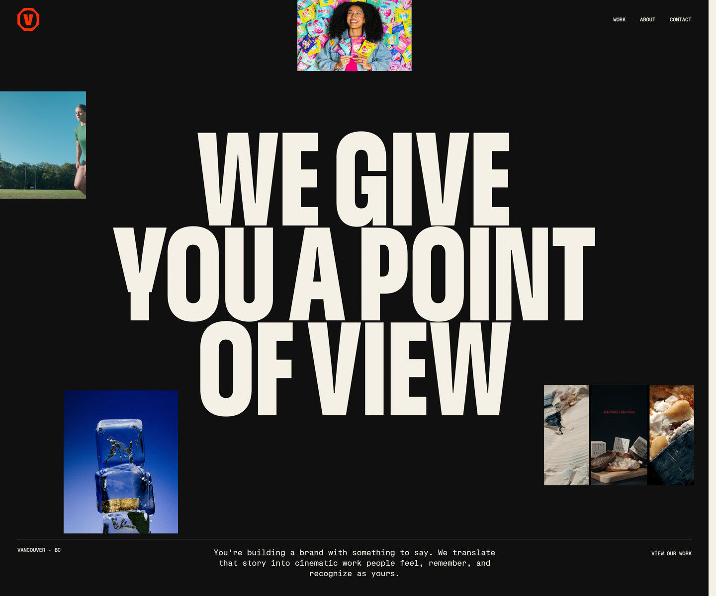 Velour Productions velourproductions.com Decode Cream condensed caps at fold-filling scale on near-black, with film stills tucked into the gaps between the letters rather than laid out beside them. A mono caption row runs underneath like a slate, and orange is held back entirely for the mark and the closing panel, where the studio name fills the screen.
 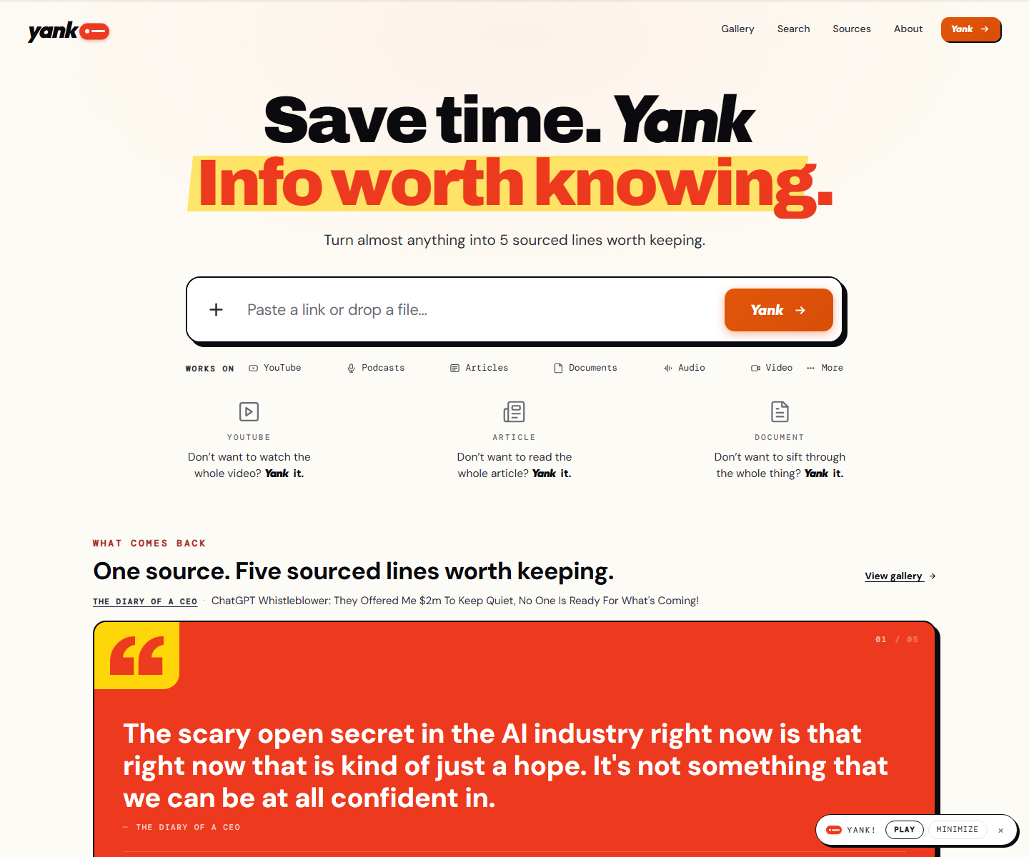 yank.info yank.info Decode Cream paper, an orange second line on a yellow highlighter swipe, and a hard black shadow under the paste box: a summarizer that looks like a marked-up page instead of a chat box. Right under the input the product runs itself on a pink panel, a TED talk with its distilled line in a red quote card and a numbered playlist of sources beside it.
 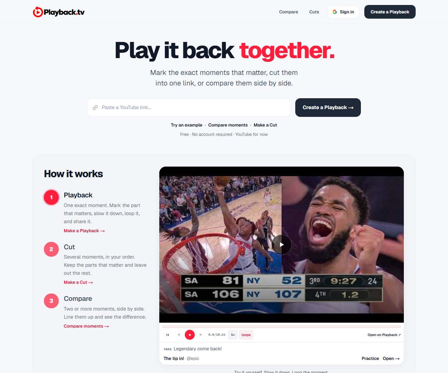 Playback playback.tv Decode A paste-a-link hero with the product demonstrating itself directly underneath: two clips side by side, scrubber and all. One red carries the second half of the headline and every action, everything else is black on white, and a handwriting face marks the human asides.
 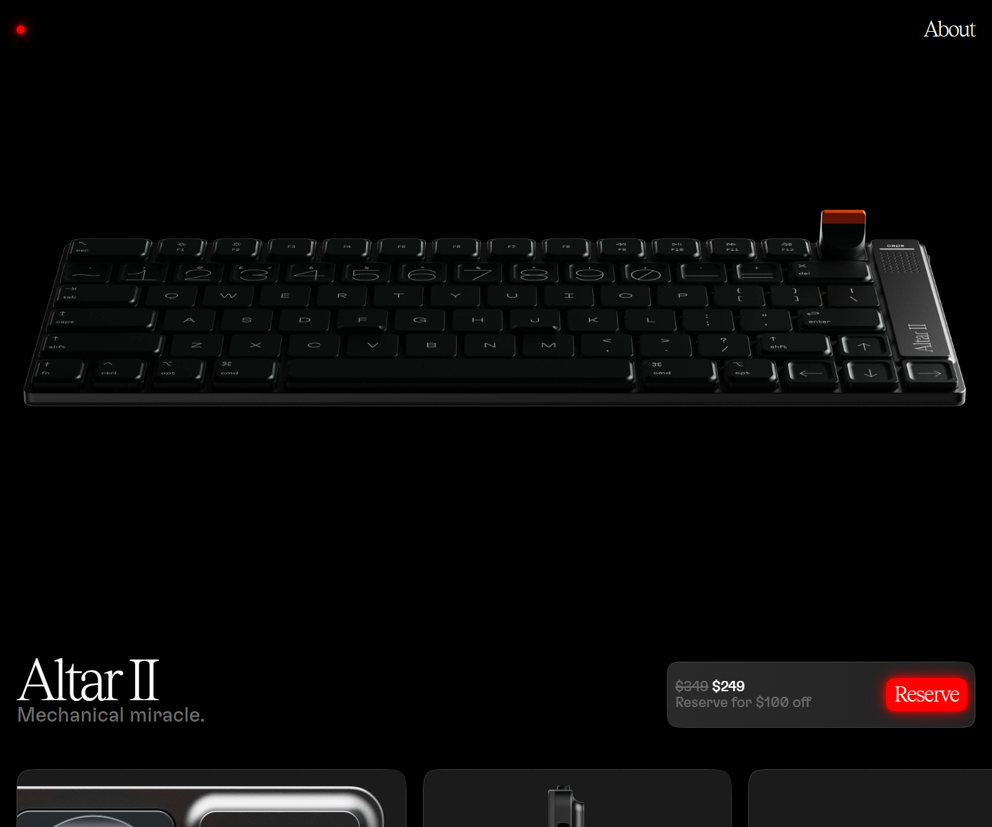 Electronic Materials Office electronicmaterialsoffice.com Decode Sells hardware by switching the lights off: a near-black page where photography of the product is the only illustration, a serif display line over a light grotesque, and the single saturated colour on screen saved for one glowing Reserve button. 26,000px of scroll and twelve inline videos, and not one stock graphic.
 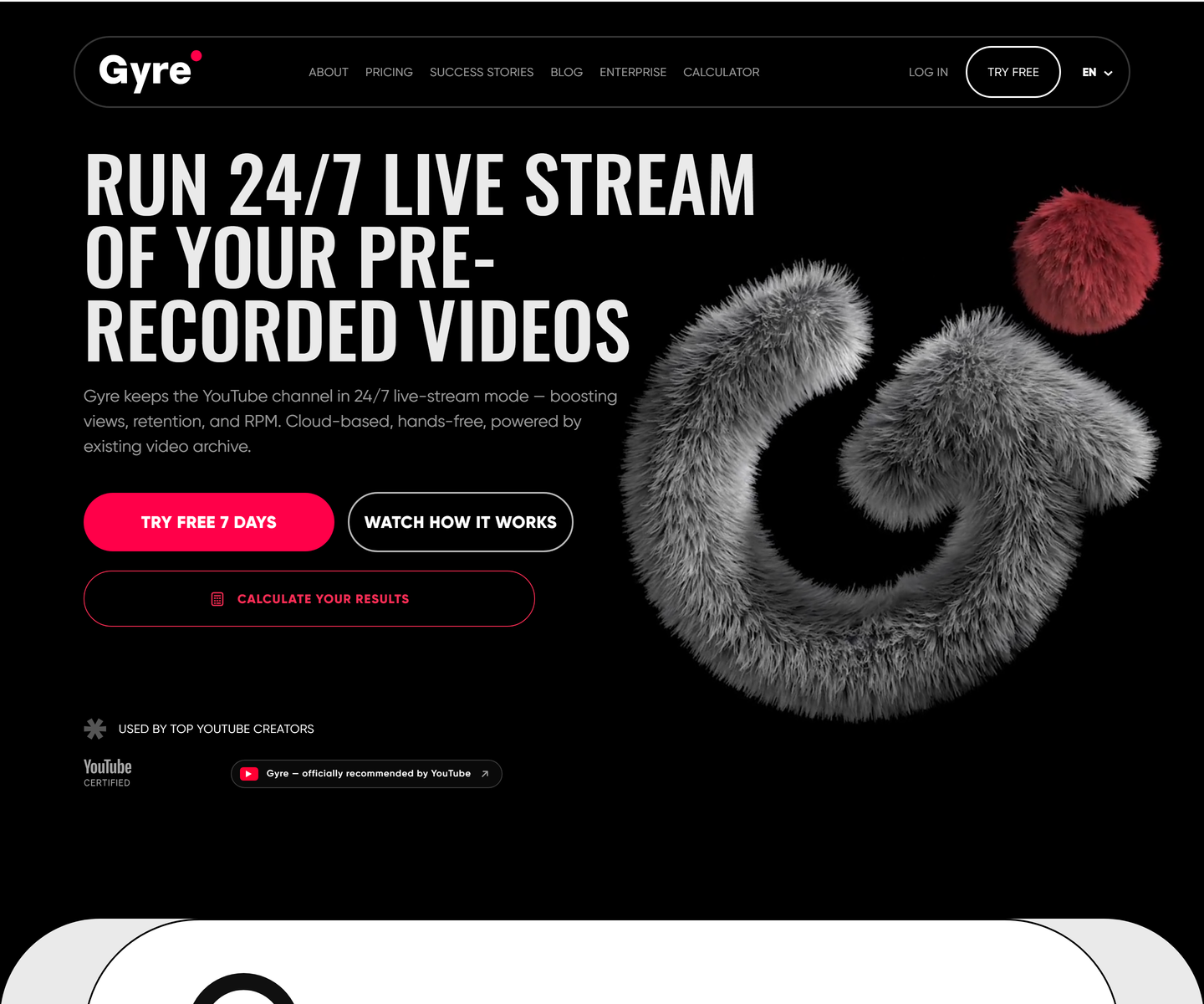 ★ Design of the Week Gyre gyre.pro Decode Condensed uppercase display type at poster scale on pure black, one hot pink accent carrying every action, and a fur-rendered 3D mark doing the job an illustration usually does. A streaming tool that looks like a record sleeve instead of a dashboard.
 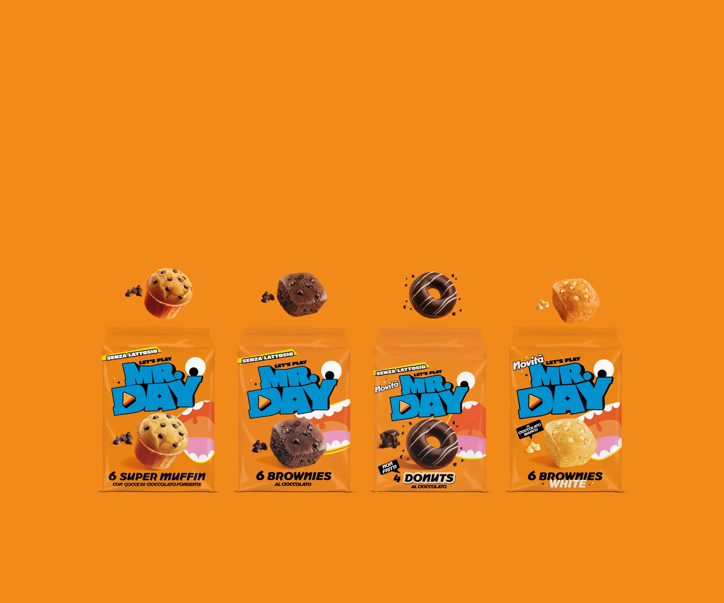 Mr.Day mrday.it Decode Marquee strips of heavy display type alternate with cut-out product shots, so the page scrolls like a moving poster — orange and cyan carry the brand while a “level up” gaming motif runs through the copy.
 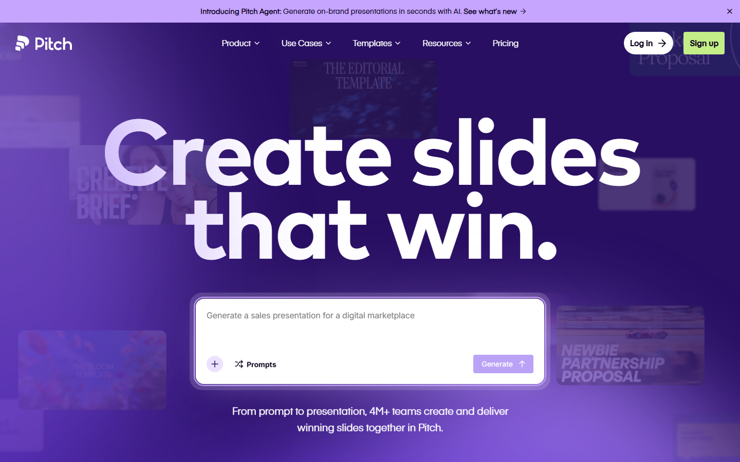 Pitch pitch.com Decode Presentation software that presents itself: bold type, vivid color blocks, and motion that mimics a live deck.
 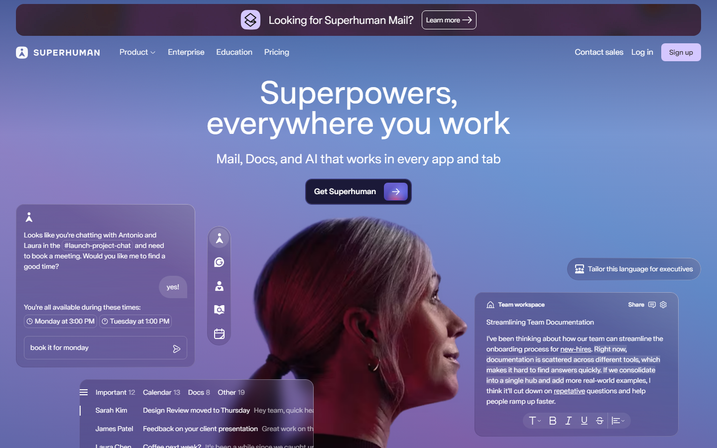 Superhuman superhuman.com Decode Speed sold through restraint: a confident type-led hero and snappy micro-interactions that reinforce the pitch.
 Other pairs
Our own render · scroll it, or use ← → for the next site