style × type · collection
Colorful × Company
3 sites that are both. Each axis has its own page too: Colorful and Company.
Colorful. More than two brand hues on one page, and still legible. The decoder shows which of these pass contrast and which are coasting on charm.
Company. Company sites: the front door, built to explain and convince. The best ones keep a product-grade design system behind marketing-grade copy.
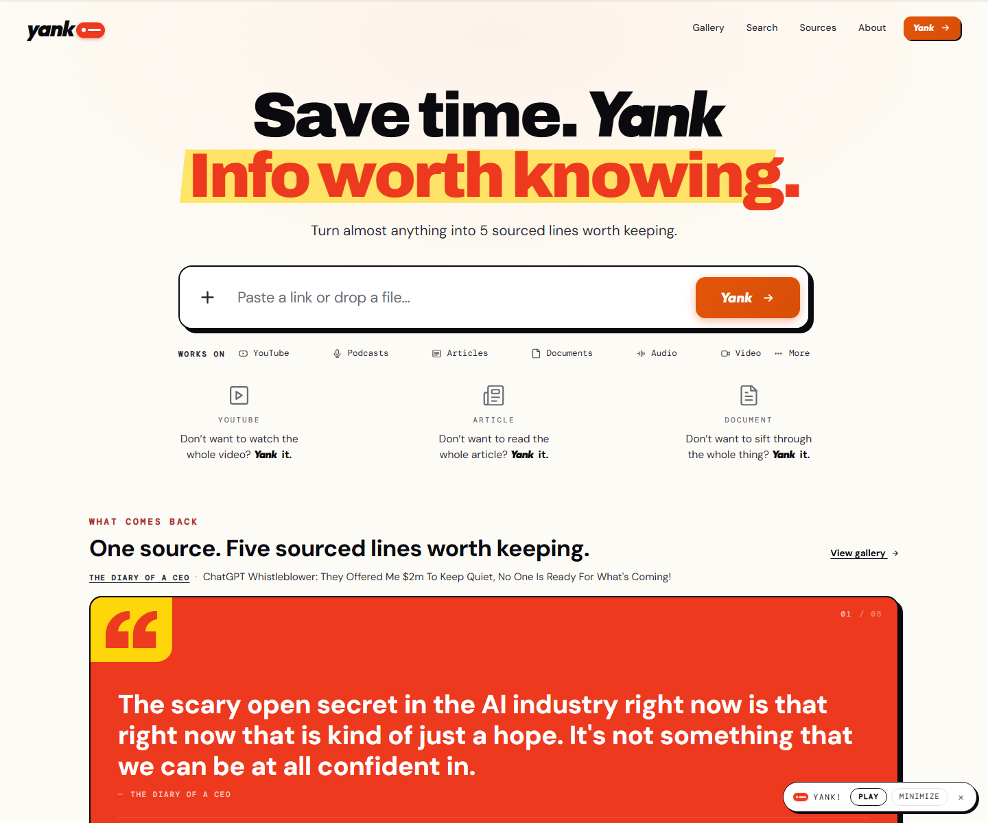 yank.info yank.info Decode Cream paper, an orange second line on a yellow highlighter swipe, and a hard black shadow under the paste box: a summarizer that looks like a marked-up page instead of a chat box. Right under the input the product runs itself on a pink panel, a TED talk with its distilled line in a red quote card and a numbered playlist of sources beside it.
 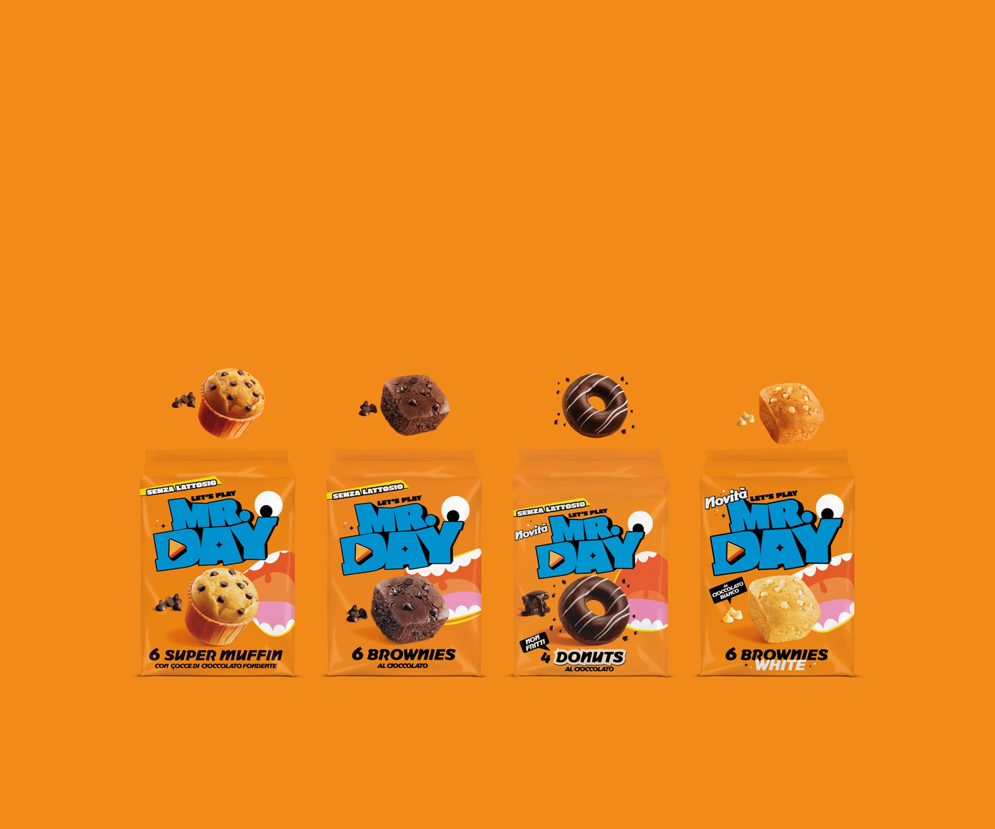 Mr.Day mrday.it Decode Marquee strips of heavy display type alternate with cut-out product shots, so the page scrolls like a moving poster — orange and cyan carry the brand while a “level up” gaming motif runs through the copy.
 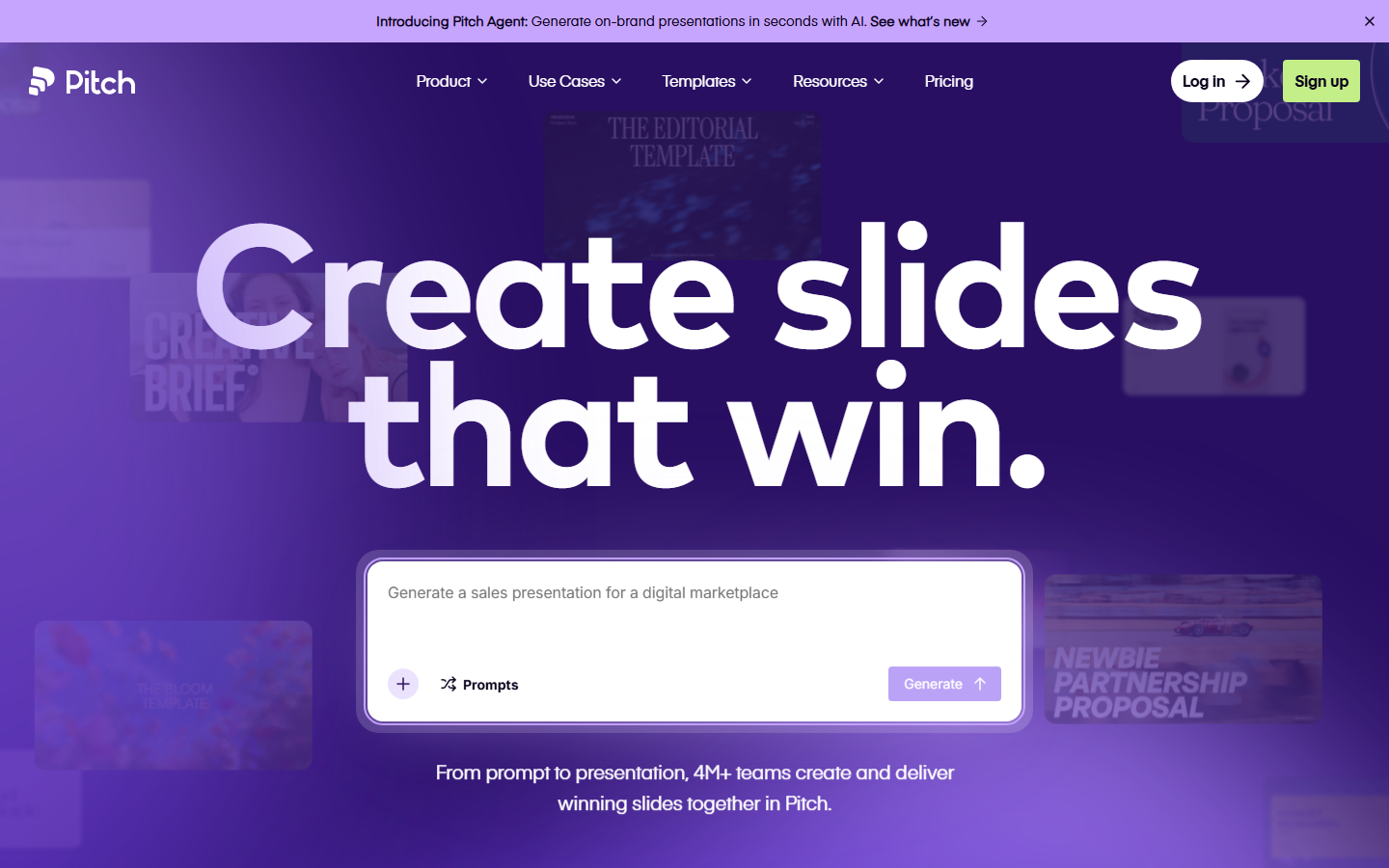 Pitch pitch.com Decode Presentation software that presents itself: bold type, vivid color blocks, and motion that mimics a live deck.
 Other pairs
Our own render · scroll it, or use ← → for the next site